I have a font that I added overlapping nodes for interpolation purposes, now it looks much messier… like it’s a mistake — it’s not. Before it was tolerable:
I have a font that I added overlapping nodes for interpolation purposes, now it looks much messier… like it’s a mistake — it’s not. Before it was tolerable:
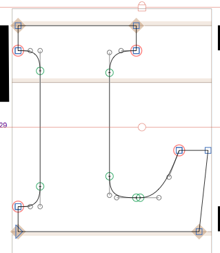
Why do you need the overlapping nodes?
Because in the hairline, the serifs get much longer and need an extra point
You really think so? I find it much less obtrusive than it was before.
And it is not advisable to have overlapping nodes in the exporting instance (potential rendering problems). But this can be taken care of automatically with a custom parameter.
Separate the overlapping nodes by a few units.
I see it changed again, this one is good 
Wouldn’t it be nice to have this highlighting as well for overlapping OffCurvePoints? I mean when they happen to lay over an OnCurvePoint.
Interesting thought. But maybe more subtile. As many people like to have them (we are advising against it, still).
Right. I remember that discussion. I think it’s not a good habit, as well. So, maybe it’s anyway appropriate to have this calm warning. Users working against the advise are already ignoring something. Why not ignore the warning then, too? ![]() From my point of view, I’d expect to see warnings now in every case and assume it’s all ok when there are no warnings. But you know better how other users see that. One could just outsource it in a plugin (like Angled Handles, Red Arrows, or my yet unpublished Path Measels).
From my point of view, I’d expect to see warnings now in every case and assume it’s all ok when there are no warnings. But you know better how other users see that. One could just outsource it in a plugin (like Angled Handles, Red Arrows, or my yet unpublished Path Measels).