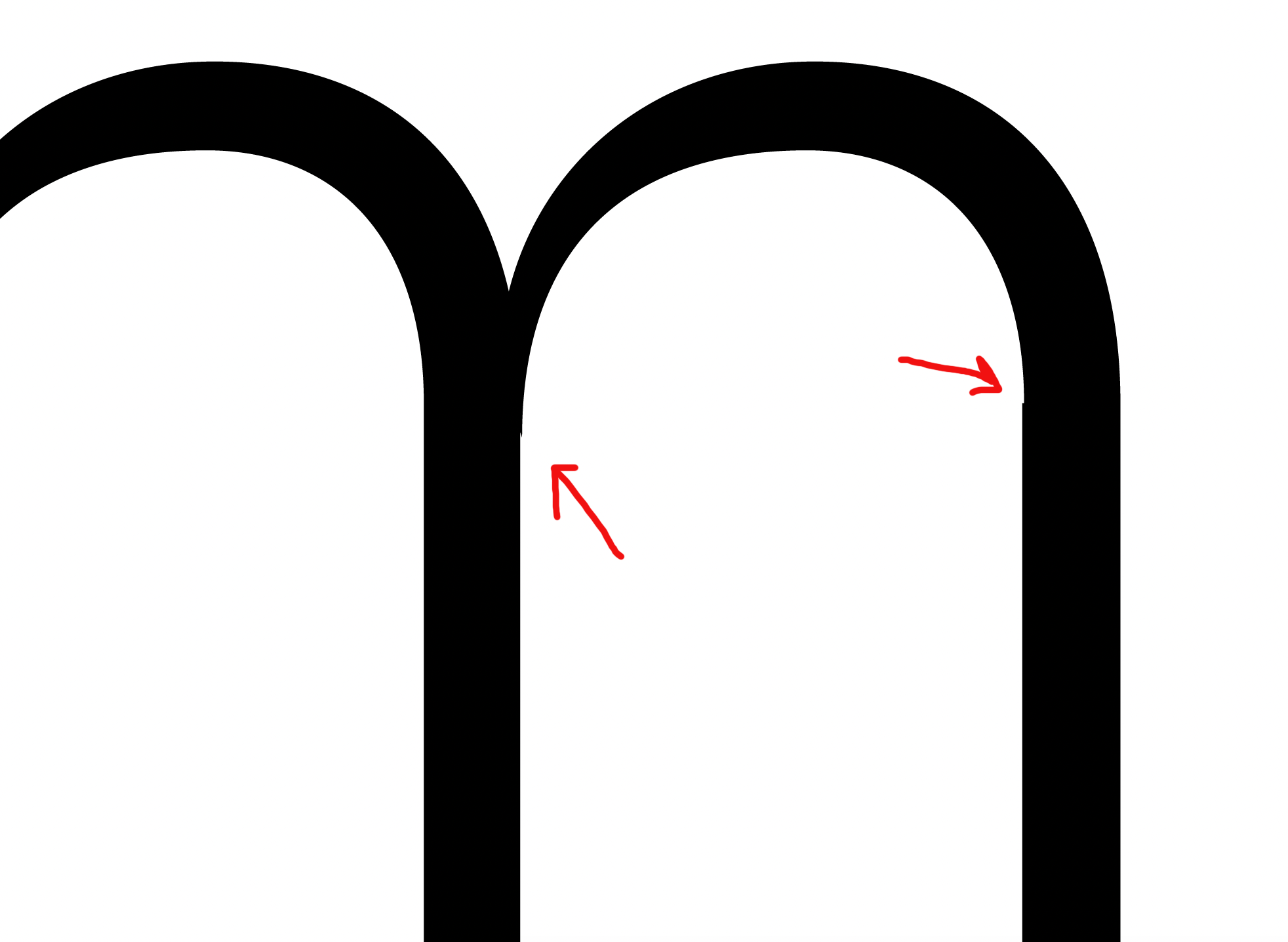
I’m exporting my WIP font for testing and the paths in the lighter weights are not interpolating (?) correctly. I have 3 masters - Thin, Regular and Black. And all the paths are correct on the masters.
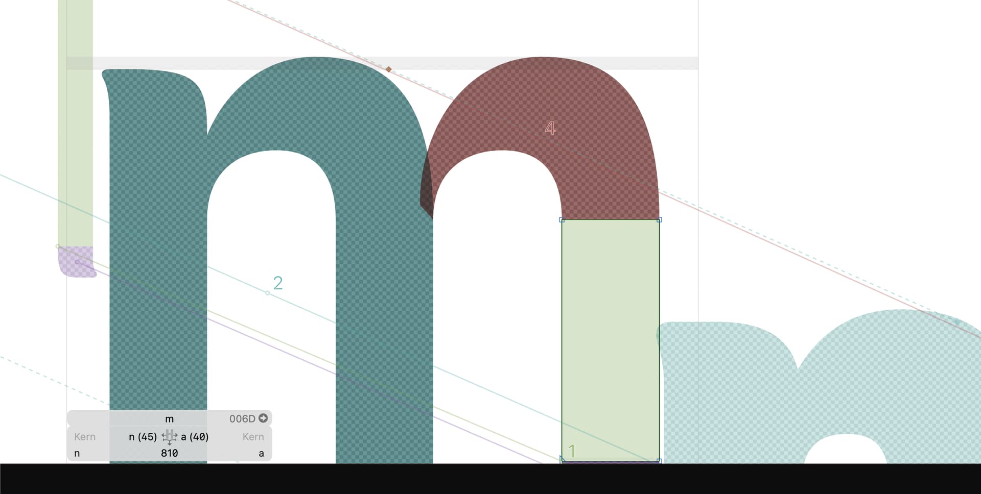
You probably build the glyph with different components? The position and size of components are interpolated independently and that can produce such misalignments. Can you show a screenshot of the ‘m’ and it’s parts?
It means that you should avoid making glyphs that are composites of components and some outline parts. Instead you should make your composite glyphs entirely out of components, and then use anchors to connect them, and possibly #entry abd #exit (special) anchors if you need the components to add to the advance width of the composite glyph. If you do that (and have all the stems the same width they will interpolate without errors.
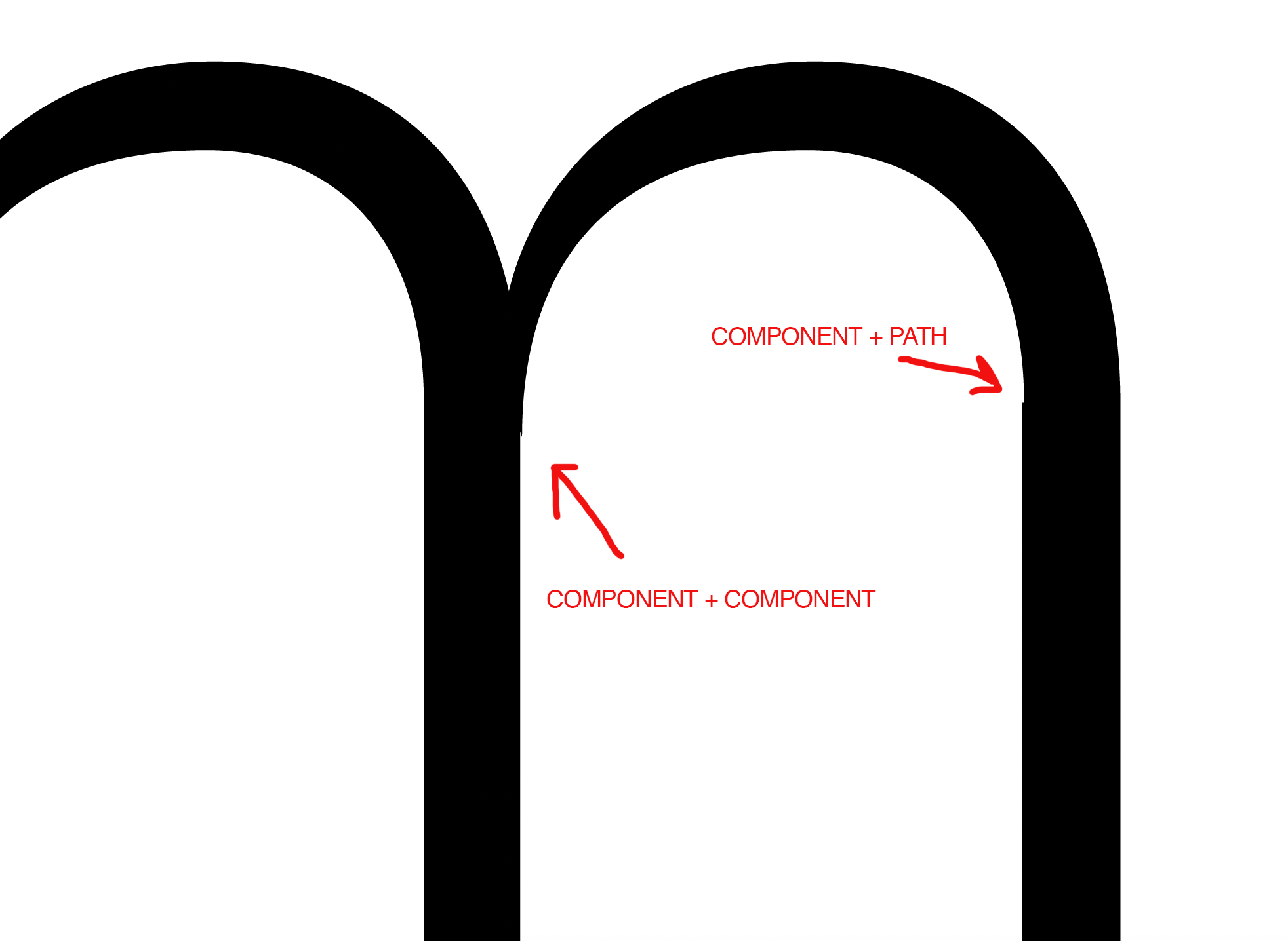
Ok, so I’ve been doing some tests working with components and the #entry and #exit anchors and the problem keeps happening. I have two masters, Light and Black. And in some of the interpolations I have a bit of misalignment.
You don’t really do something wrong. As I said easier, components (and path) are interpolated independently and that can result in those small offsets.
Can you send me the file? I like to play around with this to better understand your setup and maybe come up with a solution.
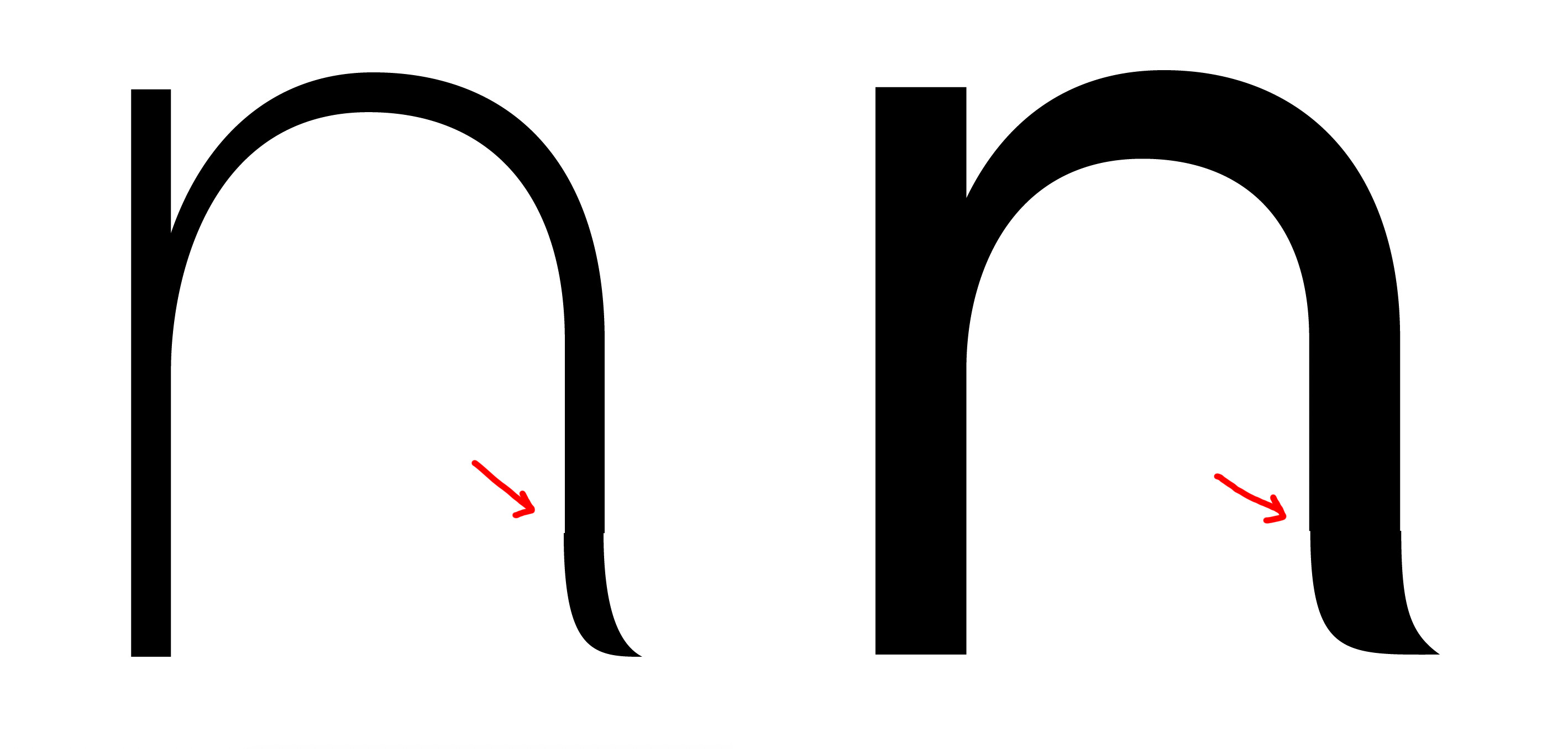
Exactly. These rounding errors do happen, and combining shapes that are intended to connect smoothly (or meet at exact points in general) are not encouraged, especially in more complex shapes like italic. There are tricks to avoid it, but are usually more hassle than they’re worth, at least in cases like this.
All the design work becomes fine-detailed. If subdivision is 2, you’re doubling the resolution, and you need to be twice as precise as before.
(edit) Also, TrueType does not allow fractional coordinates if I’m not mistaken. If you intend to release your font in TTF outline formats, you should expect the same kind of rounding error.
Yes, rounding errors are inevitable this way. Things that need to be smooth are better one shape. What you want to do is better done with corner or cap components.