I have a problem with a font I have created for an children’s educational project. The parts of the glyphs outside of the sidebearing aren’t being visualized correctly when displayed as individual letters, as if the letters have been cut off.
I am creating and exporting a quite special font for primarily web use. In Glyphs the font is constructed only with a single (open) path stroke. I am then using the excellent helpful Glyphs plugin Noodler by @mekkablue, to export the font with different thickness with the help of Instances. Could Noodler have anything to do with this issue or is there just a newbie mistake I’m doing.
It’s displayed incorrectly in Sketch, in Chrome and Safari browsers.
It’s displayed correctly in Illustrator, FontBook in OSx, Keynote.
Yes, it does show up correctly when a space or other character follows the cut letter. But the single letter still pose a problem for us. That brings me to what you say next.
Don’t really understand what you mean with “screen rendering”. Do you refer to that the rendering in the browser and Sketch (which are where the letters are incorrectly displayed)?
A quick research in “screen rendering” doesn’t lead me to anything related to a solution I can follow up and solve by myself. I mainly find subjects related to hinting. Could you explain or guide me further, please.
Italic Angles is now set, thank you. What will this impact other than the inclination of the box around the letter?
No reason actually embarrassed. I just hadn’t noticed it and so far it has not affected what we are developing. But I will definitely solve it. I believe it comes from copy-paste from Illustrator (which I only use for the speed of routines).
“The Italic Angle has an effect on a number of tools
throughout the application. Functions that respect the slant
angle include aligning anchors between two selected nodes,
the display of the x offset in measurement mode, and the
calculation of the sidebearings.”
Other fonts are working properly in Sketch (see screenshot).
One other thing is that when I zoom the workspace or move the letter around the “slice” will act differently. Sometimes it’s displayed in its full/normal character, other times half or a third of the letter is cut off.
So it might be some kind of rendering issue. But why does it only happen to this specific font, and not to other fonts.
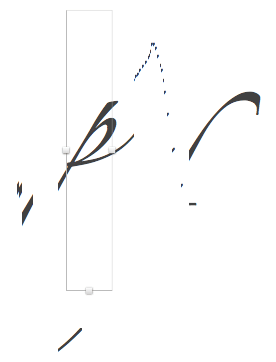
You are mistaken. It does happen to other fonts as well. In your example, you only picked letters that did not swing out very far beyond their sidebearings. But here, for example is Zapfino’s lowercase p in Sketch:
The artefacts around it stem from typing different letters and moving the text box.
So, the best you can do within the font is keep the most important part of each letter inside its sidebearings. You could shift all your letters to the left with Filter > Transformations > Metrics.
I just tried this myself and it seems to be a bug in Sketch. They cut of text rendering if the font sticks out of the text box. You can resize the text box to avoid this.
Yes, you’re right I was wrong. It is a rendering problem in Sketch and as @GeorgSeifert says: “It seems to be a bug in Sketch”. I’ll notify them about it.
How could this be done without loosing the benefits of the sidebearing and completely rely on kerning for all possible letter pairs. I mean… if I adjust the sidebearings for the entire letter to fit I’ll have to do kerning instead, right? Or are you meaning I will have to, in either case, cut some part of the letter - that is not an option as it is an educational tool for children to learn the shape of each individual letter.
This next issue will be regarding web and maybe outside of Glyphs boundaries. But it’s regarding the screen rendering issue which is the most probably cause for my improper display.
My font is improperly displayed in Sketch (probably due to a bug). But what about the web. Why are the letters displayed improperly there as well?
I’ll do some research with our developer but is there someone here who might know how fonts are being rendered on the web and if that can be substituted by another rendering engine?