I’m nearing the final phase of development in the font shown below and am struggling with a practical dilemma.
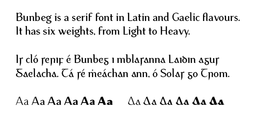
The font is currently in two forks — one for Roman and the other for italics. Both make use of stylistic sets to activate the Gaelic characters. In certain cases there are multiple stylistic sets (to enable/disable the long ‘s’ and ‘r’, for example).
My dilemma is this: while this all works very well, it all relies on the awareness of end users that stylistic sets exist. Further to this is awareness of key commands to activate seimhiús (dot accent) on letters.
While Unicode supports all of the required glyphs, the bulk of my target users will most likely be working on Office in Windows, with UK English keyboard settings. My aim is to make using the font as easy as possible for the end user.
I’m debating separating the Latin and Gaelic versions into separate fonts and using something other than dot-accent to generate the seimhiú accents.
I’d be interested in hearing other type designers views on this. I realise is is a bit niche, I don’t think it has any parallels with other languages as the Gaelic forms were largely abandoned in the 1950’s in Ireland.
Thanks in advance for your thoughts.