The .notdef glyph that Glyphs generates is too fancy for my needs, is it possible to have an option to generate a simpler one? (the current box but with a × instead of the current text, for example) I know I can draw one, but I feel like Glyphs should be generating a more standard shape by default.
1 Like
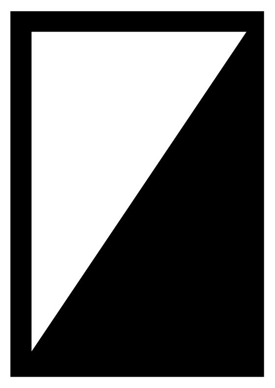
I use this shape. Simple, few nodes, can not be mistaken for a checkbox, is dark and thus easy to spot on a page, not bound to a specific language.
1 Like
Equally good for me. Might be a bit close to “◪” (U+25EA), though, so I’d make narrower and taller.
Ha, I am sure there is a symbol in Unicode for every simple shape 
There is no real standard, the spec just mentions a few ‘recommendations’ that have been in use:
Glyph 0: the .notdef glyph
Glyph 0 must be assigned to a .notdef glyph. The .notdef glyph is very important for providing the user feedback that a glyph is not found in the font. This glyph should not be left without an outline as the user will only see what looks like a space if a glyph is missing and not be aware of the active font’s limitation.
It is recommended that the shape of the .notdef glyph be either an empty rectangle, a rectangle with a question mark inside of it, or a rectangle with an “X”. Creative shapes, like swirls or other symbols, may not be recognized by users as indicating that a glyph is missing from the font and is not being displayed at that location.
It is a good point that it should stand out and be noticeable. In that respect, the shapes recommended in the spec are not ideal. The fallback shape is better in that respect.
There was also a discussion about this on TypeDrawers: Pet peeve: empty .notdef character. — TypeDrawers
3 Likes
The shape Glyphs currently generates contain English words, and too fancy for a default .notdef glyphs. The options recommended by MS has the virtue of being more wide spread so users are trained to recognize them.
3 Likes
I have heard that argument before, but I never heard about .notdef recognition training, I must admit. In what way are they more widespread? An empty box does not necessarily tell me that a glyph is missing. A user will still have to get an explanation somewhere else. (Sure, the software should give an explanation, but that is another story.)
Yes, it is English. But you do not need to speak English in order to understand ‘NO GLYPH’. I bet it is understood by more people worldwide than the empty box. Though I must admit I have no hard data to back that up.
The argument that Microsoft supplies, is that it must be ‘recognized by users as indicating that a glyph is missing from the font’. That makes sense. Where I differ is that to me, that argument indicates that it should exactly not fit in with the rest and, on the contrary, stand out in terms of its design. The empty box will not stand out more than glyphs like bullet, slash, bar or brokenbar will. That is why I never liked the ‘light’ shapes.
Personally, I put a question mark on a fat circle in my font. That is why Build Symbols script creates it that way, hehe. For the script, I have had a UI for shape choices (empty box, crossed box, question mark on circle, on diamond, on square, etc.) on my list for a while.
It is so common, it got a name.
This assumes more people know English that it is necessarily the case. Glyphs is the only font editor I know that produces such a fancy .notdef glyph by default, all other editors produce an empty box one way or another. The more the shape is close to a common form the better, and an empty box (with or without a x) is by far the most common.
I don’t like question mark .notdefs since they look like a Unicode replacement character � (U+FFFD). So you can not be sure if the character was replaced (data was lost) or the font has no glyph for the character (no loss of data, just a visual limitation).
3 Likes