Hi,
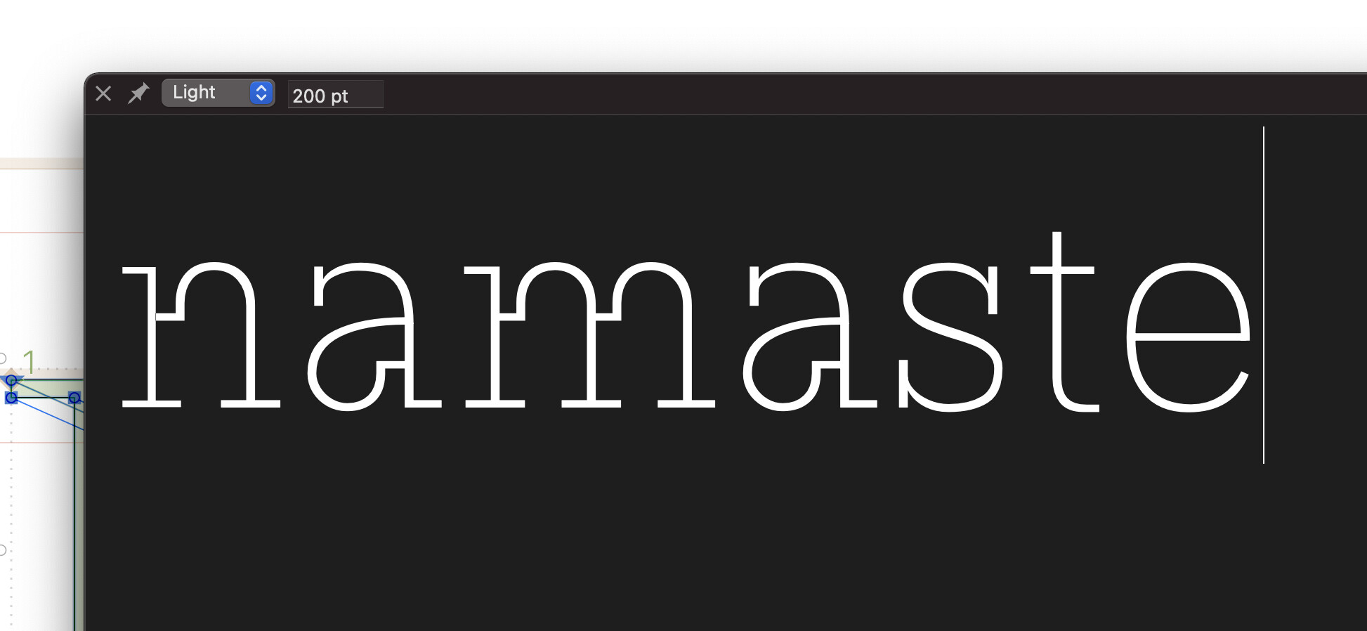
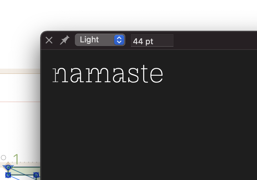
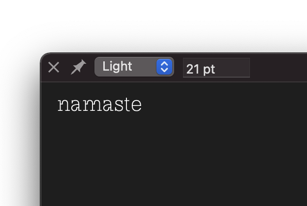
So the font was working fine (I think) when I made all the light weight lowercase and when I created a black master I suddenly noticed that the stems of n, h, etc are looking thin compared to the other vertical stroke. Both are 30 units. Attaching screenshots. Just want to make sure what the problem is before I move forward. Is it hinting related?
Edit: I am new to Glyphs and designing a typeface.