Suggestion: Orientation in Masters

Hej there!
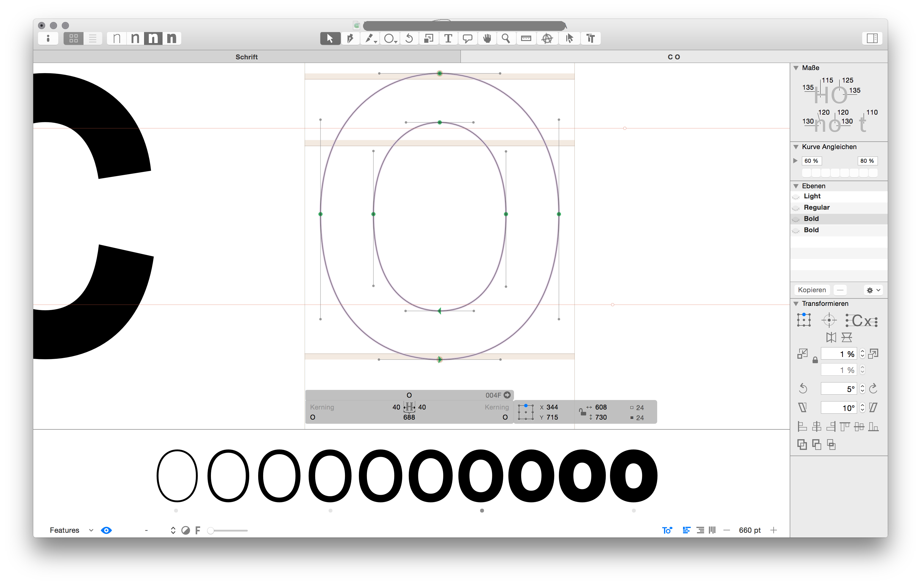
Just a litte thing: I always have troubles looking at the correct Master Glyph when working with the instances preview (which I love btw). So maybe the master glyphs in the preview could be subtly highlighted?

And also, another tiny thing: the tab option > jump to the next input fiel — never really works, i.e. in the transformation panel…

Great App! Keep it going.

2 Likes

Could be done with a plugin. How would a glyph with a descender be highlighted?

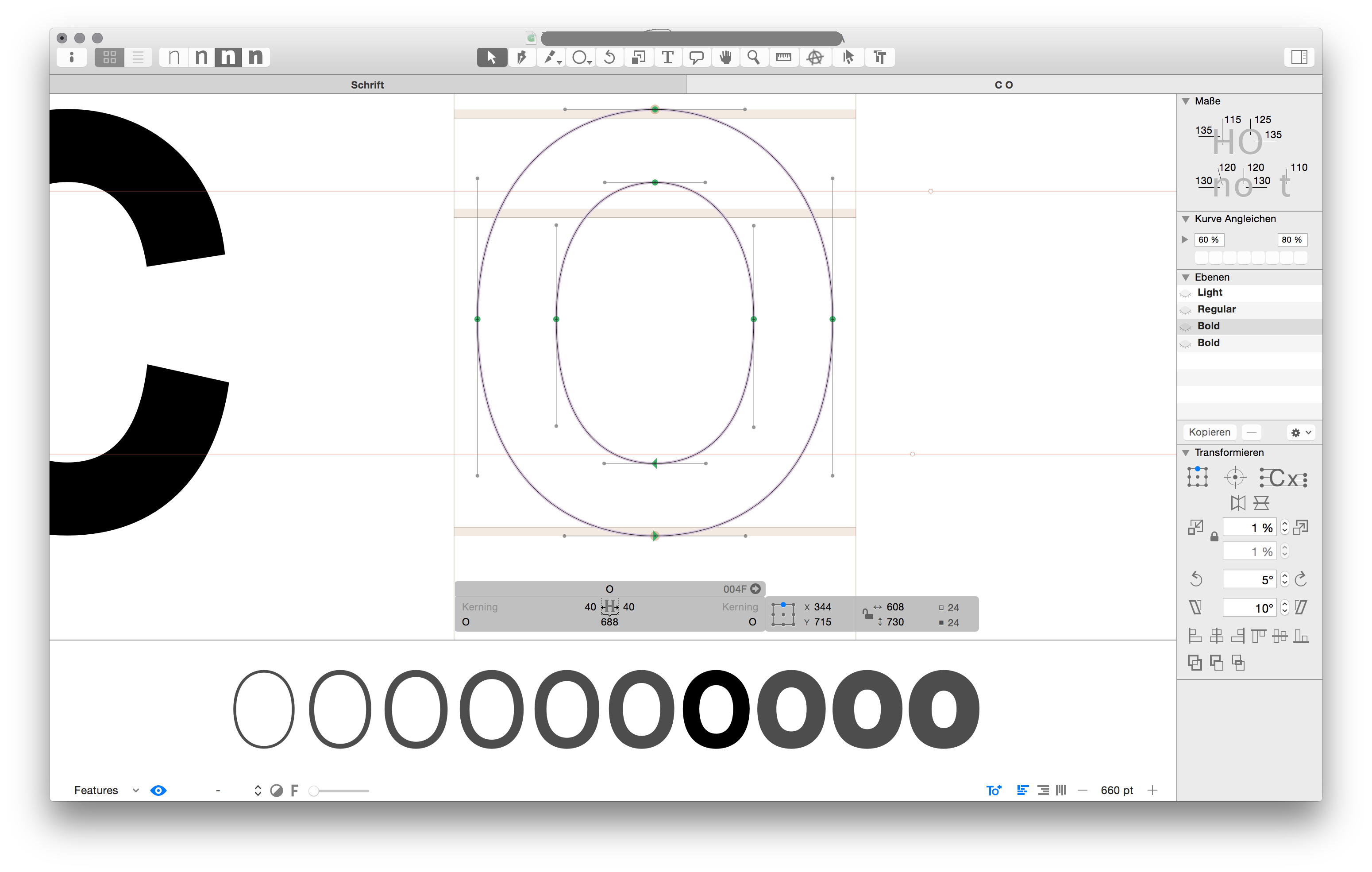
Mh, yes, that’s the obvious question. Maybe the little dots could be colored instead (with transparency), so one could see the overlay better? Or maybe, if possible, they could switch accordingly to the top?

But yes, a plug in would be great! :smile:

Hej there, how about greying out the rest in a subtile way?

If, then I would do it the other way around, grey out the master instances. The focus here is on the interpolated instances.

Yes, absolutely. That sounds reasonable.
Maybe even just the active (one) master instance softly greyed would be even enough?

Those are instances, not masters, though I suppose in most cases you probably have an instance that matches the master you’re working on.

What I wonder is if there should be a “Show all masters” option from the same menu. I would find that quite useful.

1 Like

Masters belong into the drawing area on top, and there, this already exists: Edit > Show All Masters.

That’s true. Though I find it much clumsier since it doesn’t dynamically update as you step through letters, for example. (Maybe I’d use it more if I assigned a keystroke shortcut to it.)

(And there is precedent for putting masters down below, namely when “-” is selected from the instance menu, right?)