Hello!I found a very interesting handwriting font. I am interested in the effect of smearing in it. Could someone please tell me how this effect is created? Thank you very much!

The way these strike-through effects are implemented in this case is as follows:
- Add a glyph for a strike-through pattern. For example, for
---, add a glyph namedstrikethrough.3(or any other name that makes sense to you). - Set the width of that glyph to 0.
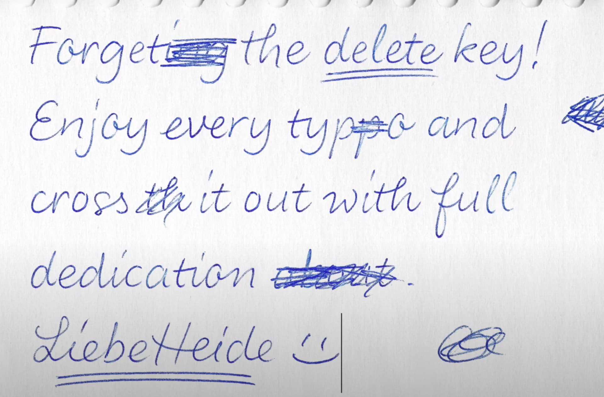
- Draw the strike-through path to the left of the zero-width glyph. If you are using images, like your example font Liebe Heide, place those on the left of the zero-width glyph.
- Repeat the above steps for each strike-through pattern that you want. You may want glyphs of different widths so that works of different lengths can be struck through.
- Add a feature in Font → Font Info → Features. Liebe Heide uses
ss03, but you can also choose any other feature likedlig. - In the feature code, add a substitution rule for each strike-through glyphs. A rule is written as a line of code like so:
sub hyphen hyphen hyphen by strikethrough.3;
In general, I would recommend against doing this as it goes against the spirit of Unicode. If your font is mostly used for posters and other print products (that is, not digital uses like webpages, ebooks, or apps), conformity to the Unicode is less of an issue.
I would do it differently. Make a stylistic set that is smeared already. So you don’t need to type this hyphens but just apply the stylistic set.
Wouldn’t the strikethrough lines then have to appear letter by letter?