Hi all,
I’ve been on 2.5b (1119) having lots of fun with the TT hinting (fun, yes!) improvements. Something very strange happened though when reviewing and tweaking the hinting today.
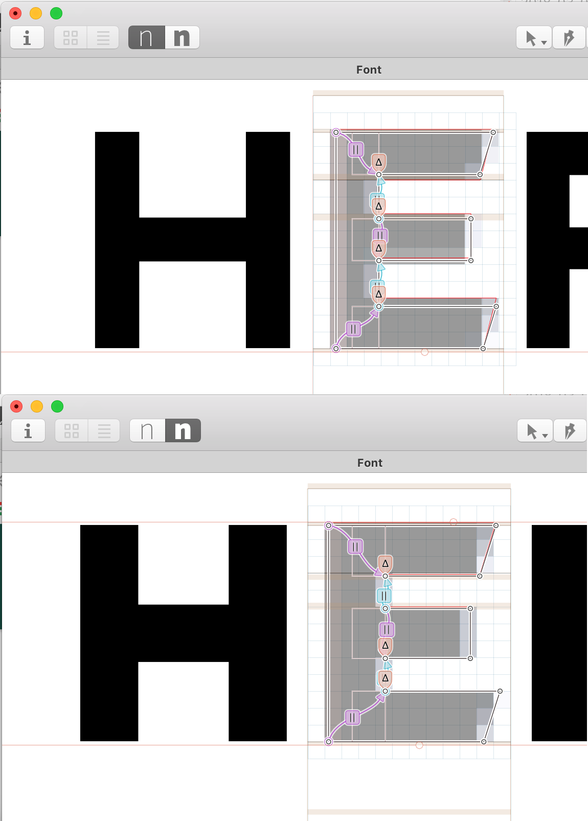
I can’t add any Deltas to the second master. To be precise: deltas can be added, they do show in the interface and in the window below the glyph, indicating the amount of change, but, nothing really happens, it doesn’t affect any result. I tried on other glyphs and nothing…
Even more strange: I then generated the instances and tried to hint from scratch the second master, then in a single master Glyphs file, but the same thing happens: deltas do not affect anything.
I tried cut and pasting outlines again; removing all hints and trying the whole process again, with no luck…
I didn’t find info about the Deltas in the handbook and tried looking up in this forum. I’m sorry if I’m missing something obvious here… I’ve been testing the generated fonts on Windows 7 and I see tremendous improvements. But something went wrong at some point to kind of ‘lock’ the Bold ‘master’? so no changes can be made now
I can provide you the Glyphs file if you’d like, but can’t share it public from here…
Thks again : )
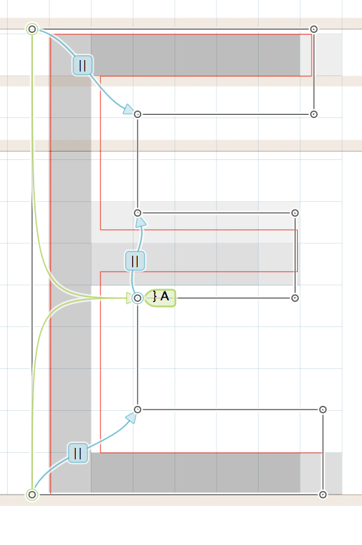
select an instance in the Preview area at the bottom and a pixel size in the grey info box (Cmd-Shift-I). Then, simply select a touched node and press the up and down arrow keys to move it, that’s it! Now you can watch the delta do its magic on the hinted red outline and the ClearType preview in the background
Indeed, I wasn’t selecting the instance at the bottom of the interface. Silly me
I knew how to apply them (as you can see in the screenshot that have Deltas). The font doesn’t have any interpolated instance (only 1 for each of master) so I wasn’t paying attention to those.
Thanks very much for your prompt and effective support.
The counterspace was closing up at smallest sizes so I added a no stem hint between the bars.
Going further: I’m very curious about how to handle more complex glyphs, like the Euro on a Black weight, for example. Would there be an open-source sample/reference Glyphs file of a font, TT hinted, which one could look into and discover how optimal hints are applied across an entire font?
That would be extremely valuable for learning purposes.