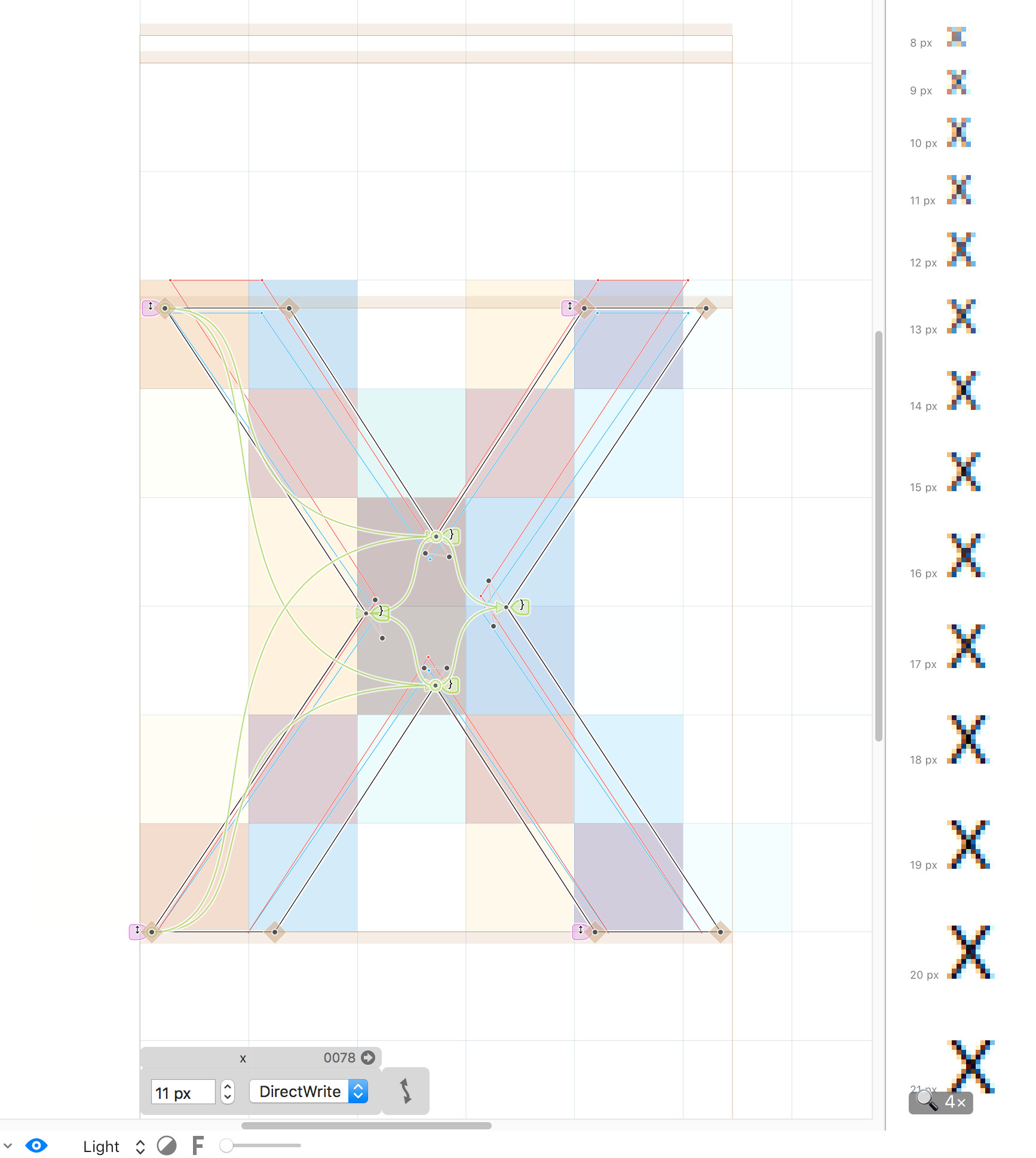
I manually hinted my font in Glyphs 3. It looks perfect on a PC with old screen resolution. The preview in glyphs also shows even hinting. However, when I check it on a newer screen with higher resolution or on a tablet (1920x1200), the vertical heights look wired. I used global deltas to get the same x-height in all weights. The results are this:
Please note that at size 11 the x-height of the bolder weights are lower (even the outlines are higher). And more wired, I don’t even have global deltas at size 11. Same at size 13 and 14.
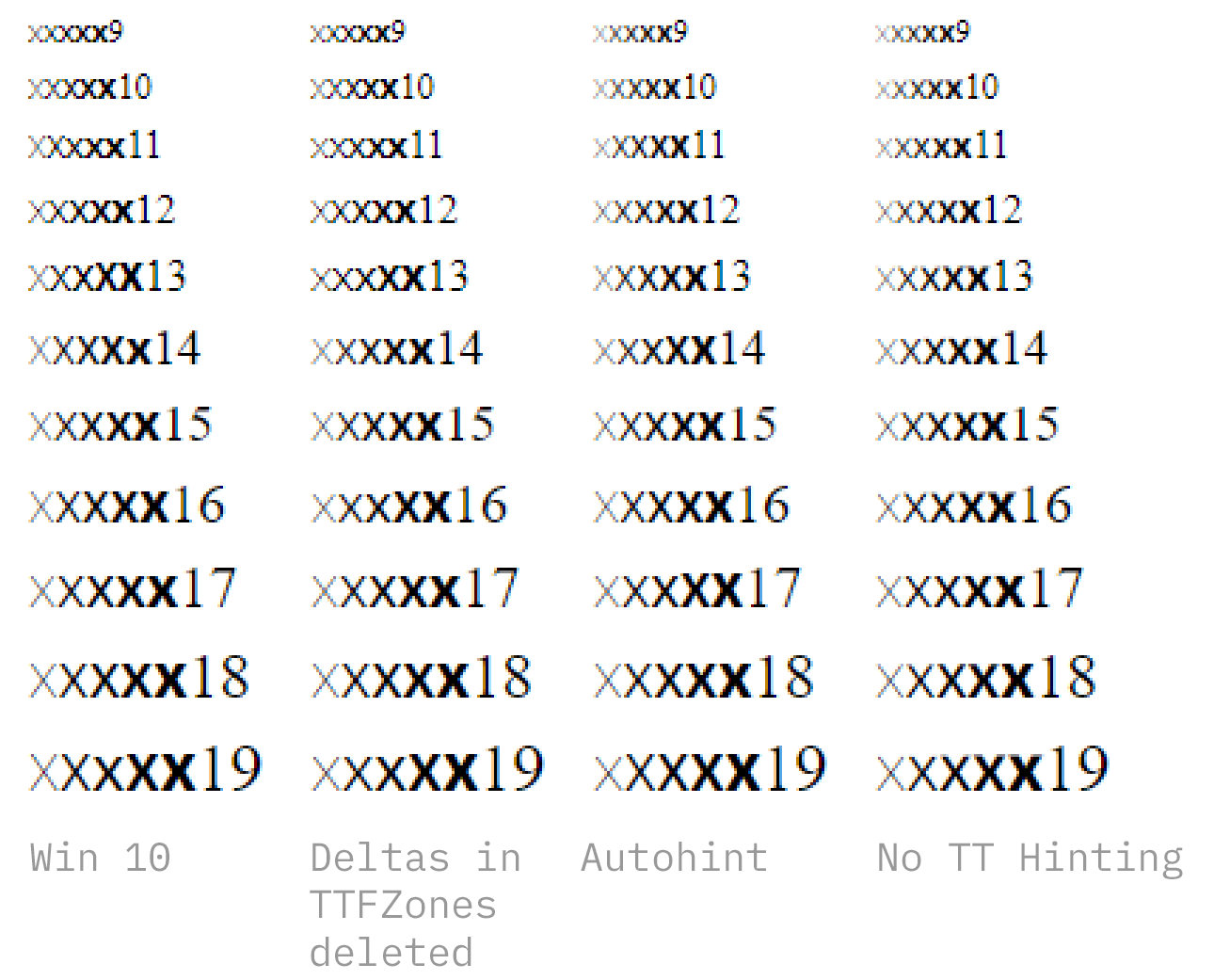
Now, when I remove all global deltas, this inconsistency (for example at size 11 or 14) also removes. This is amazing, because size 11 and 14 don’t have global deltas.
Can you compare the pixels you get for each point size on both screens. Maybe the internal resolution of Windows is different. And maybe this difference in scale alleys the deltas for different sizes?
Still, why is the x-height of the bold in size 14 smaller than the rest, even there is no delta imvolved and the real outline is higher then the rest? When I remove all global deltas in the custom parameter TTFZones, the x-heights are correct and the same. With ttfautohint it works as well correct. I assume it has to do with the global deltas in custom parameter TTFZones?
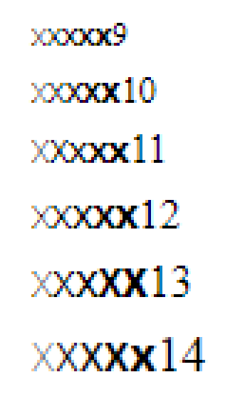
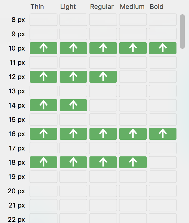
Let’s have a look at size 11. The x-height should be 6 pixel in all weights. That’s what glyphs shows and thats what the (old) PC also shows. But on the new PC, the two thin weights have 7 pixels. Interestingly, I don’t have any deltas applied in this size:
However, when I delete all this global deltas, than all weights have 6 pixels in height (see 2. column). I did some more tests (autohint and no hinting).
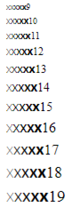
Some story for size 14. It should have the same x-height in all weights. It looks good in Glpyhs and on the PC in lower resolution with 8 pixels in height. However, on the new PC with higher resolution in the bold weight it is 9 pixels, and all other weights have 10 pixels. I have global deltas for the thin weights, but not for the regular and bolder weights. Why is the bold x lower, even when the actual outline is the highest? When I just delete all global deltas, it looks much more consistent. Also autohint and no hinting looks better.
Is there a way to get a consistent x-height in all weights and still be able to increase or decrease the vertical heights via global deltas? I compared with other fonts, and there it works (for example IBM Plex).
Yes, this helps, but it’s not a solution. How to get a good result on all screens? It seems to be possible (see IBM Plex). Also when I delete all deltas or autohint does a better job regarding the rendering on different screens.
Theoretically, when I hint ALL sizes so that they have the same x-height, it should not make any different on which screen, right?