Hi everyone, I haven’t been able to migrate to Glyphs 3 because of UI oddities. Has anyone else experienced blank glyph cells, as well as a blank info window? See attached.
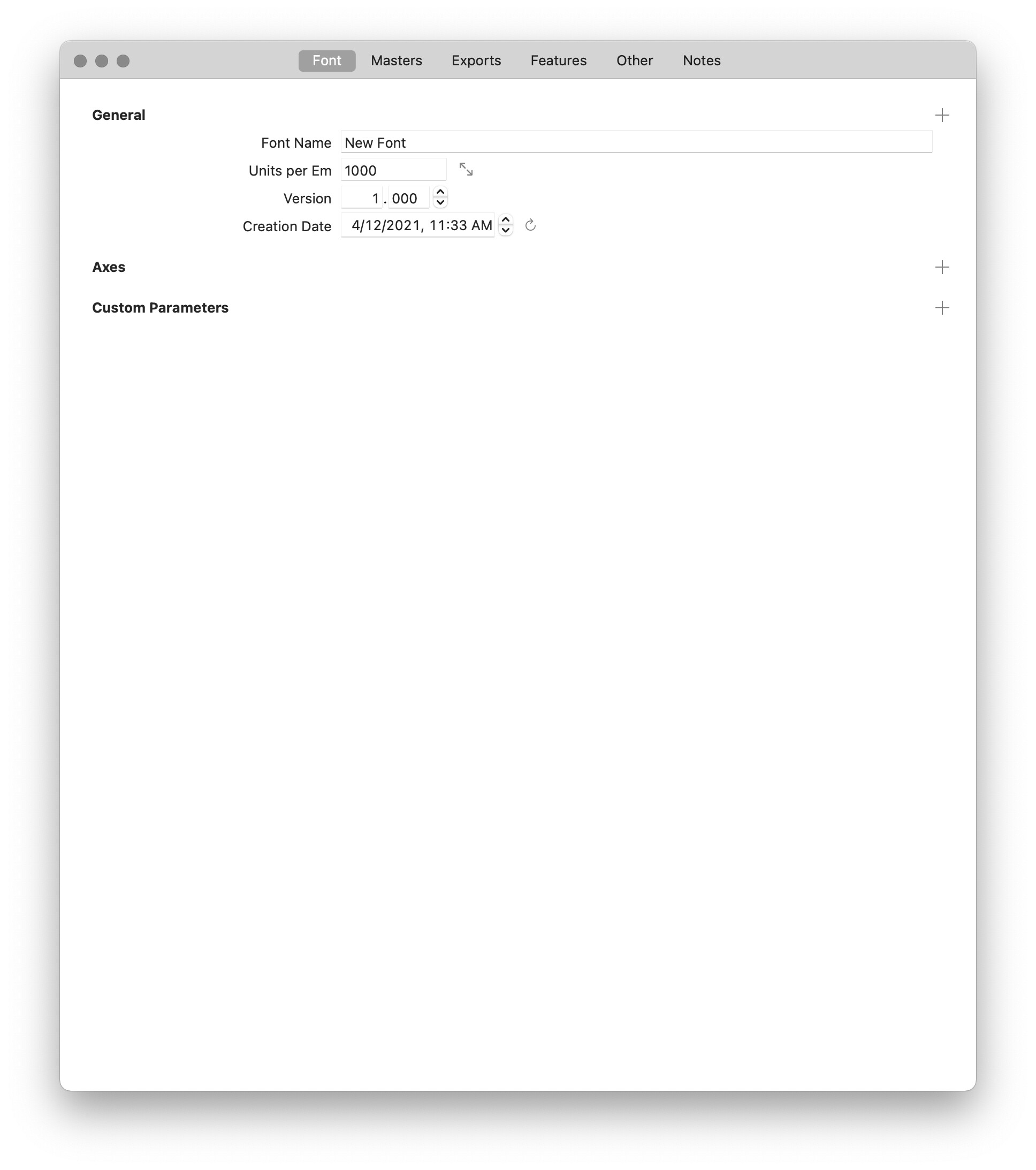
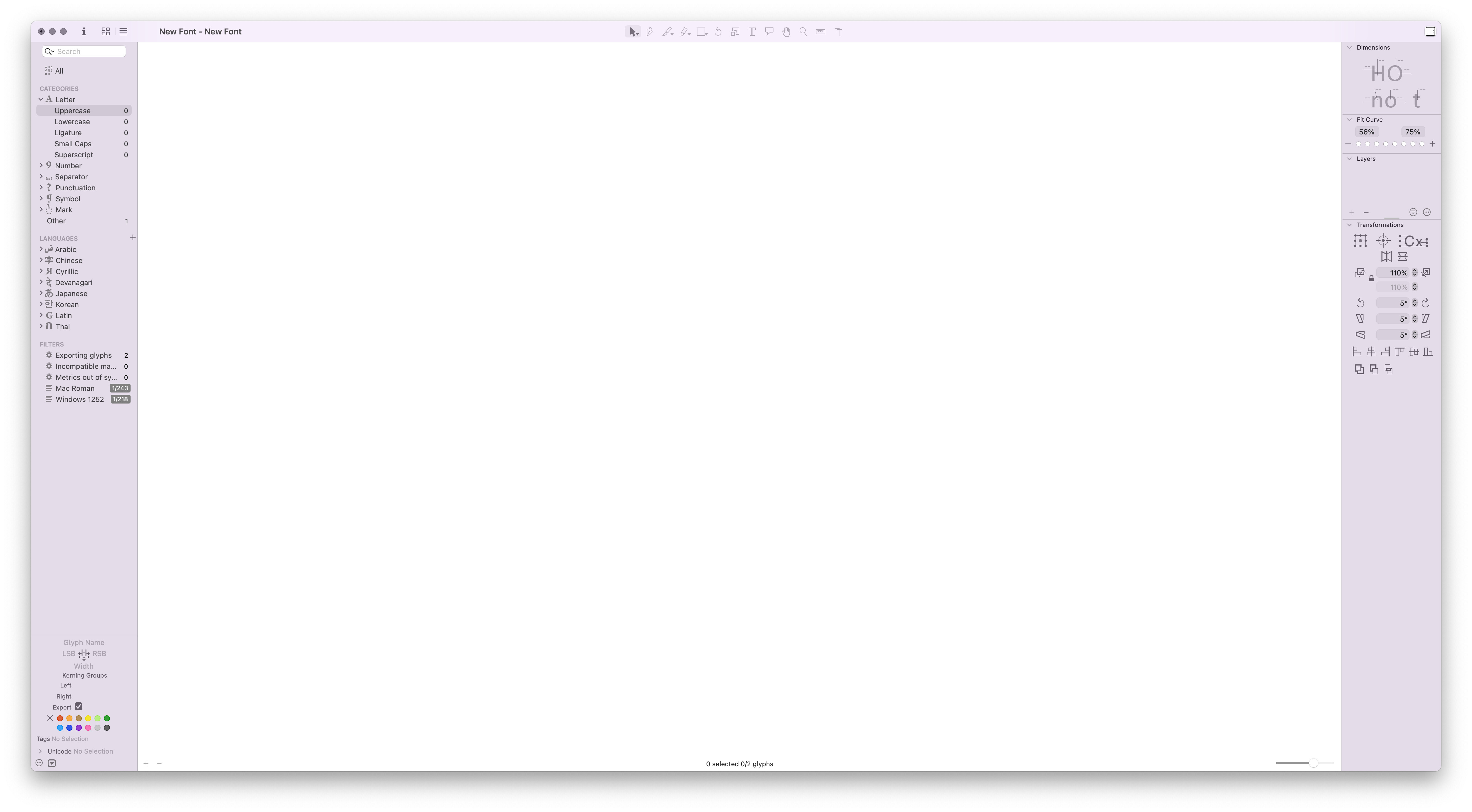
The first window is blank because it does not contain a lot of information. The second window is blank because the font only has 2 glyphs, none of which are uppercase and the Uppercase section is selected in the sidebar on the left. Select All instead.
You can add the “missing” fields with the plus buttons on the right.
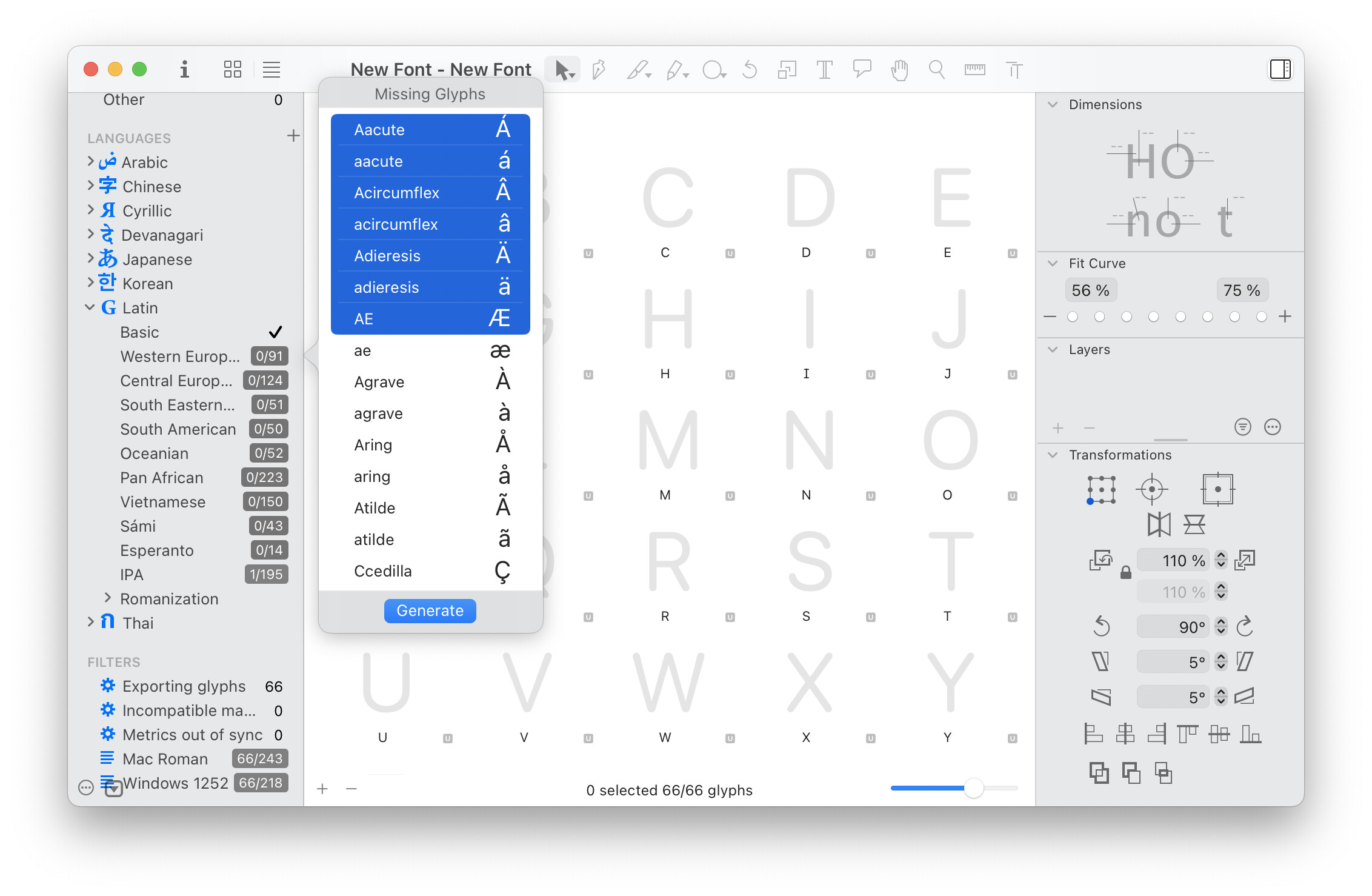
Hmm, perhaps my expectations are incorrect, but these behaviors are different from both Glyphs 2 as well as other Mac OS apps. In the information panel, it’s difficult to orient myself because there is not delineation for the fields. The left side of the information panel seems to bleed into the right, which is disorienting and inconsistent with other Mac OS apps. Glyphs 2 has nice delineation, whereas Glyphs 3 doesn’t and this is super confusing. On image 2, Glyphs 2 had proxies for the sample Glyphs, and when I right click on the alphabet Glyphs 3 doesn’t have a pop up that lets me add them. Are these features or bugs?
Would you prefer the layout as proposed here:?
Hi Florian, sorry to disappear! I was overwhelmed with a few font projects and I don’t have notifications on for the forum. I appreciate your response. I do prefer the grey field for the menu on the left. Is that a preference I can activate for the info window?
Also, the vertical line separator you use on the Masters tab is fine too. The Font tab just needs a little more delineation and orientation for the user. Thanks!