As part of a type animation template for a client, I’m attempting to create a font that acts as a background highlight. The regular font goes on top, over a “blackout” font comprised of rectangular fill. The trick is that the fill rectangles need to match the widths of the individual glyphs in the actual font, so that as the glyphs type on, the highlight behind matches perfectly
I’ve opened the existing font in Glyphs, and attempted using mekkablue’s Delete all paths.py followed by Fill Up with Rectangles.py - but I find that I’m losing the widths and spacing of the original font, probably once the paths are deleted. Fill Up with Rectangles.py won’t fill a glyph that’s not empty, which was its original intention, of course - to show rectangles wherever there are empty characters.
Ideally, I could use a script that simply replaces all paths on all glyphs with a new rectangular fill that matches the existing charcater widths, but I’m way out of my depth as far as code tinkering - and type design, for that matter.
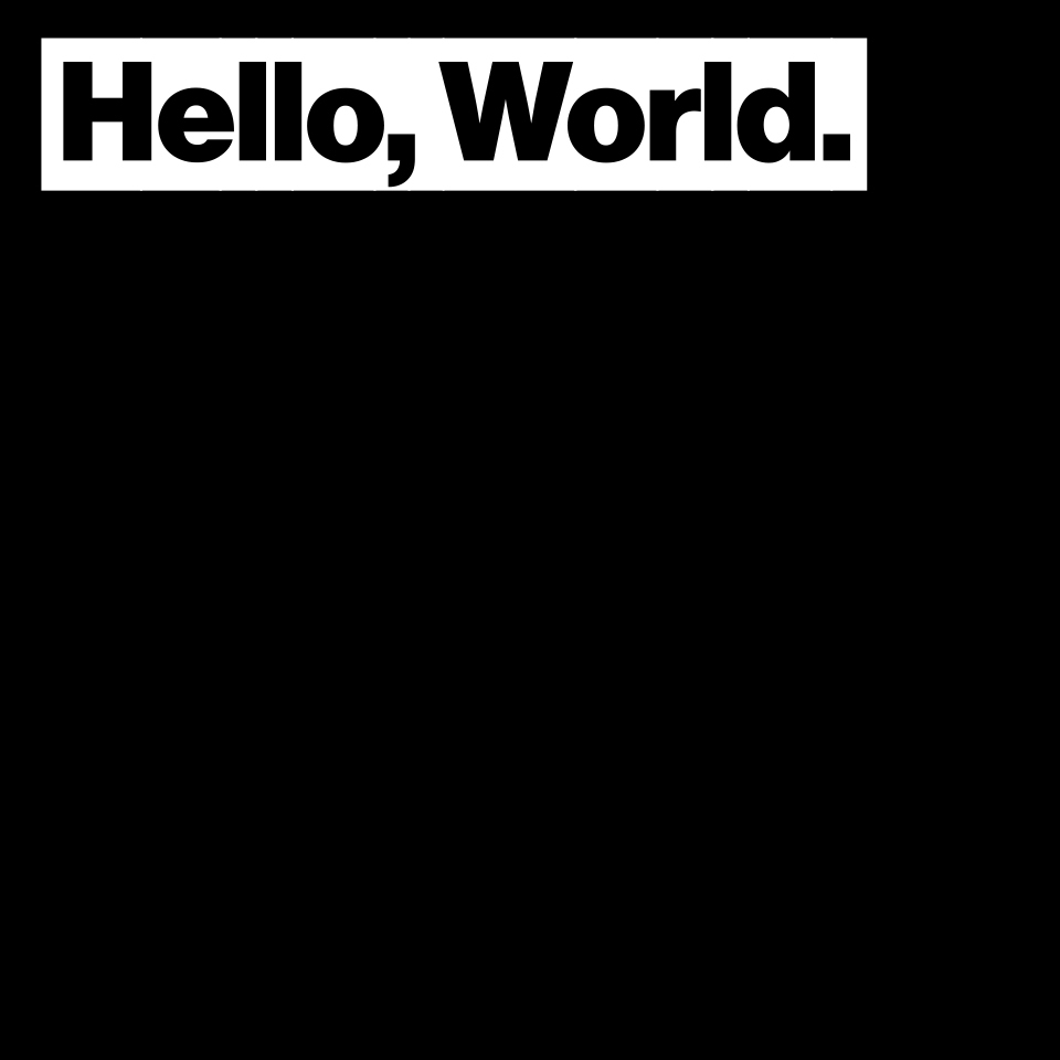
Hi! Thanks for your reply. “Disguiser” is close, but my hope is to keep the top and bottom limits of all ascenders & descenders. etc., consistent. Here’s are an example frame of the desired result. Normally I would do this with a single rectangle, but since it’s a live template for a client who will change the content often, my hope is to create a highlight font, which will make it flexible but still easy to use.
Again, many many thanks for any ideas anyone has on this.
If you make a font out of boxes and apply optical kerning in Indesign, you will get totally different spacing for the boxes. So you really need proper, synced kerning in both files.
But if you only need it in Indesign, you can simulate the effect with a paragraph line.
Ah - that’s true re: paragraph line. Great idea - unfortunately, we’re in After Effects (it’s an animated type template, which is what’s creating all these issues). As a temporary kinda hack, I was able to draw individual fill rectangles in each of the most-frequently-used glyphs (time-consuming, tedious, not at all clean) but AE is using some alternate glyph for “space” - not any of the separators.
Sorry to go on and on about this - it’s just that it’s very close to working, but not there 100%. Still trying to see if there’s a better solution for this out there somewhere. Thanks for your your replies!
To make the background shapes is a perfect example that writing a few lines of python script could save a lot work.
About the ‘space’: That is a known problem. I’m not familiar with the OpenType support in After effects but you could try to substitute a box for a wider one if the glyph is next to a space. You might have the same problem that the space is replaced internally.
Or make each box extend a bit more than half the width of the space glyph. Then it will fill the space automatically.