I’m having problems using two intermediate layers to correct interpolated forms for a particular glyph.
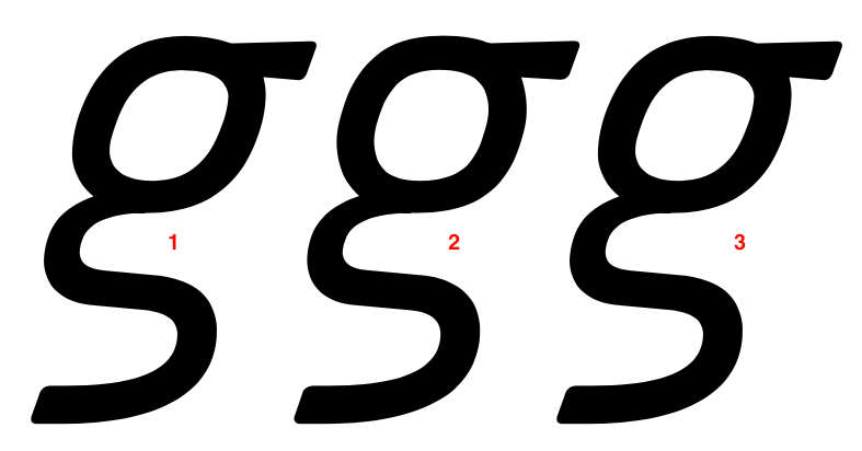
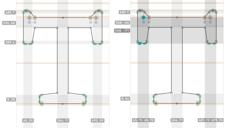
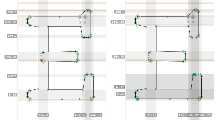
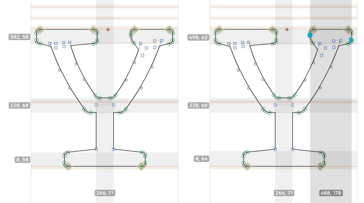
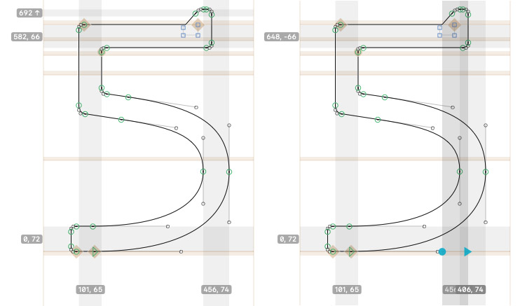
I have a typeface with 3 axes – weight, width, italic, and for each axis there are 3 masters – one at each extreme, and one in the middle. I don’t like the look of the regular and bold semi-condensed interpolations, #1 and #4.
#1 and #4 are simple interpolations at this semi-condensed spot on the width axis. I want #2 and #5 instead, so I presume I would need to add each of these to a new intermediate layer.
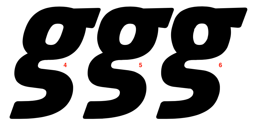
When this character has only one intermediate layer containing #2, it makes sense that #2 and #4 are rendered. When this character has only one intermediate layer containing #5, it makes sense that #1 and #5 are rendered.
My problem: When this character has both intermediate layers, #2 and #5, what gets rendered is #2 and #6. Where does #6 come from, considering I specifically defined #5?
To go a little off topic (no idea on it after your fix), may I ask out of curiosity what do you do in upright about the points which are on the vertical extremes in italic? I believe the optimal compromise to make condensed+normal to go variable italic is to not add any extremes and just let it slant. There’s a slight chance you won’t need the extra layers in that case.
The vertical extreme points in the upright remain, but aren’t extremes. You’re right about leaving out the extremes; the forms look ok. I’m thinking more here about proper PS hinting for static and variable fonts.
Pulling off those extra points without kinks seems like quite a lot of work, but then you don’t get PS hinting in variable fonts anyway, and for OTFs there’s CP filter that adds extremes on export. And after all, hinting is only useful if the font is intended for small sizes, which at that narrow width is probably not the case
My goal is to manually hint the fonts, so adding extremes on export won’t work.
The regular widths can benefit from good instructions. And when it comes to viewing PDFs, all styles can benefit.
Because in the vast majority of cases going through the hints manually gives me superior results to an app’s autohint. Italics, despite being used less often, deserve the same attention to rendering as uprights.
What I correct are the ghost hints on the serifs (all characters), the bad stem guesses (E and Y), and the double-hints (T and 5). Experience tells me these would otherwise render too dark.
If I add extremes on export and autohint, my corrections need to be done in the instances. Not only is that likely a lot of work, but re-exporting fonts puts that correction work in the trash.
I’d rather have in the Glyphs file points where I define them, and optimized hints based on those points.