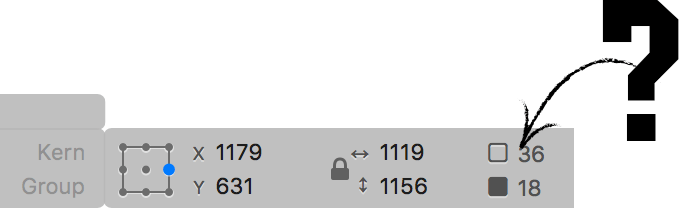
I moved my cursor over them hoping a tooltip would appear to tell me, but nothing came up.
I posted about this last year, but despite having three releases since, there’s been no improvement.
I’d like to stress this is extremely frustrating, and postponing such an obvious (and simple) enhancement makes no sense. I don’t know what Glyphs is built with, but I trust Apple’s UI frameworks are involved. They should make this addition trivial.
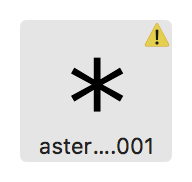
The alerts the user to an error, but no tooltip exists to tell them what it is.
BTW, a user shouldn’t be permitted to enter an invalid value (in this case, the advance width). It should default to the previous value, and preferably include an audible or visual cue to point the user to their mistake.
There are numerous other accessibility issues with Glyphs’ interface, but tooltips are definitely the most important for an interface with predominantly non-textual elements.