Variable font + "scripted" and/or "regex" features

Hello everyone,
Sorry in advance, it might be long to explain what I try to achieve, brace yourself !

Context :
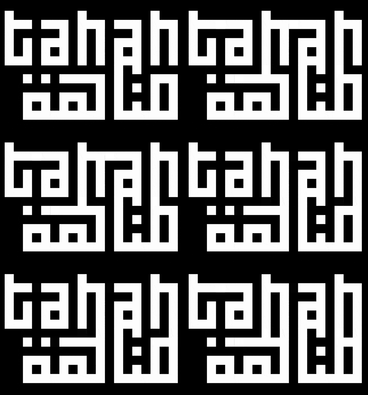
I have a latin/arabic two axis variable font, one axis create connexions between letters et the other one extend x-height. It allows to create kind of abstracted text compositions, inspired by kufic calligraphy.

What I do :
I created an interactive poster with HTML, CSS, JS that allow user to adjust axis of each letters, one by one. This thing works well even if the code is a bit fat.

What I want to do :
with webpage it is easy to do letter by letter compositions, but I would like to be able to the same thing directly when typing, by “coding” the font via some kind of regular expressions such as : “a((2,3))” wich replace this expression with just “a” having the two variable axis set to 2 for the first and to 3 for the second one.

Some fonts have similar features such, like Datalegreya, Typoji, AtF Sparks, Andersen, etc.
As I understood, they use complex “sub … by …” But I would like to avoid hand coding that as it would be 10×15=150 combinations for each letter in the font (so at least 26×2×150 = 7800 for latin alphabet, without diacritics, without every arabic letters).

So I would like to know what I could do :
• create a script to generate those thousands of line automatically
• create an embedded script in the font that does the same on the go (this second option seems more elegant ?).
I didn’t know much about font scripting, but I know web programming.

Any tips, advices or usefull links are welcomed

Thanks,
Alexandre
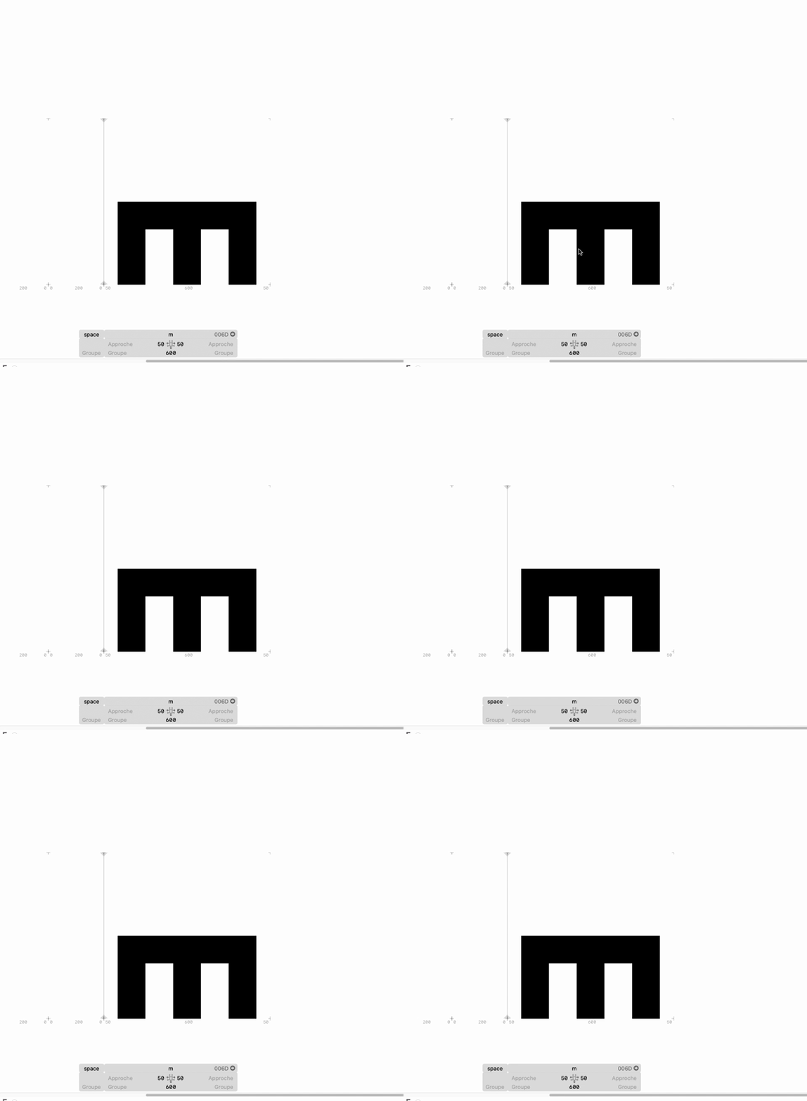
That would be a ligature. But I don’t recommend it. Can you show me what your variants look like?

Hello,

here is a little gif :

exemple-two-axis

I separated the two axis for this exemple (the first extend terminals, the second extend x-height), but you can mix the two.
Basically, you can join every letters in a given text, both vertically and horizontally to create compositions that could be near impossible to read.

I don’t see anything in the gif.

I don’t think that you can do what you like to do. You can’t change the axes from within the font itself. So you would need a (none variable) that has a glyph for each axes combination.

You can’t do regex but contextual substitutions:
https://glyphsapp.com/learn/features-part-2-contextual-substitutions
https://glyphsapp.com/learn/features-part-3-advanced-contextual-alternates

Damn, this is what I feared. I thought I could do axis variation directly from the font. So I guess i will need to hand write here.

For the gif what is the problem, I can provide an other gif/images if needed.
Here I have an old exemple of the font when there was only 1 axis, maybe it will be clearer :

exemple

First of all: the vertical connection cannot be controlled from within the font. The user choice or an app default may be different from what you envision as ideal leading. You can only control it if you control the medium as well (e.g. if the font is only used on your website).

If you do this as interpolation axes, it is up to the user (or your HTML/CSS) to make the variations. Choose this option especially if the connections are not meant as discrete steps (like in the GIF), but can also slide somewhere in between (e.g. slider positon 40%). If that does not make sense, better use contextual alternates.

If you do this in contextual alternates, understand that you can only check for contexts on the same line. There is now ay to figure out which letter is below or above.

Understood, thanks for the advices.
I will try some contextual subs then.

Just to be sure, as I’m not fluent in english : the “coding” method like the one found in Datalegreya is not recommended, like typing “a((2,3))” would be replaced by a “a” named something like “a.axis1-2.axis2-3” (where this target an alternate glyph in non variable-font), but can you explain why ? I’m not sure to fully understand the cons of this method.

Are we talking about the font you show in the screenshot? As far as I can see, it has meaningful glyphs, i.e., they show text that is supposed to be read. The whole idea of OpenType fonts is to display text input (characters) with glyphs. Now, in your example a((2,3)) is supposed to show some shape of the letter ‘a’. So the user is forced to break the text input (characters), just so that your font works. Not a good idea.

Rule of thumb: if it doesn’t work when you switch to another font, your font is broken.

Please read more about it in the Unicode tutorial.

OK OK, it is clearer now.
This can work on closed environnement like the interactive poster I talked about , but not on regular font system, wich is logical indeed.

Thanks