Is there any official recommendation as to whether vertical metrics (typoAscender, typoDescender, typoLineGap, winAscent, winDescent, hheaAscender, hheaDescender) should or shouldn’t be identical in all styles?
So far, I have always ensured they are indeed identical in all styles of a family as I absolutely want to avoid lines with e.g. a bold word in them causing a different line height for that line. I have seen that happening and it’s a disaster, of course, if the line height is inconsistent in the same paragraph. Similarly, a regular paragraph should have identical line spacing as a paragraph in bold (in the same family), for example.
Could there a be reason to give different styles different metrics (or against using identical ones)?
I would still make them identical because it will not prevent users from indeed setting them on the same line, even though the design was not intended for it.
Here’s one: small sizes require somewhat “average” vertical proportions with clearly pronounced ascenders and cap to lowercase difference and loose line spacing. Display proportions can be more dramatic in either way, but usually we want tight line spacing and big letters, meaning short ascenders and large x-height.
So, in theory, vertical proportions can or should be different, mostly depending on the display styles, but a) you don’t have to do any of that and b) even if proportions are different, you can probably still set the same metric values as a compromise to make the files compatible, even though they won’t match the real vertical proportions.
There are some of the vertical metrics that are usually different (typo x-Height).
I’m a bit hesitant to add another place that holds vertical metics. It complicates the process and may lead to confusion (changing the values in one place and wonder why nothing changed because it is overwritten somewhere else.
If there are values in the font and the master, who wins?
If a custom parameter for a vertical metric is defined only for the first master then it is automatically applied to all exports, is that right? No interpolation with default values?
This means if I want identical vertical metrics for all exports I simply set them via custom parameters for the first master and don’t give the other masters any explicit vertical metrics. Is this how it works? Problem solved, and I’m happy I can stick to the Don’t Repeat Yourself rule. No need for a font-based custom parameter then.
Just to be sure, are you talking about Custom Parameters or Metrics? The typo custom parameters are generated from the master metrics, but you can add additional parameters in the Custom Parameters section to customize those values. In general, you should not need to do that and instead stick to the metrics.
The metrics of the first master are not used for other masters. If you want the metrics values to be the same for all masters, select all masters in the masters list in Font Info and batch edit their metrics.
Now I’m confused. Custom parameters are generated? Can you elaborate?
Again, I’m confused what that means.
Strange. I just tested that and it’s exactly what seems to be happening. I set custom parameters only for the first master, and they seem to be applied to all exports.
Sounds elegant in terms of UI but it’s still breaking the Don’t Repeat Yourself rule. Sorry, not acceptable to me!
If you don’t set these custom parameters, they are generated at export.
So you would want to add these custom parameters to the Font tab. If such a custom parameter is in both the Font and Masters tab, the Masters tab value is used over the Font tab value. That would be the feature request?
It seems we are using the term “custom parameter” in different ways. To me, “custom parameter” is a concept in the Glyphs UI, something set by the user.
It appears you are referring to values that are stored in a font file as “custom parameters” as well?
No, as I wrote above, the current situation suits me well (but it would be nice to get a confirmation that my assumptions are correct).
The values of those custom parameters, yes. If you open a TTF/OTF in Glyphs, these values will be shown as custom parameters in the Masters tab, even if you did not set custom parameters for those values in your Glyphs file.
The metrics calculated per master form the “Metrics” but custom parameter are overwriting those.
If you define a custom parameter only in the first master, it will be used for all instances but for all other master (and not in the first) it will be ignored. So add them in all masters to get predictable results.
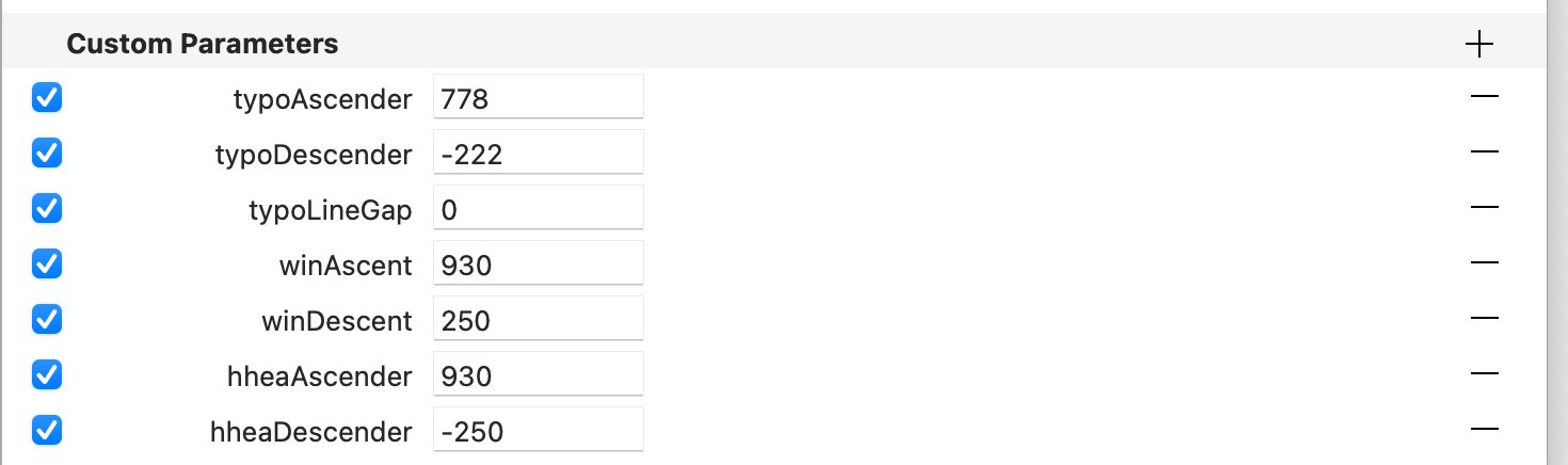
Now I’m confused. Note: We are only taking about the custom parameters that control vertical metrics (typoAscender, typoDescender, typoLineGap, winAscent, winDescent, hheaAscender, hheaDescender).
As I understand, the custom parameters defined for the first master will be applied to all instances/exports. Fine. Sounds perfectly robust and predictable to me.
Can you explain? Why does it give more predictable results?
… or, maybe you change the values in one master and forget to change them in the other(s). To me, that’s the greater risk. I’ll just stick to the simple rule, Don’t Repeat Yourself.