Thank you Eric. Like so?

Thank you Eric. Like so?
Yes.
Thank you. It still won’t verify. I even tried setting the win values to an absurd 9999/999 and it still gave me the same error.
If I set the hhea/typo values to the same values as the (original) win values, it will pass, but then I have an unnecessarily huge line height, which defeats the purpose of the hhea/typo metrics in the first place.
I’ve emailed their support team. If I hear anything helpful, I’ll share it here!
I can say for certain that the Monotype validator seems to be confusing the hhea values and the win values. Whatever I set my hhea values to, the validator is counting that figure as the clipping point, NOT the win values. So:
Correct win values and correct hhea values: will not pass
Correct win values and incorrect hhea values copied from win: pass
Correct win values and no hhea values at all: pass
I’m at a loss.
Something else of note: I have to set the hhea/typo/win metrics on every instance/export (Thin, Medium, Bold, etc.).
If I only set the values on the two masters, I get this error:
If I set the values on every instance, the error goes away.
Can you send me that file?
Done, thanks Georg!
FYI: I received an update from Monotype. They’re working on updating the validator’s vertical metrics logic.  It still doesn’t pass in the meantime, though.
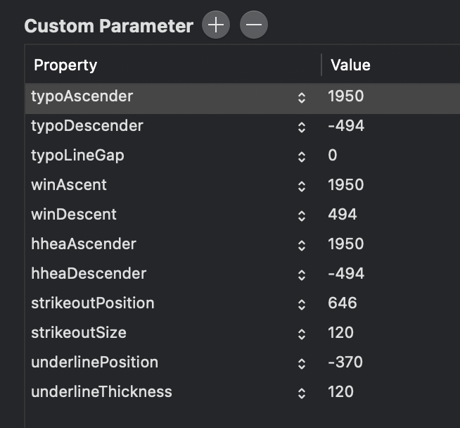
Hi @mekkablue , I’m struggling with the vertical metrics and I was wondering if you can answer to this. I’ve read everything here, tutorial included but It’s still not clear to me how to properly set up my parameters, plus it’s confusing to see a result on Glyphs but a totally different one on Adobe or Affinity apps. I’ve read that Winascent can’t be equal to typoascent/hheadascent but then I opened SF-Pro-Text-Regular (2048 UPM) into Glyphs to find out this set up:
Is Apple wrong?
I’m just trying to find the best way to deal with this problem, but the more time I spend over it the more I get lost.
Thanks for your help!
Who says that?
That is to be expected. What is confusing about it? Different apps do different things. Even within the same app, you can switch between different line gap calculations. Try the different settings in InDesign for instance.
No, there is no right or wrong. On Apple devices, only one method needs to work. This particular font is only ever going to be used on Apple machines, so they pick their method for their purposes. I do not know why they chose these settings, but they did what probably works best for their own layout engine. I assume that only one set of values are used at all (probably the hhea ones, but I do not know). They do not need to care about what is being clipped on Windows for instance. But you probably have to.
What I therefore recommend is the Webfont Strategy described in the tutorial. And I also explain there why I recommend it. (Will not repeat that here.) But again, it is just a recommendation. If you want to do something else, fine. Different foundries have developed different methods. I cannot force them to do what I recommend, so yes, you will find fonts with different settings than the ones I recommend. ![]()
all right, thank you