I have an issue then I think i fix but I was wrong… so my problem is when I try my variable font in adobe suite, the typeface go outside the case text if someone can help me pls
I have an issue then I think i fix but I was wrong… so my problem is when I try my variable font in adobe suite, the typeface go outside the case text if someone can help me pls
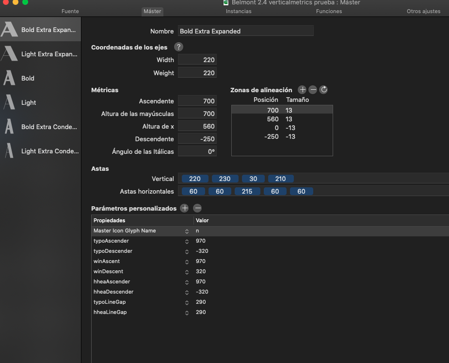
i forgot to say i set my metrics with Mekkablue - vertical metrics manager- script
This is discussed in the Vertical Metrics tutorial. Scroll down to ‘First Baseline Offset in Adobe Apps’.
thanks you master ![]() big fan, but i don’t get the answer for Photoshop i research but i don’t found this option in psd
big fan, but i don’t get the answer for Photoshop i research but i don’t found this option in psd
PhotoShop was never intended to be a typesetting application. Options like First Baseline Offset will likely never appear in the app.
so my issue continuous cause in psd i have the problem
First, thank you for the great article on Vertical Metrics. To be clear, in the ‘First Baseline Offset’ for Adobe apps (in which you mention syncing lowercase d) is achieved within the Adobe app?
I was hoping for a solution within the font file as my font’s baseline does not align with other fonts (when changing in Type menu) so it results in having to manually change all Text Box Options and re-setting the First Baseline Offset value.
Not sure I follow you. If they are on the same line, they share the same baseline.
Or do you mean in two different text boxes? Do not worry, no two fonts do unless the lowercase d’s are the same height, or the user picks a different first baseline option.
Apologies, I forgot to mention I’m using the Web Font Strategy.
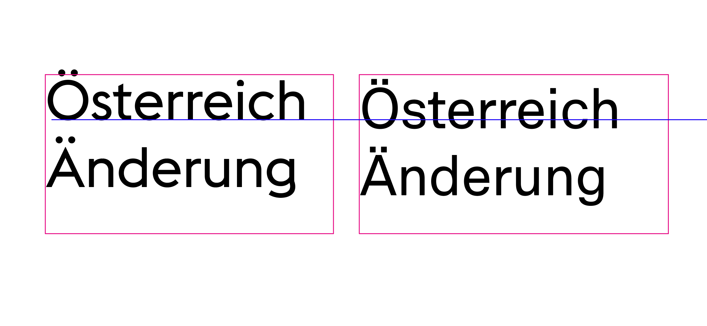
So when I create a text box in InDesign with the default baseline option (Ascent) my font’s first base sits significantly lower than other fonts I’ve purchased, or system fonts… see attached screengrab.
Is the intended behavior with the Web Font Strategy?
Those are two different fonts. They share the same baseline in the way that the baseline is always at 0. What differs here, is that the cap height and/or ascender in the font on the right is higher. So if you take a letter that is higher than another letter and align them at cap height it is to be expected that one letter goes further down.
Try using those two fonts in the same text box, than they are aligned at the baseline …
Yes @ddaanniiieeelll when they are in the same text frame they share the same baseline.
However, with using the Web Font Strategy for vertical metrics (font on the right) you see the umlaut mark is positioned within the text frame, so the font sits lower than all other typefaces by default in Adobe software. I was attempting to illustrate this behavior in the screen shot.
I was wondering if this is expected/intended behavior with the Web Font Strategy?
There is nothing wrong with it. And as I said above, every font is different in that respect. If you are bothered by this for some reason (again, there is nothing wrong), reduce the typo and hhea values. You have some degree of freedom there.
Thanks for confirming @mekkablue
I adjusted the values so the first baseline offset behavior in Adobe apps is consistent with most fonts (or fonts I own at least), and retained the generous line-spacing the formula produces for the web.