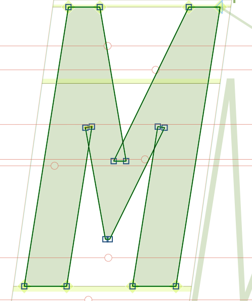
here’s a screengrab of how the character is built in both masters.
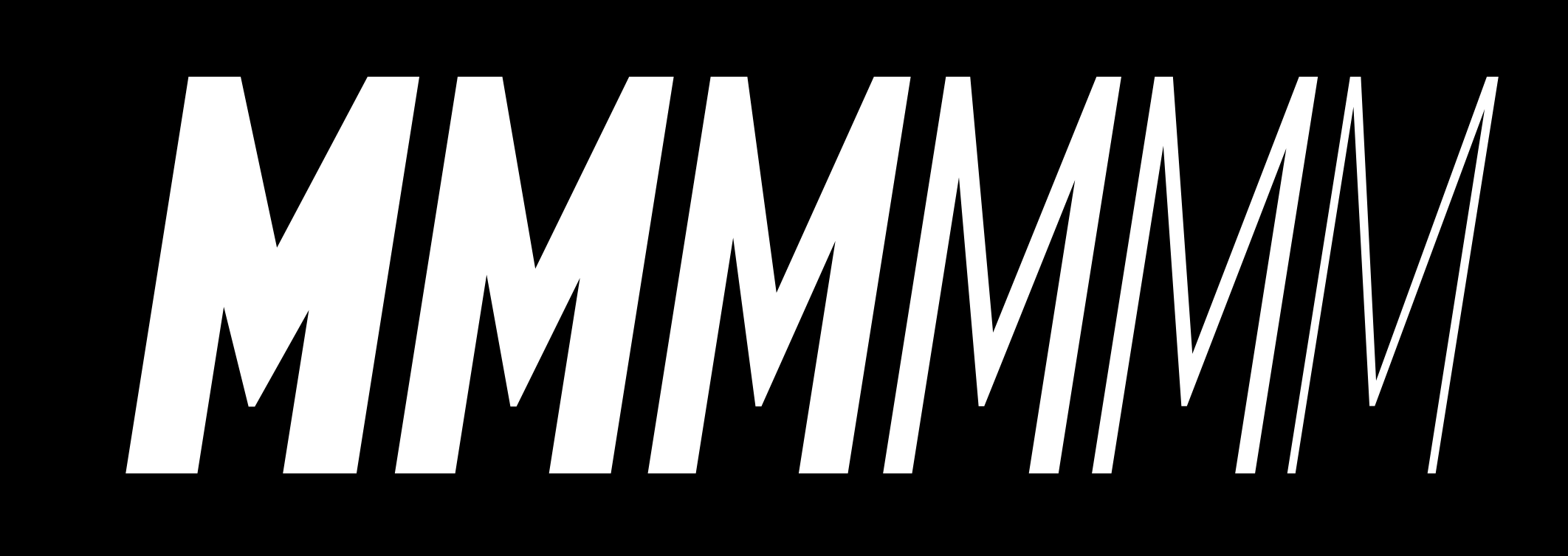
should I be drawing the character differently to avoid this wacko interpolation? to reiterate, this is the only character out of like 450 that is doing this, and it’s only happening in italic, so I wasn’t sure if i was missing something entirely.
both masters’ paths and anchors are equivalent and winding in the same direction + beginning in the same place.
Based on your screenshot, I believe you need to modify the boldest weight. It has more weight on the outer strokes compared to the diagonals – but the lightest weight appears to be be much closer to the same weight throughout. That would produce what you are seeing in the interpolations.