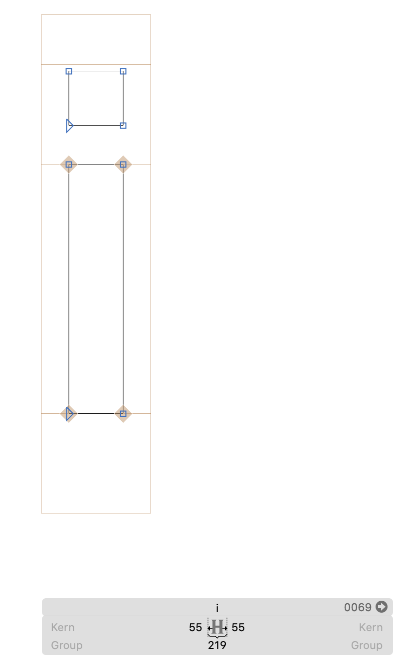
The dots over my i’s and j’s appear outside of the text box in Adobe apps. I suspect this to be because of my metrics, but i can’t seem to fix it. The web developer using the font, have problems with the dots ‘disappearing’ or simply just showing as a placeholder in webdesign. Could this be related?
It looks as it is supposed to, the i’s and j’s just seem to ‘stick’ out over the textbox. And when the webdesigner uses it, there is a problem with not showing the dots. But this might be fixed with the webfont strategy? I will start by having a look at the Vertical Metrics tutorial, thanks!
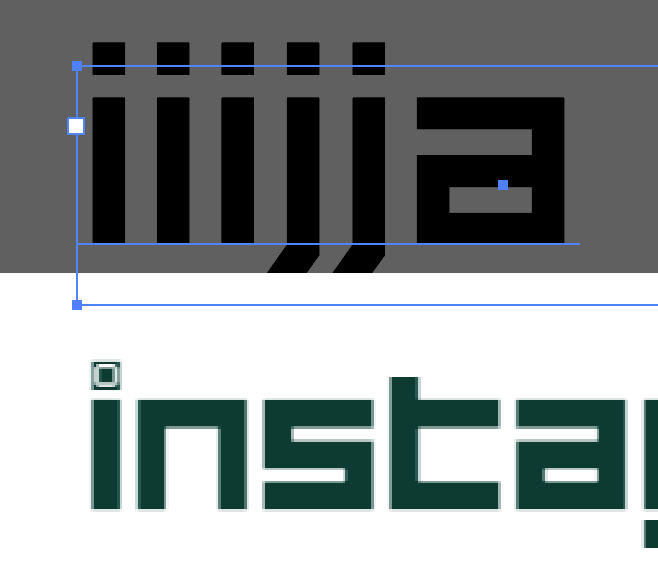
Yes, here is a screenshot from Illustrator. Below is a screenshot forwarded to me by the webdesigner - this is what i mean by the dots showing as ‘placeholders’ on web. The web guy specified that it is only on Chrome with iOS Big Sur + Edge and Chrome with Windows 10, there is problems.
I dont think i have expressed myself very clearly. I apologise for that.
I have two issues, the metrics and the browser problem, which is really not related to the questions i had about OTF import. Would it be better if i made a new topic for these questions? Either way i would have to detail the problems i am having in a more clear way.
In principle: yes. Think of other users who have a similar question, and may be searching the forum. If it is two closely related questions, it may make sense to keep them in one topic. I will go ahead and split the topic for you.
In its default setting, AI calculates the first baseline offset with the height of your lowercase d. If you do not like that, you have two options: either the user changes the setting, or you change your lowercase d. For details, see the Vertical Metrics tutorial that dedicates a whole chapter to this topic (towards the end).
My problem is that the dots are not showing properly in browsers when the font is installed in a webdesign. My thinking is, that this might be related to the fact that the dots are sticking out of the box in Adobe apps. And so i thought it was fixable through the metrics panel in Font Info. But it might be more complex than so?
When you say change the the lowercase d, is that the ‘lowercase d hack’ that is mentioned in ‘Layered Color Font tutorial’? Or should i instead try following the Webfont Strategy from the Vertical Metrics tutorial? Or a combination of both?
For info, my font is a modular font consisting of square forms. I have only one master. Thanks in advance!
I had some help from a colleague, who helped me to put in custom parameters for the vertical metrics - this seems to have done the job! At least the web developer does not have the weird dots anymore.
If you still want, i can send the file - there might be something else that we have overlooked?