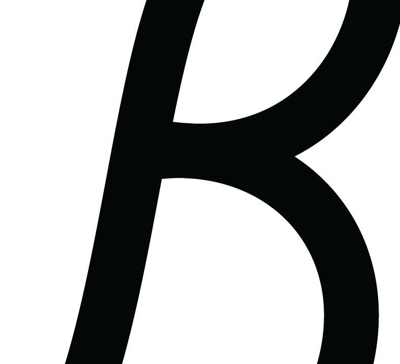
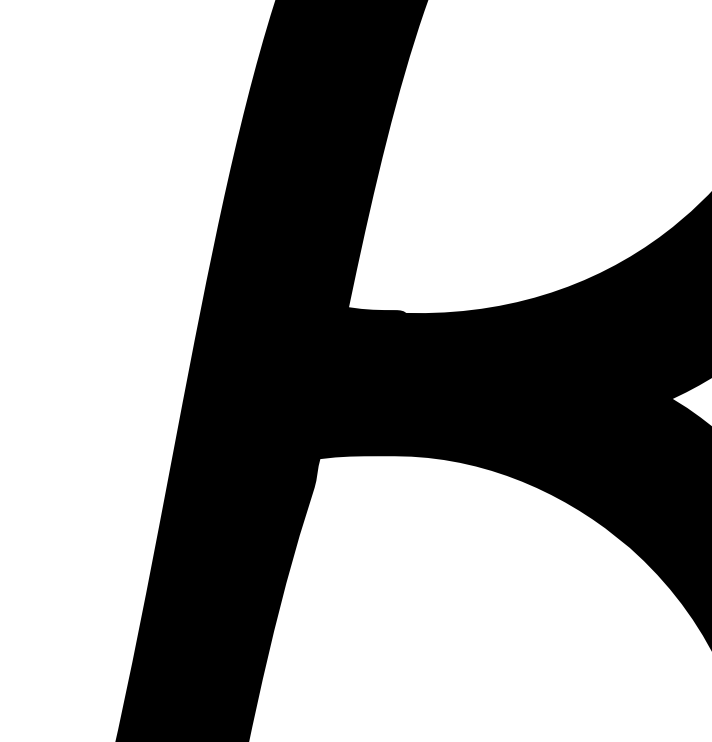
I need to fine tune the kerning of a recent font of mine. I tried uploading it to Glyphs, and the nodes get a little funky. Granted, my vector work isn’t “perfect”, I wouldn’t expect this, especially since it looks fine before I import it. There are various areas in the letters where I notice this, is there a solution?
Coordinates are normally rounded to a full integer numbers. That is enough for most fonts, but can be disabled if needed. Before you import the outlines, set the grid to 0 (zero) in Font Info > Other settings.
And what exactly do you mean by uploading?
Ahhh that makes more sense about the rounding.
I suppose uploading wasn’t the right word. I guess simply opening an OTF in Glyphs to view the kerning properties is what I meant. Changing the grid to zero is precisely what I needed, thanks a ton Georg!