Hi, my name is Britt and I’m new here, and I really hope you can help me! I have been a typography teacher for over 10 years at different art academies in The Netherlands, which I love. Since a few weeks I’m also organising my own courses to private students, which I love even more:-)
I have a small group of people, from different countries, different ages, different experiences. One thing the have in common: THEY START LOVING TYPE! Since we are heading to our last lesson I would like to give them something extra. I think the most valuable thing I can give them are tips and tricks from YOU.
So do you have any tips and tricks (preferably in Glyphs) that you would like to share about making the perfect outline?
Thanks a million, especially from my students! Have a great weekend:-)
close your computer and look at what you have made for at least 30 minutes and makes notes on your work (I recommend a red pen). That’s what I do with my students because I noticed that they never really look at what they are making
Hi Britt, here is a tip that saves me so many hours and frustration, I don’t even want to think about all the time I wasted doing this manually, no knowing there was a better way.
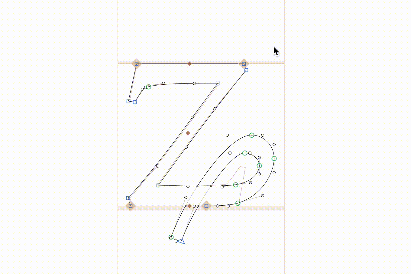
When designing a glyph that derives from another glyph, it’s best to use components to build the new glyph. For example, ä (adieresis) can be build from a and dieresiscomb. But what to do if simple stacking does not work? ʑ (zcurl) is like a z, but its outline seamlessly flows into a curl at the end. It’s difficult/impossible to use components in this case.
Then I discovered Mask to Master, a script from the Freemix collection by @TimAhrens. (Installable from the Plugin Manager → Scripts.) Mask to Master aligns the selected nodes to the background. One click, or even better, one shortcut:
You can assign a shortcut in the Glyphs preferences → Shortcuts → Mask to Master. I have set the shortcut to Command-K since I use it all the time.
When you have only one node selected, you can do Command+Shift+A and it will move to the nearest node in the background. Of cause, for this, the script is more useful.
That’s the default for OTF but it doesn’t mean we should design at that resolution. If you use a different UPM in your Glyphs file, simply use the custom parameter Scale to UPM to scale the font on export.
I never design at more than 500 UPM and have designed typefaces (e.g. JAF Bernini Sans) at 250 UPM from start to finish. I’d even ask the students to start designing at 125 UPM, I guess. Trust me, it is perfectly possible to design a good typeface at that resolution, and the big (I really mean HUGE) advantage is that it keeps you from fiddling with pointless details. And it’s still WYSIWYG as the scaling is lossless.
Think about it like that: At 1000 UPM, and a 1200dpi printer, we have a 1:1 relation of units to dots at 60pt type size (1000UPM/1200dpi*72pt/in=60pt). Maybe first ask your students to have a guess, that might be interesting. That’s not literally 1:1 in terms of contours to dots because we have hinting and dot gain but you get the picture. If we have to print our fonts in that large size to even reproduce the 1000UPM details then that’s a sign that something is wrong. If designing means making changes in our font that might (or might not) lead to a change in our printout – at typical text sizes – then something is wrong. We need a reliable relation between the source (what we work on) and the output (what we judge) for a sensible workflow.
I’d rather work with 250 UPM and then know that a change of 1 unit in the font editor will lead to a change of exactly one dot in my 15pt printout (and if we are considering changes then that’s generally true even with hinting and dot gain).
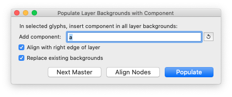
Hehe, I unknowingly duplicated that functionality with the mekkablue script Components > Populate Layer Backgrounds with Component:
Slightly different intention, but an all-in-one solution for adding the component (‘populate’), aligning selected nodes, and stepping to the next master.
If, for example, I have an e with a brace layer and insert an o (which does not have a brace layer) then Insert Glyph to Background inserts the correct (decomposed) interpolation, which is often very useful.
And in Insert Glyph to Background, you can simply type the beginning of the glyph name you want to insert (as long as it is unambiguous or you feel lucky). Or, just enter the character instead of the glyph name.
@TimAhrens Does this also apply to SVG color fonts?
as in, should I work in Illustrator creating 250px artboards, and
then place the exported SVGs in a 250x250 glyph area?
It was meant as a design advice, it’s not about technology, and not a hands-on instruction. As Illustrator does not work with integer co-ordinates I’d say it does not matter. Well, Glyphs also supports fractional co-ordinates, of course – if you use that feature, again, the UPM you design in becomes completely irrelevant. Oops, well, you have the keyboard increments, same in Illustrator, so it does have some effect on how you edit your shapes. Now I hope that was not too confusing.
Hello, following your very, very interesting advice, I started to draw a font, a slab-serif-styled reinterpretation of some 17th century designs. This is my second serious typeface project => I’m a novice in the field.
So I started this project setting the UPM to 250 and Scale to UPM to the usual 1000. Ok… Fine! It’s really a joy to follow closely in print what I’ve just changed on the screen. But there are some situations/challenging curves, when I find this resolution somewhat limiting, for example the ear of the g.
My question is, was JAF Lapture also made using the 250-UPM-method? And your in-development Garamond revival project? Or UPM 500 is more appropriate for a more complex design, lot of intricate curves etc? Thanks!