Hi everyone! I have been searching across the forum but most posts about this are over 5 years old.
I finished my typeface a few weeks back, including kerning etc.
Then I went through the guides of making an oblique/italic version.
I ended up making a new master from the current upright version.
So far so good…
Next I went through all the glyphs and transformed them into an oblique version. Working out pretty good too and I’m nearing the end of this.
I’m on glyphs Version 2.6.6 (1352) by the way.
Now for the questions:
1: Keep masters italic and upright in separate files?
I noticed older posts mentioning not to keep two different styles like this in the master unless early phase. Separate them for kerning etc. because glyphs takes kerning pairs across the whole font. Is this still true?
When I copied the original into a new master, the kerning was copied with it. However, I seem to be able to kern my italic version without issues and it doesn’t seem to influence the kerning of the upright version within glyphs so far.
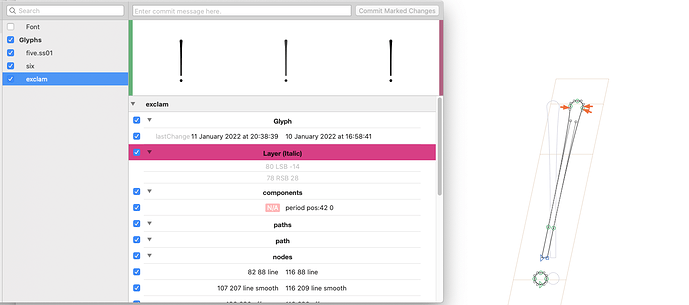
2: Commitglyphs not showing italic preview
^that. I notice that the program shows the glyph(s) that changed. If I change the ital version of k_x.liga, the preview in commitglyphs will show me the regular/upright k_x.liga
Is this to be expected with all files containing multiple masters?
3: Am I using masters wrong?
I figured if I made multiple masters, I could easily show both layers, maybe interpolate them for different instances if I ever wanted to adventure that far, plus not having to play with multiple files, just switch on the master button on the top.
If I completely misunderstood I’d love to know! And if I have to separate the 2 now before I break even more stuff, I’d love a pointer on how to do that with the least casualties.
Notes:
Kerning actually translates really nicely to the italic version. It doesn’t seem to need a lot (if any) of adjusting at all. So either I am terrible at kerning and just don’t see it, or this is a common thing. I couldn’t find much theory behind italic versions of fonts, like what to do with serifs etc.
I am playing around with commitglyphs. Actually about 6 months ago I decided to make a repo for a font (just through terminal and github online) and it seemed very promising to find my pushes on github with nice code and code changes so I figured it worked. Since I’m still a programming beginner I must have messed something up after that since I wasn’t able to pull earlier commits back onto my system. I still don’t know how that will work out now, but I am a bit more confident with git and hope this will help me make use of older commits when needed or at least replace the code. Using the commitglyphs app is a great visual reminder next to my work screen that I have uncommited changes. So huge thanks for putting in the effort for an accessible form of version control!
