Hi All,
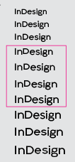
The typeface I’m working on has some issues when displaying in smaller sizes on screen. This issue only appears in two out of three weights interpolated in between the two masters. Here are the screenshots. I apologize that they are small, but that’s when the issue is starting to show up. You can see that the "D"s jump up over the baseline for the second weight and the fourth weight from the left. There are quite a few glyphs that have this issue, but again only on some random weights. I’m not sure if this is a hinting issue.
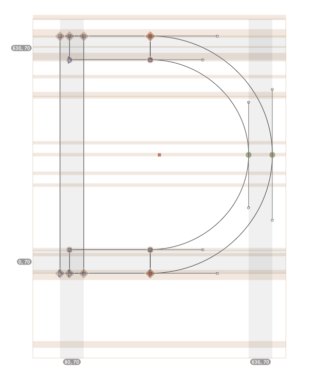
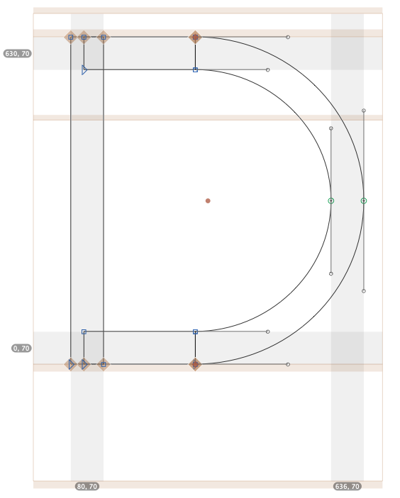
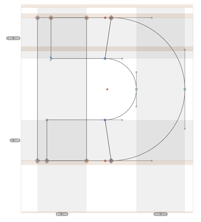
And here are the screenshots of the hinting for the D on both masters.
The alignment zone covers the baseline on both masters, although they were set slightly different (Regular master at -20/30, and Bold master at -25/30).
Please let me know if you guys have any suggestions or need more info. Thank you in advance for your help.
Hi @GeorgSeifert and @mekkablue
Thanks for your reply. I fixed the Alignment zone per the article you attached. And the baseline zone is starting at 0 now. I reexported the file and tested it in InDesign again. Unfortunately, the problem still exists, but not with all font sizes.
From the screenshot, this issue starts at 19 pt to 22 pt size of the regular weight (Light is the master weight). The smaller font size of 16-18 appears ok on screen. A similar issue also happened with the bold weight (another interpolated weight). The InDesign view is at 50%. It, however, looks fine at 25%. I used the Mac’s screen Zoom to zoom in and take this shot for you. Also, you can start to see the “es” at the very bottom line (below the pink frame) starting to go up above the baseline as well.
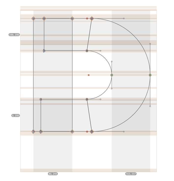
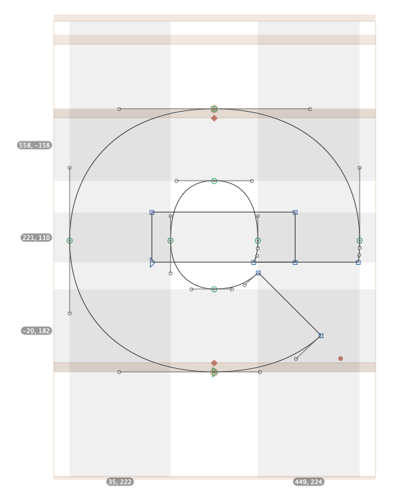
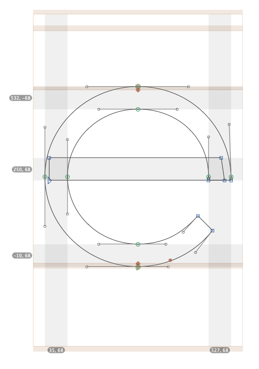
And here are the screenshots of the alignment zones and hinting for the D and e.
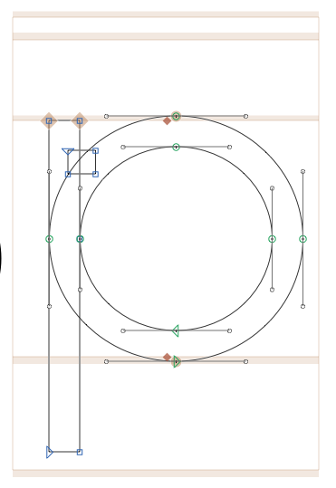
@GeorgSeifert@mekkablue After resetting the Alignment zone, I came across another question. I set my font’s Ascender is at 750. So I set the Descender line at -250 (to make it 1000 units). But the actual descender of my font only goes as deep as -210. So, when I use the refresh tool to help automatically set the Alignment zone, it is not anywhere near the bottom edge of my descender. Please see the screenshot.
In this case, should I change the automatic setting of the Alignment zone from -250 to -210, or I should change the descender setting from -250 to -210, or both? Do the number of units between the Ascender line and Descender line have to equal to 1000 (the same as the number of units per em)? Please let me know when you have. a moment.
The ascender+descender don’t need to add up to 1000. Just set them to the dimensions of the design. If you really need other values in the font, use custom parameters.
@GeorgSeifert@mekkablue thanks for your reply. I read that tutorial before, but it’s been a few years back. Back then, I don’t remember the UPM dogma section and the first baseline offset section. So, it’s definitely great to know.
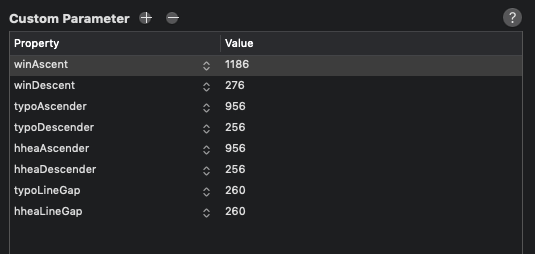
I do have another question after I read this article again. My bold master has a bit deeper ascender (about 36 units) than the regular master, but the same descender height. I calculated the vertical metric with the Webfont strategy. At the moment I use the same custom perimeter numbers from the bold master for both regular and bold master. My intention is to keep the baseline consistent (same line gaps) across all weights. Is this how you’d recommend? Or should I calculate specific custom parameter numbers for each master? Please see attached screenshot for reference.
Yes, the parameters for win, typo and hhea values should be the same throughout all masters. The Vertical Metrics Manager has an All Open Fonts option for exactly that purpose.
The Ascender, Cap Height, x-Height and Descender values in the UI of Font Info > Masters should best have individual values for each master.
@GeorgSeifert Ok, great! @mekkablue, thanks for the detailed reply. Those are exactly what I have. I appreciate all the advice from both of you very much.