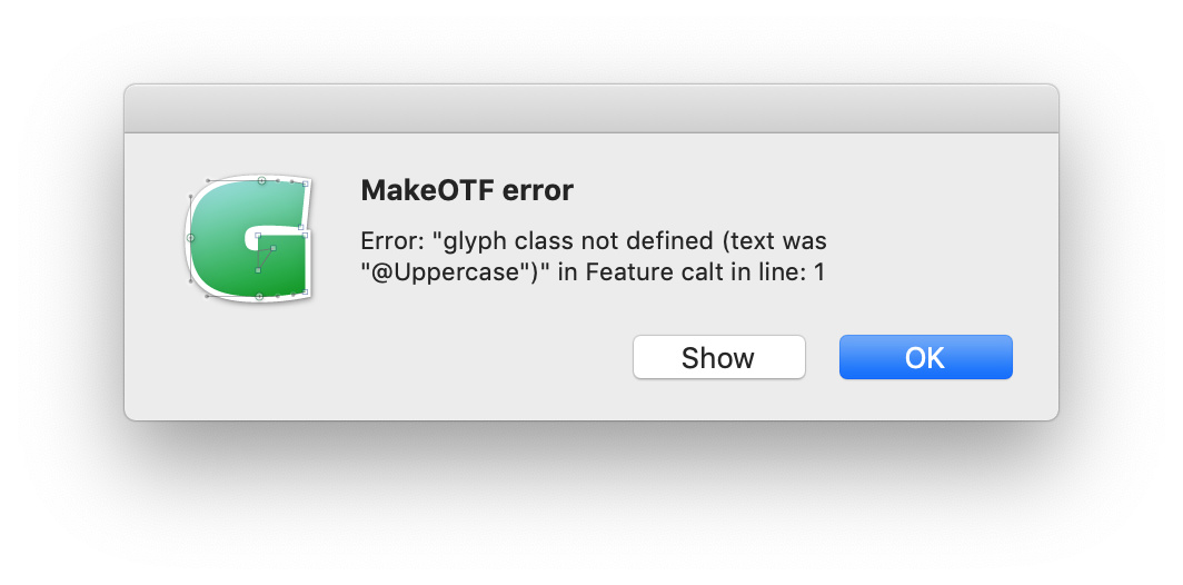
Luckily, Glyphs automatically generates the Uppercase class, we just need to add it through the Plus button in the lower left corner.
In the Features tab of the File > Font Info… window, press the plus sign button in the lower left to add a Class. Name it Uppercase and then select the Generate Feature Automatically checkbox. The Uppercase class will also get automatically added when the Capital Spacing feature (cpsp) is added.
I consider it a bad hack to force the capital sharp s by context.
The new glyph is officially optional.
There are many easy ways to type/get the glyph in Office and design apps.
As calt is always on, users are bereft of their choice.
My advice: do nothing special, treat it as any other capital.
The name should be uni1E9E, not Germandbls.
P.S.
I find it utterly annoying that Glyphs keeps on inventing new glyph names that are not industry standard. Adobe did just that in the nineties, before they realized a decade later that is was a bad idea. It causes serious problems in multi-tool environments, in spite of supposedly automatic renaming to production names.
Glyphs would certainly be more useful to us if it would also work with standard glyph names like dotlessi and shorter extensions like .sc. A Zapf Table with multiple identifiers could solve that.
Apart from that I don’t find idotless an improvement over dotlessi, it just add chaos and confusion.
Glyphs differentiates between nice name and production name. The production name is the uniXXXX name and that is the one that ends up in the OTF. Which Problem Are you encountering?
If you are annoyed by the nice names, and rather memorize uniXXXX codes, then feel free to turn them off in Font Info > Other Settings.
The calt solution is OK because it is clear what the user wants. If he puts an ß between Uppercase letters, it is clear that the UC Form is wanted. It is not just like any other letter because you still cannot type it.
I have received otfs exported from Glyphs (to be produced properly) where many glyph names were not according to AGLFN.
When I drop a Glyphs file on FontLab, glyph names are wrong
I have heard that automatic features only work when you use the Glyphs proprietary naming, f_f.liga instead of f_f. (Personally I think f_f is nicer than f_f.liga.)
All the encoding lists I’ve produced over the years are not glyphs compatible
Confusion: will Glyphs users learn that a font must contain dotlessi instead of idotless?
Adobe made several mistakes with glyph names in the past, why not learn from them and stick to AGLFN?
I do not have to memorize uniXXXX codes, because I have a computer! With excellent ways to handle AGLFN and uni names.
To get back to the German Sharp S: sorry but you are absolutely wrong here.
The official (Duden) rule is that ß is replaced with SS in all-caps setting.
The new uppercase shape is an optional goody.
By using calt, the ß will change to the capital shape by default, which is wrong, SS should be default. You assume that it is clear what the user wants, a wrong assumption: for certain purposes it is required to have a lowercase ß in-between capitals, and many users prefer SS instead.
By using germandbls.calt you end up with a “lowercase” unicode in between “capital” unicodes, another wrong. If you assume the user wants a capital shape, you should also assume the user wants the corresponding capital Unicode in the glyph stream. Defining a capital shape as an alternate to lowercase doesn’t make sense at all. Capitalisation is handled by the app, and apps are struggling, Affinity Publisher did ß case conversion to the capital sharp S for a short period, Affinity Designer has proper behavior: displaying SS, selectable as one glyph, racting to spacing.
But like I said, the Glyphs tutorial about this subject is an ugly hack, don’t do it!
Ugly hack effects:
1
If you capitalise the word FUßBALL-fan, the fake capital turns into SS, not good.
2
A user wants to have the capital shape and switches on All Caps before starting to type fußball: it is not working.
3
All Caps is on (accidentally or not) and the user types FUßBALL, it should work according to the tutorial but it doesn’t.
4
It is not working in the advertising version of the word: FUUUßßßBAAALLLLL!!!
5
You assume the result you get in InDesign is all that counts.
However there is no rule how capitalization is supposed to be handled by app, and you have yet to discover that Office actually turns lowercase into caps when you activate UPPERCASE, so with your hack Office users will ALWAYS get the optional capital German Sharp S shape. That is not what you intended, please stop recommending that hack.
There are certainly more Office users than InDesign users, please always test Office.
(I actually think the Office capitalization behavior is more sound that what InDesign does, keeping lowercase Unicodes in an all-caps glyph stream doesn’t make sense to me.)
As for typing the capital shape: a keyboard layout including the new capital was standardized in 2012, Layout T2 according to DIN 2137:2012-06.
You can also use the Neo-keyboard layout, or the EurKEY version 1.3
And you can buy physical keyboards with the glyph printed in the proper place.
And there are many other easy ways to insert the shape.
Contrary to the Glyphs hack, these solutions will be upon the users discretion, and will insert the proper Unicode.
If you find bugs, please report them, otherwise we cannot fix them.
I have heard that automatic features only work when you use the Glyphs proprietary naming, f_f.liga instead of f_f. (Personally I think f_f is nicer than f_f.liga.)
You have unfortunately been a victim of fake news. Who told you this? If you employ automatic feature code, f_f does trigger creation of liga, not dlig. Adding a suffix makes the intention clear, of course.
When I drop a Glyphs file on FontLab, glyph names are wrong
I believe FontLab bugs can be reported in the FontLab forum, but I admit I have not verified this.
All the encoding lists I’ve produced over the years are not glyphs compatible
First, you do not need to employ the nice names. Secondly, if you do, you can easily convert encoding lists with system services. It’s easy and I do it all the time.
Changing to double-S would be a change in the character stream and hence a job of the layout engine when you do case conversion, so that already works the way you propose ‘as default’, and it keeps working, also with the calt solution.
If a user specifically types ß between uppercase letters, that is an entirely different story. And it can be safely assumed he/she wanted the uppercase shape (or perhaps does not care).
E3: Bei Schreibung mit Großbuchstaben schreibt man SS. Daneben ist auch die Verwendung des Großbuchstabens ẞ möglich. Beispiel: Straße – STRASSE – STRAẞE.
I see that as both solutions being equivalent. But again, that is not an argument for or against the calt solution. I cannot change the ß to double-S in the OT features, but I can find a shape that better fits the surrounding letters.
The reality is that almost all users have never heard about Unicode, and they only have an ß key on German keyboards. Pressing it with Shift yields the question mark, not ẞ. IOW if a user wants to capitalize everything, he/she press caps lock, and types FUßBALL. This is when the calt solution does its job, because it is safe to assume that the lowercase ß between uppercase letters was not intentional.
If the user turns on the case conversion, then the layout engine intervenes as you describe, and then there is nothing the OT feature is supposed to do anyway. The goal is to prevent the lowercase shape between uppercase letters. So, I see this not as ‘doesn’t work’, but as ‘works’. And it works in Word as well (provided the user turned on OT features).
As for typing the capital shape: a keyboard layout including the new capital was standardized in 2012, Layout T2 according to DIN 2137:2012-06.
You can also use the Neo-keyboard layout, or the EurKEY version 1.3
And you can buy physical keyboards with the glyph printed in the proper place.
And there are many other easy ways to insert the shape.
These input methods (accessible to a tiny minority of users) are not hampered by the calt solution. They still work. If they become the de-facto standard one day, the calt solution will be compatible with that as well.
Fake news:
I was told by several professional Glyphs users that you need to stick to Glyphs names and extensions for Feature generation to work. Maybe my example was not right. Will A.sc work?
System Services:
I work cross-platform, mainly on PC, and do not really trust automatic conversions
Duden: they publish what is decided by the Rat fuer Rechstschreibung, or whatever you call it. I consider that official. Me and linguists do not interpret the rule as describing equivalent solutions. SS is the default capitalization, and the new glyph - still missing in this webfont - is optional. The standpoint of this body is that the new glyph is also allowed now, and that they will look at where it is going to appear in real life for several years before making further recommendations.
Mekka: Changing to double-S would be a change in the character stream
Not as it is implemented in some main design apps. These letters are App/user things, not something you need to solve with a hack.
Besides, changing ß to ss or SS is still the official rule, when ß is not available. (E2)
I described that your hack is NOT working in Office as it is in InDesign. In InDesign the hack offers the user a choice, in MS Word the calt hack always forces the new capital shape. A lowercase ß in between capitals often looks good enough, and is common practice with bureaucrats and official documents, it is not a crime. And I pointed out other problems, which you are free to ignore, keep on hacking, I’ve done my share of stupid hacks in the past
Keyboard layouts with the German Capital Sharp S are available for Mac minority as well, anyone can install them.
P.S. the Rat fuer Rechtschreibung is monitoring real life use of the capital shape, please note that the hacked-in ones carry the lowercase Unicode and will not be noticed in digital texts.
if you like to use a certain feature of a product there are certain rules to apply. If you don’t like those rules or don’t need that feature you do not follow the rules. e.g.: If you have a car and like to drive it, you need to fill in a special expensive fluid. If you don’t like that, nobody will keep you from filling anything else in it. But than that feature (driving) might not be available any more. There are a lot if usages for the car. You can sleep in it, plant flowers (if you fill in some soil).
I am confused now, first Rainer defies it as fake news, now you seem to say that A.sc is the wrong kind of fuel.
Did you notice I proposed a solution? I would like to see a Zapf table where multiple identifiers point to a glyph. With a column for production names, a column for “Glyphs friendly names” and a column for my own established glyph names.
When Glyphs knows that A.smcp and A.sc are the same things, it should run on Kerosine, Diesel and Zweitakt.
You wrote you have been told f_f would trigger dlig rather than liga, but the opposite is true. You can force it into dlig with a .dlig extension.
The SC automation is more complicated, because some users like to separate between uppercase and lowercase glyphs. If you have A, a, A.sc, and a.sc in your font, Glyphs will create smcp from a and a.sc, but c2sc from A and A.sc.
Maybe this example will help to explain what does and what doesn’t work.
I have a Glyphs file with these glyphs: Z uni01B5 uni01B6 z z.sc uni01B6.sc uni0308, i, I, Idotaccent, i.sc, dotlessi, dotlessi.sc and “Use Custom Naming”.
Automatic anchors (ctrl-U) work in Z, z, z.sc and uni0308, but not in uni01B5, uni01B6, uni01B6.sc, so mark positioning code is not generated for the uni01… glyphs.
When I add anchors to them manually, mark positioning code is OK.
dotlessi gets automatic anchors, but no automatic ccmp feature.
The autogenerated smcp feature is OK:
feature smcp {
  sub i by i.sc;
  sub dotlessi by dotlessi.sc;
  sub uni01B6 by uni01B6.sc;
  sub z by z.sc;
} smcp ;
but uni01B5 and Idotaccent are missing from the c2sc feature:
feature c2sc {
  sub I by i.sc;
  sub Z by z.sc;
} c2sc ;
even though the relations should be clear through the name mappings in GlyphData.xml and Glyphs manages to add uni01B5 to the @Uppercase class.
Last time we worked with Arabic fonts, none of the automatic mark positioning code could be generated by Glyphs if the glyph names don’t follow the Glyphs standard. And when we exported the fonts, they still contained some Glyphs-style glyph names.
No, you did fake reading
I never mentioned .dlig, scroll up.
Personally I consider the Adobe method of duplicating small caps to cary lowercase Unicodes (a.sc) another glyph-stream-obsessive-compulsive-disorder induced masquerading-hack.
If I see Small Caps in a PDF, I expect the text clipboard of such a file to result into capitals, definitely not lowercase, as is the case with a.sc. Adobe, wake up!
Sure, and when you only have A.sc, Glyphs creates both s2sc and smcp from this, which sounds like a manageable complication.