I’m exporting several fonts from a 6 masters project (weight & optical size) and when checking some instances I found that the alignment zone is not interpolating the same way as the outline. What happens is that I have several glyphs out of the alignment zone at a certain instance. How can I solve this? any pro tip? Or should I just add 1 unit at my masters’ alignment zone to avoid this?
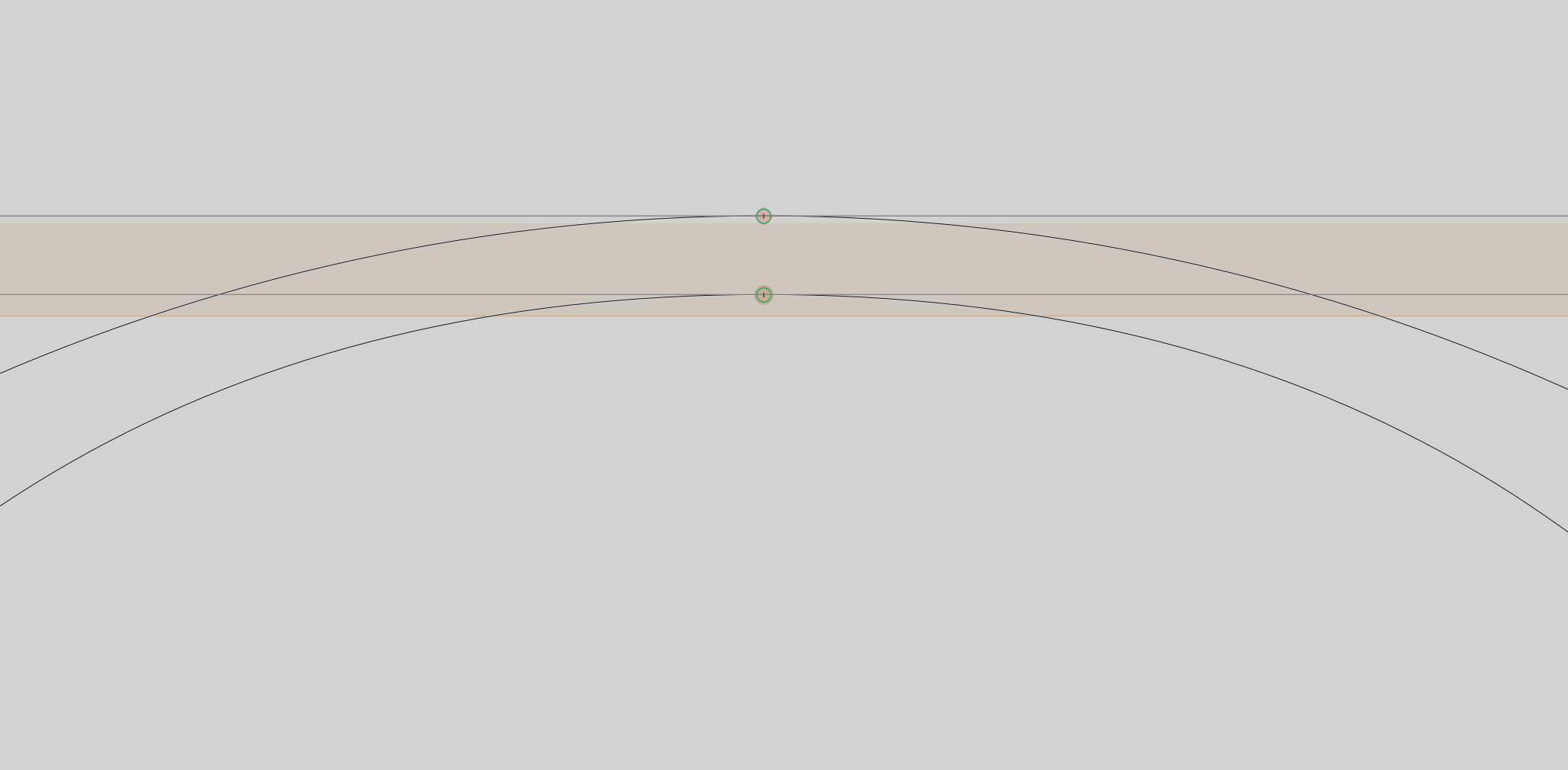
That can’t be avoided. We advice to always make the zone at least one unit bigger then the biggest path.
1 Like
That can be done with the BlueFuzzer script in the mekkablue scripts.
Or, in affected instances, you can add a blueFuzz parameter.
1 Like
Thanks @GeorgSeifert and @mekkablue for your answers.
For know, I will add 1 unit manually at certain masters to solve it.
Still (I don’t know exactly how it works but) I think it would make sense if the alignment zone could follow the same interpolation as the path. This because you say we should “keep them as small and tight as possible”. So I feel that ‘adding 1 unit’ is not the best solution.
About BlueFuzzer, it is not exactly what I need because it also changes the position (not only the size of the alignment zone). I want to keep the capheight, etc at the same position. So I’m afraid of using it as a parameter…
This is not always possible. Google ‘rounding errors’. So the best solution is to increase by 1u.
It expands the zones by 1u in both directions except the baseline zone, which needs to stay at zero, and also where this specific rounding problem is unlikely to occur.
The cap height does not change. Positive zones and the baseline zone are always aligned to their top, negative zones to their bottom. The only thing you achieve by not expanding in both direction is that in an interpolation there may be a hinted path that gets rounded down, just 1u out of the zone, and therefore will not be aligned with other stems.
1 Like
I see that it is may be misleading. I will have to change the wording in tutorial then.
1 Like
Hi guys!!
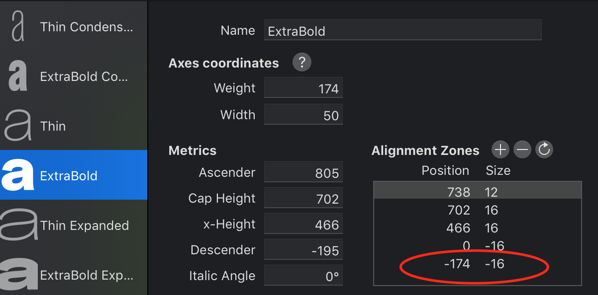
Is there a way to define different alignment zones on certain instances?
This because in a SemiCondensed I’m keeping the descender with the same size as Condensed (using Rename glyphs)?
I don’t want this to happen.

I want to keep it at -159 on SemiCondensed instances.

This is not possible.
Can you make it possible with a custom parameter? I think it’s an interesting option for static fonts.
Anyway can you confirm me if I can change that info with OTMaster? I’m trying but I can’t find it.
I could. But for sure not in Glyphs 2. Sorry.
No problem. I will change to Glyphs3 at some point. I just think I may need it again in the future.
Thanks anyway