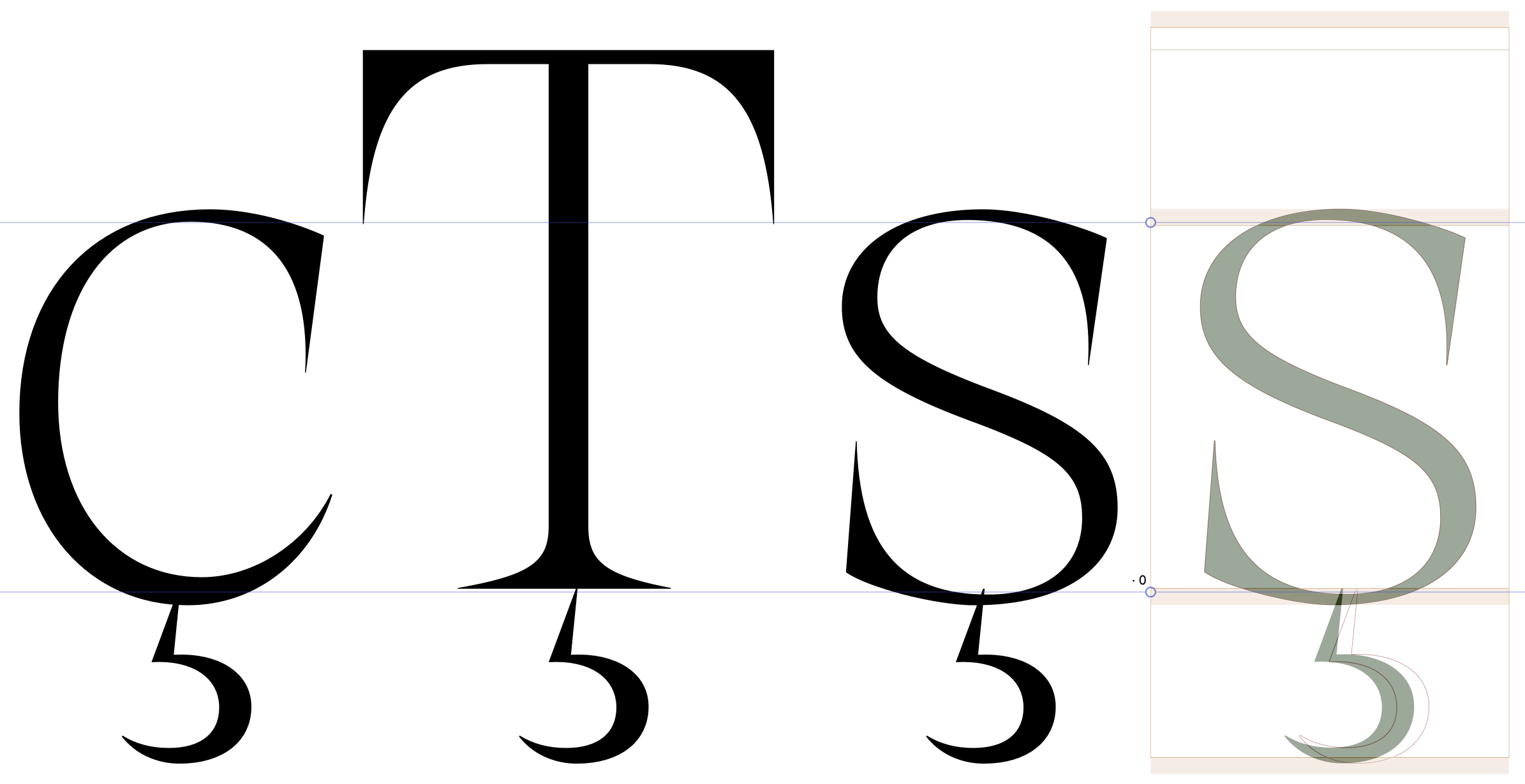
I’m having this problem: the beginning of the “cedilla” is aligned to the baseline, but in some characters like “ş”, the stroke is so thin that the curve goes below the baseline and this happens:
Move cedillas up/down. In real text, you will not see Tedilla and Scedilla side by side (they are both used in Romanian, but do not appear next to each other. Even when they do, misalignment is a smaller problem than cedilla sticking out in s)
Reduce the overshoot of s. To me, s’s overshoot looks a bit much and doesn’t need as much as c. (flatter shapes need less overshoot, and s’s curve looks flatter than c’s)
Don’t care about the T. Just make it work with CcSs. If it is too low for T, so be it. Tcedilla really does not exist, it is just a historic accident. In Romanian, Tcommaaccent is used.
If OCD forces you to make an alternate, make cedillacomb.T It will be preferred over cedillacomb when you create the composite for Tcedilla.
Note: don’t forget to then also decompose the base letter you are using this on. Never mix components and paths, this only creates alignment problems. I would strongly recommend what Rainer wrote above: make a cedillacomb.s (or whatever letter you’re having trouble with) and continue using automatic alignment.