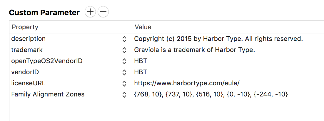
If I understood it correctly, ttfautohint’s Blue Zone Reference Font performs a similar function to that of Glyphs’ Font Alignment Zones, which is to avoid height differences between different fonts of the same family at small sizes.
I’m exporting my fonts as TTFs. From my testing, autohinted CFF-based fonts respect the font alignment zones, whereas TrueType fonts do not. Is there any way to set the Blue Zone Reference Font from within Glyphs or should I autohint TTFs separately?
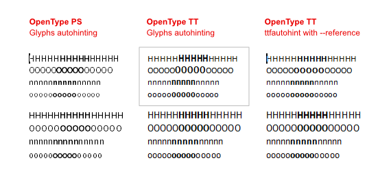
In the first example, the fonts were exported as OpenType PS (.otf). The result honors the Family Alignment Zones.
In the second example, the fonts were exported as OpenType TT (.ttf). The result does not honor Family Alignment Zones, as the bold weight gets rendered taller than the regular. I’m guessing Family Alignment Zones only works on PS hinting.
In the last example, the fonts were exported as OpenType TT (.tff) unhinted. Later on I ran ttfautohint on the fonts from Terminal using the --reference parameter.
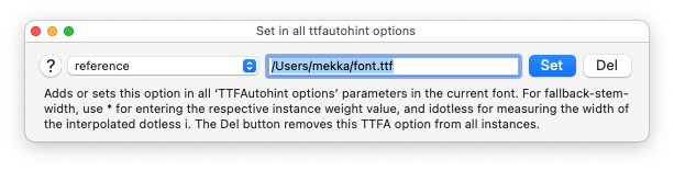
How can I achieve the result on the third example using Glyphs only? Is there a parameter I can add to my fonts so the Glyphs’ version of ttfautohint knows which instance should be used as Blue Zone Reference Font?