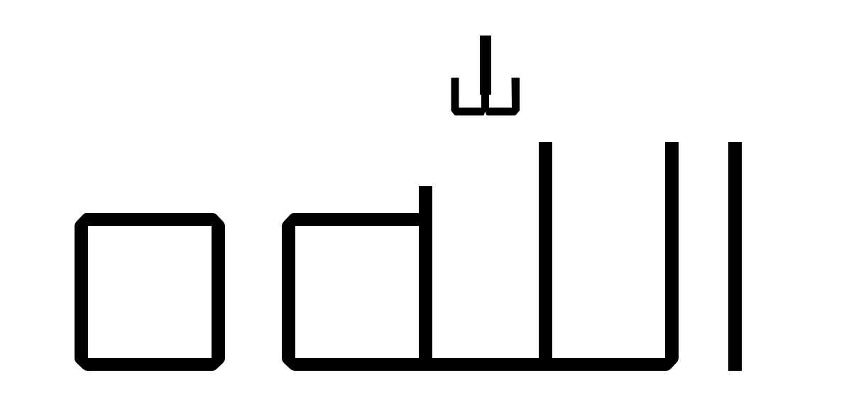
Even though I placed the anchor points and have the diacritics with 0 width they never look good in words that have more than one diacritic (on top of each other) on the same character.
What am I doing wrong?
Sorry if this was already covered but I didn’t find a solution to this in the forum or tutorials.
The screen shot does not show Anchors names;
there might be either mixing of naming between (_top) and (top) or the typesetting order by the software you’re using.
this can be instantly verified by the shaddaAlefabove-ar combined mark glyphs if you have it in your file.
But if you’re building up the U+FDF2 Allah glyph … and that specific mark case is showing there… then you probably need to check the basic structure … as the anchors of lam-ar.medi determines other marks positioning.