I’m in the process of polishing the Armenian glyph set of my Quinoa family with Hrant’s help, and I noticed that some letter combinations in my PDF proof look wrong. Within Glyphs, the same combinations look good. The problem appears to be the kerning, which is applied on the wrong side of the letter in the exported fonts (both in Keynote and in Fontbook), as if it were an RTL script.
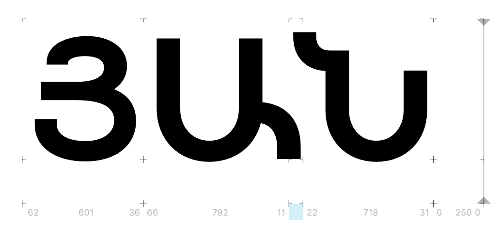
Note how the Ա moves closer to the Յ in the bottom line, whereas the Ն should move closer to the Ա. In the line above, the distance between Յ and Ա is more natural because there’s no (or less) kerning between Ա and Կ.
If you are kerning a RTL script, you need to change the syntax of the position rule. (Short story, the RTL run process applied for the text composer is invoke after the shaping). Glyphs does that automatically for you for some scripts but it is good to be aware of the following syntax:
For LTR: pos firtsGlyph secondGlyph -25;
For RTL pos firtsGlyph secondGlyph <-25 o -25 o>;
I’m not writing the kerning down as OT code, though; I’m just using the built-in kerning function, which is supposed to know the directionality of the script… I also used a dedicated set of kerning classes for the Armenian, rather than mixing in some from other scripts.

 Should I send you my file? I suspect the older version you already have should exhibit the same behavior, though.