Hello, I am working on my first font. When using it in Illustrator or Word it does not have the same baseline as other fonts. Can someone please point me in the right direction for where to make adjustments to this in Glyphs? I have tried editing baseline, ascender, cap height, etc. Nothing works.
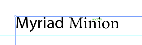
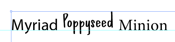
One thing I have noticed is that when other fonts are typed out without my font, the baseline is higher and when I add in my font, they all drop down (I added a guide on the illustrator screen so you can see). I am attaching screen shots.
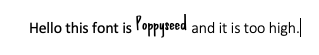
I did read this, thank you. I set up the metrics and played around with them a little. However, nothing seems to be changing? There is still a difference in the baseline on the fonts in both Illustrator and word. I tried also using the web method as defined in the article and it did not make a change either. It was helpful to learn these features… Just didn’t help this situation! I’m guessing I am missing something, but I’m not sure the right place to make changes from here. Is there a certain place you would suggest changing the value in order to make an edit to the baseline? Thanks.
The fonts should share the same baseline as long as they are on the same line though. Can you share a screenshot of your font in Glyphs?
The first baseline offset is what the user chooses in the text box settings. For the setting you seem to have (height of lowercase d), the offset appears to be alright. It is to be expected that the line moves down because you have a very high ascender.
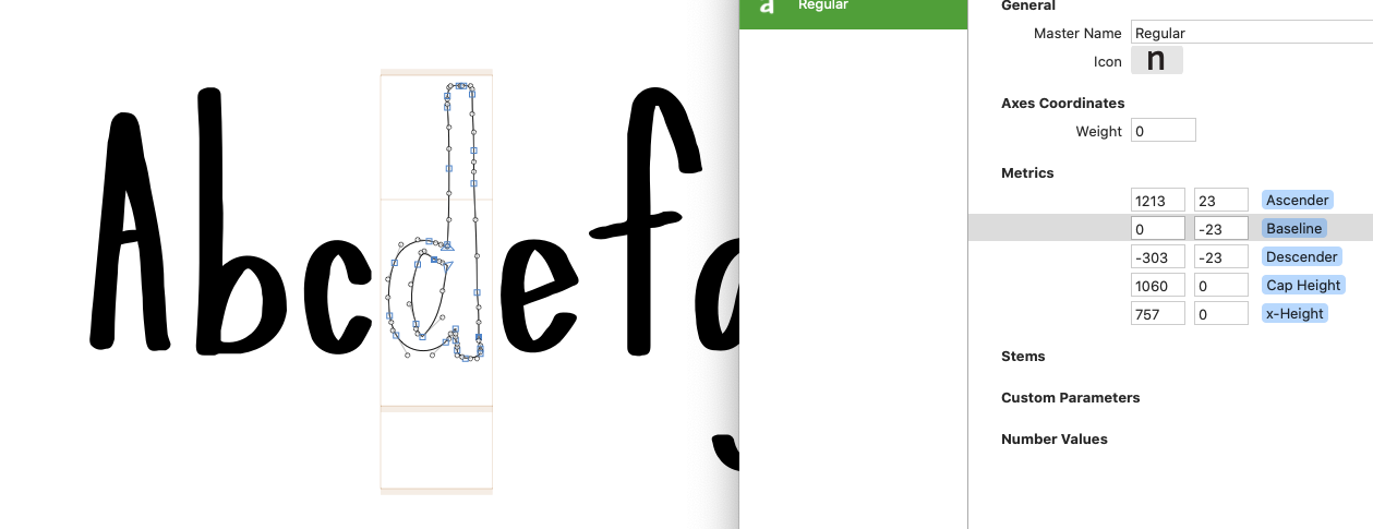
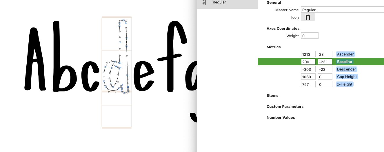
Thanks, I am attaching 2 screen shots of my font in glyphs. I have seen no difference from adjusting anything that article mentions.
So, to make this font, I brought in characters I designed in illustrator and lined up according to a grid. When I brought them over, they did not line up on the default baseline that was set up by glyphs when I opened the file, but they did align with each other. I just kept going. (I’m thinking maybe this was my problem?) So you can see in the first screen shot that when the baseline is set to 0, the letters are above the baseline. It needs to be set to 200 inorder to reach the bottom of most letters (2nd screenshot). But even if I export the font with the 200 baseline, it is still high (I’m guessing because its at 200?)
Is this the problem? And if so, is there a way to move all the characters together so I do not have to manually move each one down to a 0 baseline? (Hoping for a yes!)