Hello.
I am a beginner, wanting to take the time to learn and do things properly.
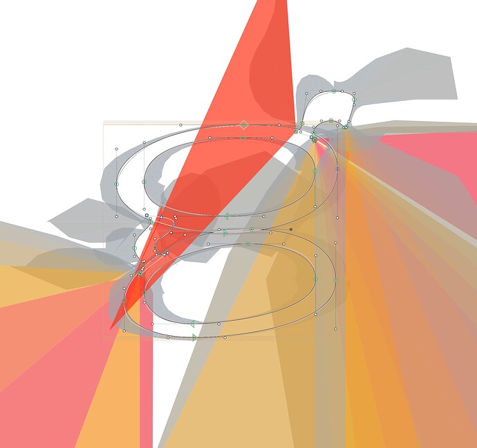
My question relates to utilising speedpunk. A mentor recommended that I use it and I’ve looked at the tutorial on the Glyphs website about it, but wherever I see these examples it looks quite neat and easy to understand.
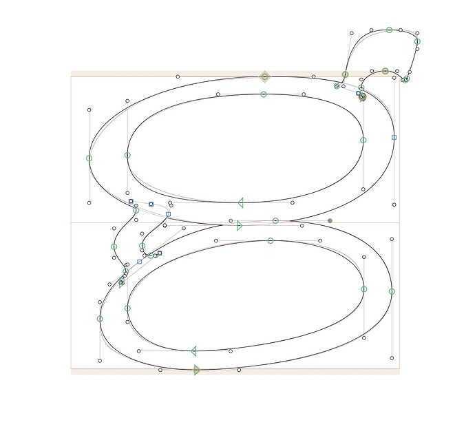
However, for some of the letters I’ve drawn, speedpunk looks a total mess and I don’t know how to go about using it to improve my glyph. I’m sure there is probably something fundamental I’m doing wrong in how I’m drawing things still, but I’m feeling very stuck. Any help much appreciated.
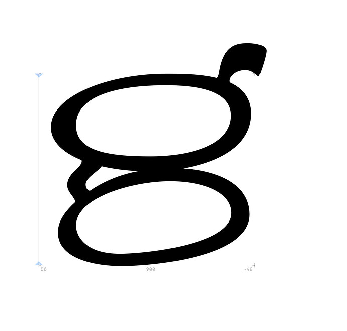
Here is an example letter ‘g’ I am trying to draw, screenshots provided with and without speedpunk on to demonstrate what I mean…


