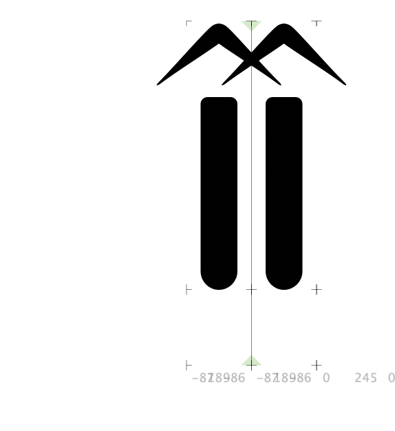
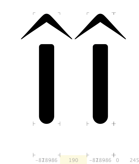
Hi there, I am currently kerning a typeface. I am unsure whether I should kern some of the accented characters like the icircumflex for example. This is because when two of these characters are placed next to each other the accents overlap. However if i kern the characters so that the accents don’t overlap then there is a very large gap between the letters. I wanted to find out if there is a correct way to deal with this or if it is just a personal choice. Any information would be greatly appreciated. Many Thanks
It’s way better to draw narrow marks for i’s, to minimize kerning. This kind of kerning creates big holes and even worse than unkerned overlapping shapes (check how it looks in a word)