Created a unicase font family (Regular/Light/Bold) and worked out all the spacing/kerning. Would now like to add an oblique for each of the 3 weights [such as a 12-degree right lean] in the same .glyphs file. What’s the best way to do so?
But it’s not clear to me what the initial steps should be. Do I first go to File > Font Info > Masters and add 3 new Masters (Regular Oblique/Light Oblique/Bold Oblique) and also 3 new Instances for each under “Exports” (then check the “Italic” box for each under Style Linking" with the name of its associated upright style)?
Any pitfalls to be aware aside from the straight stems getting a bit distorted when slanted?
Hi, I personally work like this, after finishing the roman (upright) masters of a family:
in Font Info > Font, add an “Italic” axis.
in the masters tab, select all your masters, and duplicate them (bottom left, + button, “Duplicate Selected”).
for your roman masters, set the italic axis value to 0, in your oblique masters to whatever makes sense to you (I like 0–100, but you can also use your italic angle, just without decimals).
if not present already, add a Metric for all masters called Italic Angle. Set it to your desired italic angle in the respective masters.
in your case, you now should have three roman and three oblique counterparts with identical outlines.
you can now go through your new oblique masters and make your shapes oblique.
Of course, duplicate your exporting instances, rename them accordingly, set the axis values to your italic value, and check the italic style linking box, entering the name of the corresponding roman style.
Design tip: a mix of slanting and rotating will get you pretty decent results. I like to do something between 50/50 and 60/40 slant/rotate, depending and the italic angle (the steeper the angle and the wider the glyphs in relation to their height, the less you should rotate).
To add to everything said above, I prefer adding italic masters one at a time because then it’s somewhat easier to keep track and manage things like metrics out of sync, interpolation issues, etc.
This was exactly what I was searching for and these steps worked out perfectly, thank you so much!
For anyone else coming across this post in the future, I used @SCarewe 's suggested workflow then followed that with the steps outlined here. This, specifically, was helpful:
“Choose Path > Transformations, and do not translate (i.e., leave the values at zero), do not scale (leave at 100%). But do pick an Origin: As best practice, we recommend picking half x-height because this is also what Glyphs uses for calculating italic sidebearings. That means that you can use metrics keys with cross references between LSBs and RSBs.”
Having done the above got my oblique set 95% of the way there. Afterwards, I just peered into each oblique glyph to make minor adjustments to any stems that might’ve displayed slanting distortion. The kerning/spacing metrics largely held up after the transformation with a few needed tweaks here and there. Keep in mind the above process is mainly applicable to obliques rather than “true” italics.
Glad you found the suggestions helpful. For the future, I would consider the following things (no specific order, just some things that come to mind):
There are angles that work better on the unit grid than other. For example:
1×4 units (one unit to the right, four units up) will give the angle 14°.
1×5: 11.3°
1×6: 9.5° (my preferred angle for text families)
1×7: 8.1°
1×8: 7.1°
Using one of these angles (or any other that works on an as-small-as-possible grid) ensures smooth curve connections and avoids kinks and jaggy segments. You can take this even further by choosing your vertical metrics accordingly: x-height, ascender, descender all as multiples of the factor you are using in your angle calculation above. The annoying part is if you want to do this after having drawn your roman, so best to think of this before even starting your roman.
If you want to achieve cleaner italics than just slanting with manual corrections, I published a very work-in-progress plugin called Italify (currently broken in Glyphs 3.2, a Glyphs update will fix this soon). It allows you to slant and rotate your outlines with a customisable balance. Beware it is very broken and will not work well for complex outlines.
Thanks for the Italify link, looks great and necessary! Much appreciative for all your input on this topic, hopefully this thread helps others new to Glyph as well.
And there is a slanting algorithm that can compensate the distortions in the transform dialog. You can switch between normal slanting and ‘cursivey’ it uses the first horizontal stem to determine the amount of correction. So a bigger stem value will apply more.
Speaking of automated italics, most algorithms seem to solve rounds, but is anyone aware of any attempts to solving diagonals? Seems to be a harder task. Glyphs’ Cursify does something to them, but very slightly.
What do you mean by “solving diagonals”? The smart italify feature in Italify attempts this.
Maybe I should explain a bit. Straight segments are transformed according to their angle. If I remember correctly, I devised the following algorithm:
Vertical segments are rotated (the pivot point being the layer center). Horizontal segments are slanted (just the v values of the segment are changed, as nothing else is necessary). In between, the more vertical a segment is, the more it is rotated. The more horizontal it is, the more it is slanted. The slant/rotate ratio is simply calculated based on the segment angle.
Example: a line segment at angle 45° will be slanted ½ of the italic angle and rotated ½ of the italic angle.
There is some messy stuff going on with opening and closing corners (the main reason Italify is so buggy), but I just need to find some time to understand the maths better in order to clean that up.
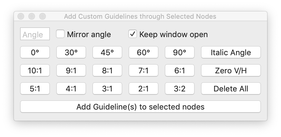
Funny that you mention ratios. I was just writing a script (with a little/lot of help from ChatGPT) and was adding presets for angles and ratios…wondering if people actually use ratios and which ones would be common enough to include. Inspired by your list, I also added those to the presets.
Gosh, only just managed to find this again. Been on my mind for quite a while, although I must admit I didn’t remember your script correctly.
I find myself constantly changing the angle value in the Rotate/Shear palette and would actually find a palette with multiple presets very useful, similar like in your script. Have you considered making it into a palette plugin?
Yeah been thinking about that too the more I’ve been using it. It would definitely be more useful in terms of easy access and screen real-estate. Been trying to get better at making reporter and palette plugins. I’ll have a go at it soon (but don’t let that stop you if you want to make it yourself).
Out of curiosity, what would be your ideal preset setup? Anything that you would change or add (I’ve actually found myself adding more presets depending on the project) to the options available now? What would make sense as a general public plugin?
I would probably have a radio group to select between rotate, shear vertical and shear horizontal.
Then a bunch of presets like in your screenshot – not sure how to go about the ratios I outlined, I would probably prefer having them as explicit angle values (maybe a toggle might be alright to switch between the two display modes).
0, 45, 90, 180, 72 (for a five-pointed asterisk), italic angle, 14, 11.3, 9.5, 8.1, 7.1
Thos would be the angles I use a lot.