Hi Georg, I have read this tutorial. I just hope someone has some best practice tips, things to avoid, good to know info.
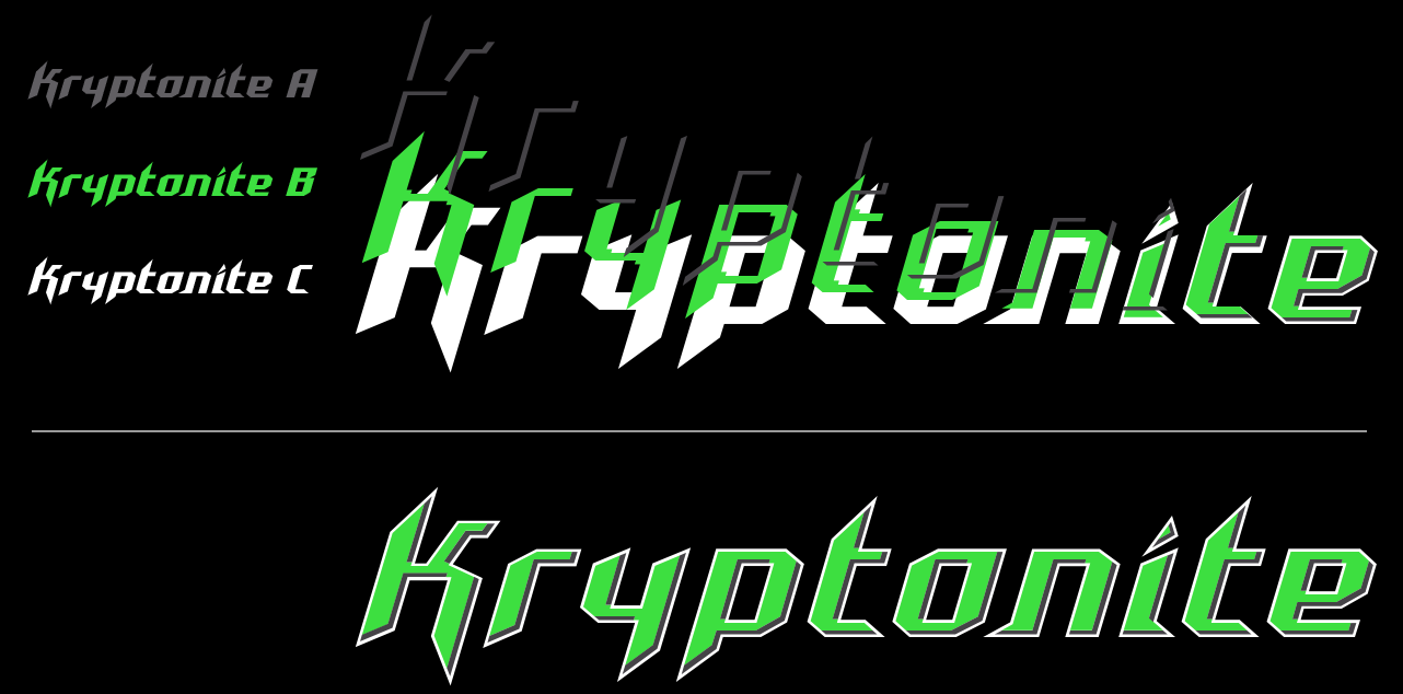
This seems like a pretty daunting task to create 3 fonts on top of each other. Important is that the base font functions like a regular font. So you can set text with Kryptonite without the 3D effect.
And since in my Glyphsapp the Layers don’t work well (this must be a problem on my Mac), I’m gathering information on how to start with this journey.
I’ve tried multiple times to make this work for my Accelerator font, but it just doesn’t show anything I’ve set up.
Like my Cutting Edge updates keeps crashing my Glyphsapp, Space Bar doesn’t work, I suppose this also has to do with the current Glyphsapp on my Mac.
I’m patiently waiting for the next version and will try it again.
I’ve successfully created several layered fonts with Glyphs. The fonts themselves get a little complex but the software keeps things pretty logical.
The advice I’ve give is to ensure your base font is 100% complete before working on the layers.
The master setup in the tutorial works really well so everything works visually and keeps everything relatively straightforward.
Thanks Jamie, that’s good advice. It’s good to hear that it works for you. I’ve got lots of work to do in Affinity Designer before importing the layers to Glyphs. I’ll do some tests before to get comfortable with layered font. This is totally new to me.
White is the bottom layer. Green is the next layer on top of that. It doesn’t have to be cut out of the white layer. It should just “shrink” a certain percentage.
I want to create this green layer from the bottom layer, without having to draw all the outlines new by hand…
Do you know of an automated method for this?
I hope anybody has a good tip for me. Thanks in advance.