I am utterly baffled by several bizarre issues with my variable font. Fair warning that I am a first time font smith, so I may well be making rookie mistakes! But I’ve tried everything I can think of to understand let alone fix these issues, and I’m totally stuck. I would SO appreciate any help.
Background
- I have a variable font with two masters and one (custom) axis.
- The axis is called “SRIF” for serif, so all the font can do is slide between sans serif and serif.
- Because I don’t support any other axes, it doesn’t vary in weight or slant or anything else.
Issues
The issues I’m having are:
- Both locally and in web browsers, I’m seeing “bold” and “italic” versions of my font, even though I have no masters for those. This isn’t necessarily bad, but I have no idea why it’s happening and would like to know how to prevent it if needed.
- The “bold” and “italic” versions look fine on desktop browsers, but on mobile browsers they look different (and bad).
- When I host my font on a website, sometimes (but not always) I get an error about my custom axis:
Uncaught SyntaxError: Unexpected identifier 'SRIF'.
Issue #1: Weight and Slant
The effects I describe below happen both when I use the font locally and when I use it in a hosted web app.
Starting from the Sans Serif Master
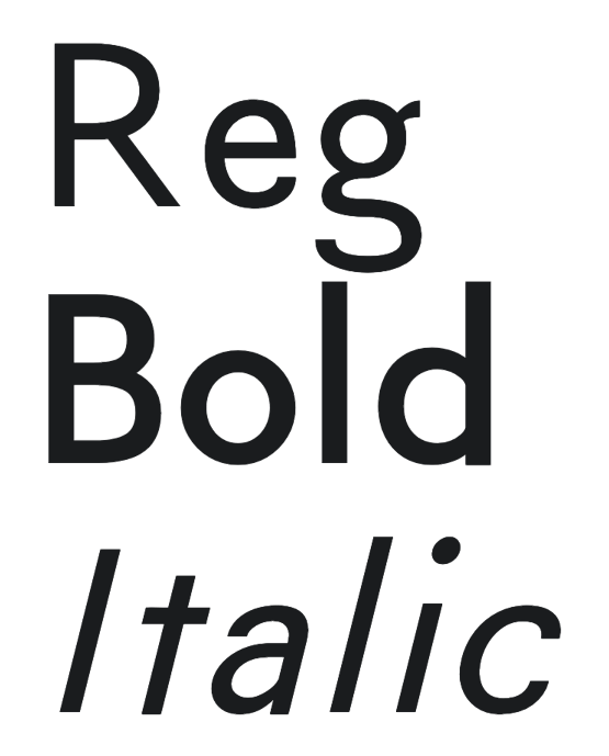
With SRIF=0 (i.e. starting from the sans serif master), here’s the font without a weight set:

Oddly, when I set the weight to different values, suddenly at 600 it becomes “bold”, even though I don’t have a “bold” master or axis!

(If I keep going up, the font doesn’t get any bolder.)
Same for italics. When I set the font style to oblique, the font becomes “italic”, even though I don’t have an “italic” master or axis!

(If I set an angle, it’s ignored if it’s below 14deg and displayed as the same base oblique angle no matter what the value is if it’s 14deg or above.)
I can even combine them:

Starting from the Serif Master
For completeness: With SRIF=1000 (i.e. starting from the serif master), here’s the font without a weight set:

When I set the weight to 600 it becomes “bold”:

When I set the font style to oblique, the font becomes “italic”:

And I can combine them:

What’s Going On Here?!
It seems to me that somehow both my computer OS (macOS 14.1.1 (23B81)) and web browser (e.g. Chrome 119.0.6045.159) have “default” ways of bolding and slanting fonts. It’s as if they just thicken or rotate each glyph to approximate a bold or italic style. That’s my best guess since I didn’t equip this font with a bold or italic master, but beyond that I don’t have much evidence for it.
Does anyone know if this is true or, more generally, what’s going on here?
Issue #2: Mobile Browser Display
Now this is a really strange issue. On a desktop browser (whether Chrome or Safari — testing on macOS), the “bold” and “italic” versions of my font look fine:
But on a mobile browser (whether Chrome or Safari — testing on iOS), they look different!

Notice how the “o” and “d” glyphs look not quite round in the middle, as if someone tried to make a “bold” font out of the base font by overlaying two copies of each glyph, slightly offset horizontally.
I thought this was a crazy hypothesis, but when I vary along the SRIF axis (in this case to around 800), I see some truly bizarre behavior (on the bold italic combined version):

Notice that on the tails of the “t” and “a” it looks like three copies of the glyph are overlayed! And the dot of the “I” look like several copies have been smushed together! What?!
It gets weirder still. When I zoom in on a mobile browser, some of these oddities disappear (e.g. the “o” gets round in the middle). But others remain (e.g. the tail of the “t” looks like 4 copies are overlayed).
Does anyone know why this is happening or how to prevent it?
Issue #3: Error When Hosting the Font
When I host my font on a website, sometimes (but not always) I get an error about my custom axis: Uncaught SyntaxError: Unexpected identifier 'SRIF'.
I have absolutely no idea why this happens some of the time but not all of the time. For example, I deployed a staging build of my website on Netlify, and I didn’t get that error — the font worked as expected. I then promoted that to production — the exact same build with zero changes — and I got the error (which meant the font wouldn’t vary)! And yet, this happened only on desktop browsers. On mobile browsers, the font varied as expected!
It’s completely perplexing to me.
Does anyone know why this is happening and how to fix it?
Thank you SO much in advance for anyone who can help. I will be eternally grateful!