Hi,
I’ve set up autohinting on my latest project and I’m happy with the results.
I was going to add a parameter for BlueScale to suppress overshoots at a reasonable size but it occurred to me that the autohinter may add a default value automatically. Or does it just keep suppressing until a full pixel is available to show the overshoot in proportion?
According to the original Type 1 spec,
“The default value of BlueScale is .039625” (p.40).
My understanding is that by default, Glyphs does not write any BlueScale value into the font (which is possible), which triggers this default.
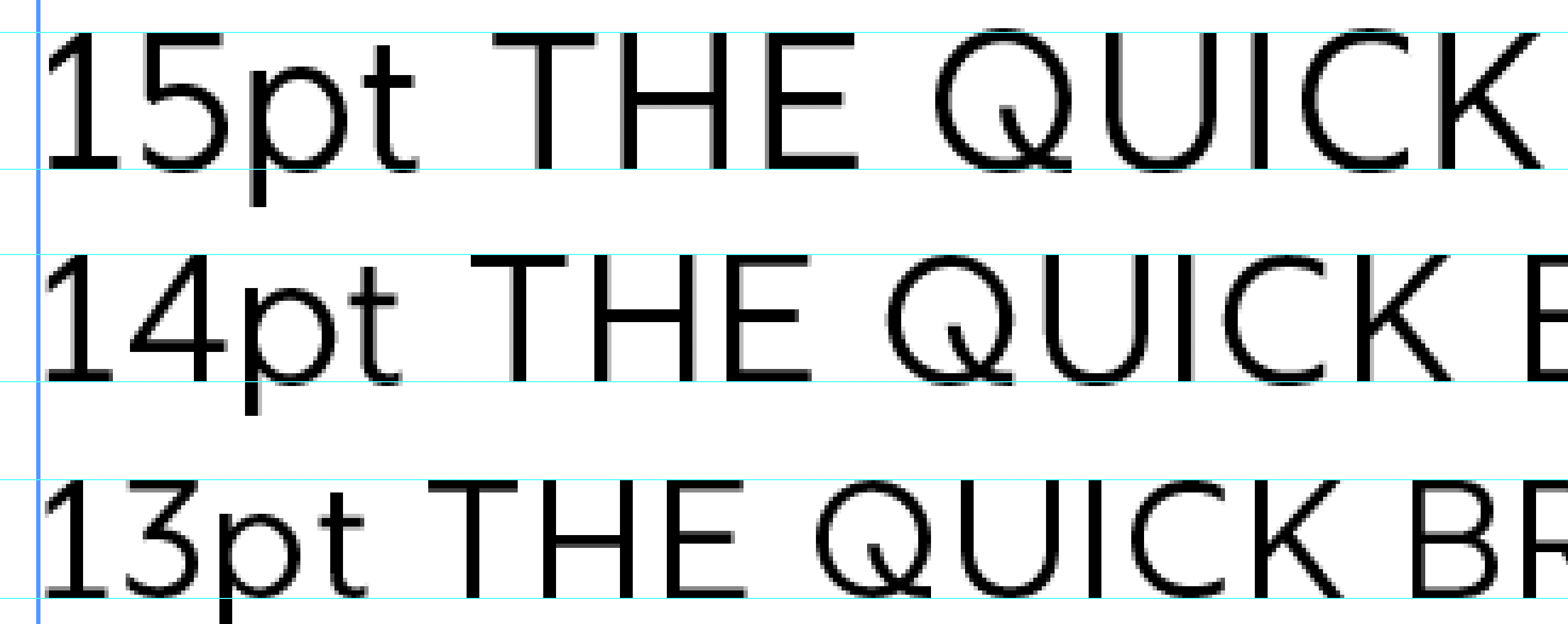
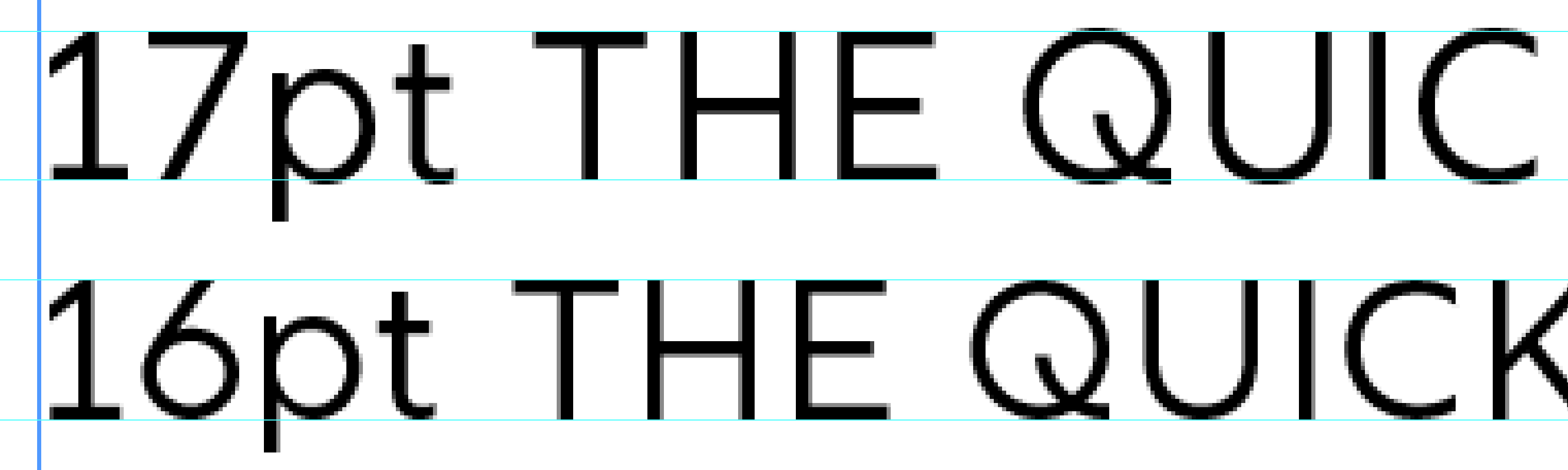
My personal opinion is that this is too low; I usually end up with something between 0.6 and 0.9.
If in doubt, or during the early stages of the design process, it does not hurt to use a very high value, which practically leads to the behaviour you described, “just keep suppressing until a full pixel is available to show the overshoot in proportion”.
First of all, when talking about BlueScale, it’s much easier to completely forget about all things pt and dpi, and only consider ppem (or px, which is identical).
My guess is that the “100%” zoom in InDesign has no meaning. You could take a screen shot, measure the cap height (in px) and compare it to the cap height (in units). That gives you an idea of the ppem you are looking at. Or, simply use Photoshop directly to test your font, create a text layer, and set the type size in px.
Ideally, to test and set BlueScale – and I consider this a very important decision during the design and production of a font –, you should view your font in a browser on Windows. Alternatively, you can work with waterfalls and simply adjust the BlueScale up or down until it looks right to you (this is possible without even knowing the ppem you are looking at). Working on a Retina screen, this may be tricky, though. So, maybe Photoshop is the better workflow if you don’t have access to Windows.