Despite of “check all” option selected, there are still glyphs with weird components alignment within a file created in Glyphs 2.
Here is how it looks in Glyphs 2
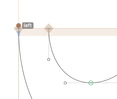
I’ll have a look at this. For now, add a “left” anchor in the “_cap.swshcaps” like this:
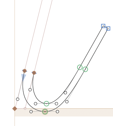
I edited your font a bit. The only spot were you need a _cap is the top of the ascenders. most other spots are better suited with _corners. specially the slightly slanted stems in M and A. And the swash should be a corner directly, for sure. (check the M.ss02 and I.ss02).
Will do! thank you Georg!
TBH I’m still a bit confused with the caps/corners components and which one to use where. Will need to revisit manual and tutorials again.
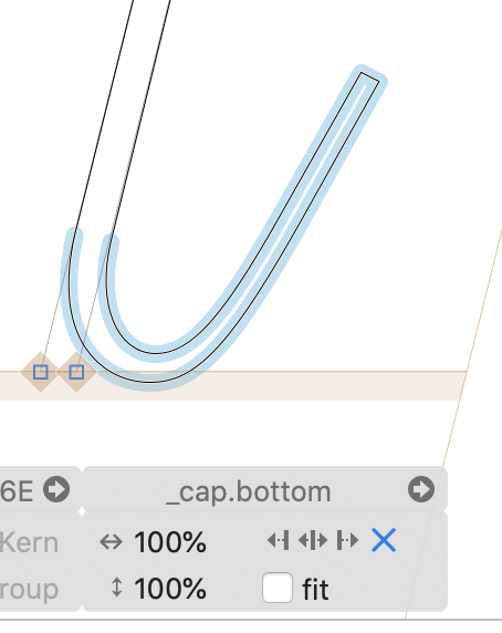
Caps are good when the shape overs two nodes, corners if only one. If stem have a (even small) flat part between the serifs, always use corners. One the top part of lowercase ascenders or in in-strokes on the n or i might need a cap.
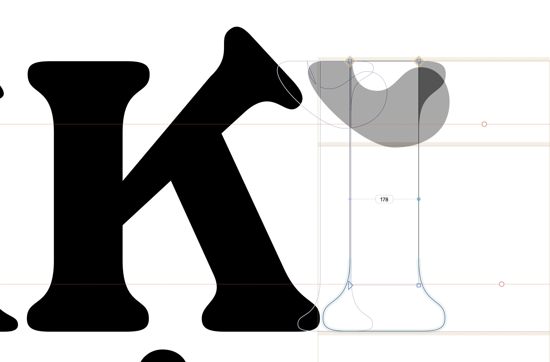
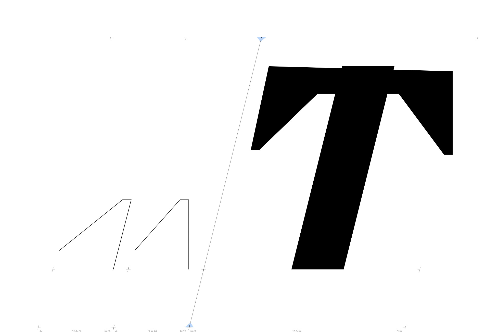
Sorry to reopen this thread, but how are Glyphs 3 cap components differing from those in Glyphs 2? Opening a G2 file in G3 completely messes them up. See screenshot for the intended look in Glyphs 2. A minimal file is attached below—most of all I‘d like the top cap component to be 100% horizontal.
You better use the “x” option in the alignment settings. That means that it will keep the original orientation.
For the “_cap.top”, add an “origin” anchor at 0, 0 and then rotate it 180° and move it up so that the origin anchor is at the xHeight. That way it you dont need to draw the serif upside down.
for the “_cap.bottom”, the angles of the connectors do not match the actual stroke of the n-stem. I copied the n-stem into the background and then adjusted the to ends of the path to match. That makes the out-stroke look much better in the n.
The left side (_cap.left) looks OK already (I added two points in south-west corner to help with scaling of the component), but the right one (_cap.right) is misaligned.
I know if I set both components to 100% and put the Y coordinate of the ending point to match the horizontal of T (=95), it will work, but that defeats the purpose of components (the ability to scale them).