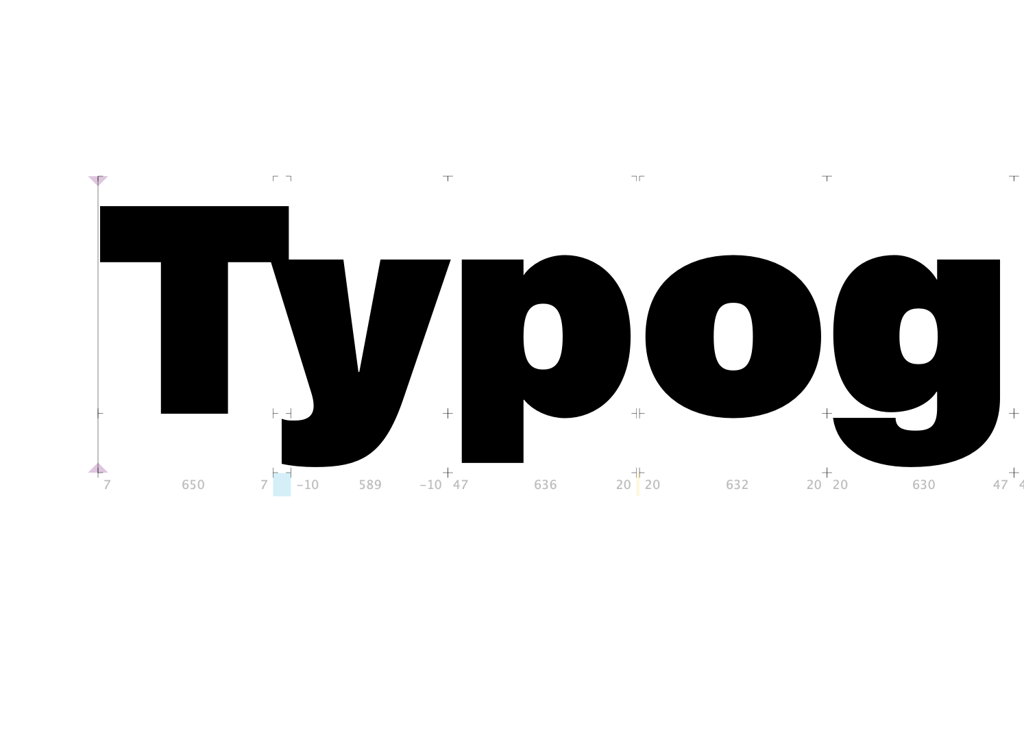
I’ve ran into a problem when designing the ultra black cut of my typeface (please see attached image).
Is there any way/ideas to solve this problem without changing the Cap-height or the x-height.
I don’t really want to change the x-height, because I specifically chose a higher height as a stylistic choice.
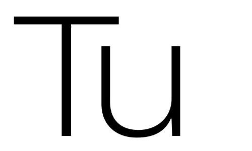
This happens only with an uppercase T in combination with lowercase v, w, x & y.
It may be actually a bit overkerned. Think of it as though some of that negative space is “inside” of T and shouldn’t be invaded, so T should have some gap. Same thing as why the negative space between AV is bigger than between HH, even though that seems not logical.
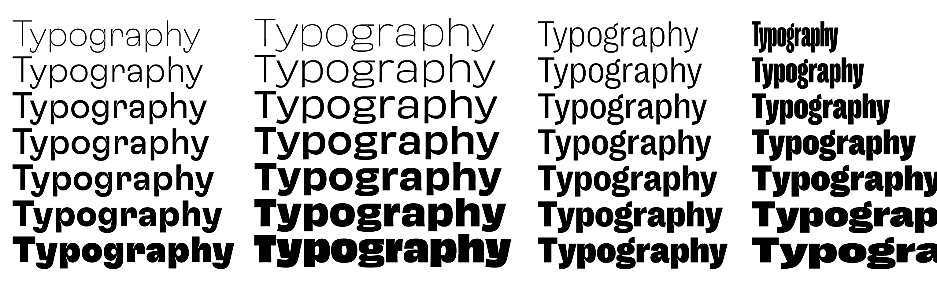
This can usually be solved pretty much linearly for both weight and width axes, have a look at some fonts: