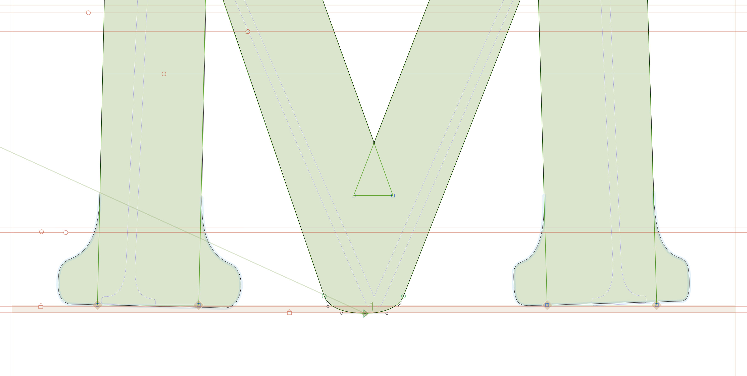
Hello, I opened a Glyphs 2 font file in Glyphs 3 and the cap components on a slightly angled stem (of capital letter M) are tilting, unlike how they are in Glyphs 2. Here is a screenshot.
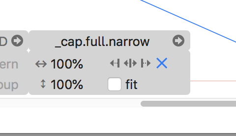
Mmmmm I figured it out, you select the X button on the Cap editing panel.
In those cases you should use corners (not caps). They match the slanting and different stem width much better.
ahhhh I know. I started the font this way awhile back and should convert it all to back to corners but haven’t yet.