A client is having a problem regarding hinting in PC Windows, in a Dell Monitor, Windows 11Pro, Edge, etc…
Current hinting workflow:
- Draw shapes with correct nodes and handles
- Use standard paths direction
- Add Family Aligment Zones in Family
- Add TTF Zones and Stems in each Master
- Add TTFAutohint Options in each Export (
- x-height snaping exceptions: 10,13,15
- Fallbackstem with (accordin to each stem)
- hinting limit 50, maximum range 48
- Grayscale: Quantized, GDI: Strong, DW: Quantized
- Export individuals as .ttf (autohint)
- Use FontSpector or Fontbakery to solve any issue
- Use latest ttfauthint in terminal with standard settings in each .ttf (does this override all the previous settings I made in glyphs? should I use one or the other?)
- Use woff2_compresion in terminal
The typeface looks perfect in 7 screens that I’ve tested in windows, one old as 2006. But I couldn’t replicate the error. One important thing is that the vertical metrics of each weight are different due to optical compensation, but the problem isn’t when the font is used mixed… so I guess that this shouldn’t affect rendering.
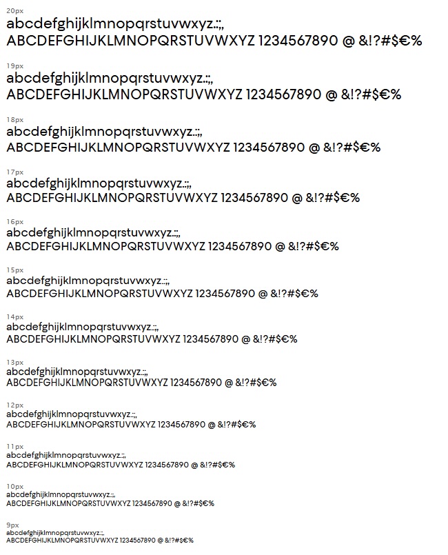
Here is a few of the client’s problem:
As you can see here, the “H” is lower and the top of the “A” stands out a lot in several sizes
Here all the letters jump a lot (what?!?!)

Here as well. the letters jump a lot (what?!?!)

——————————————————————————————————————————
And, here is what I see in a Dell screen from 2006 (for example):
Any idea what could the problem be or how to fix it?
I’m doing Rainer’s hinting course next month (fortunately).
Thanks a bunch,
Fer