Hi. I’m developing a Color Font for a specific use that has a red bar running behind the text when it is set. There is a problem with kerning where a glyph overlaps the kern of the preceeding glyph. To solve this I am adding sets of ligatures that substitute the visual error.
Everything works fine in Publisher and web tests, but InDesign places a space glyph between the ligature elements. If I name the ligature AT instead of A_T it works but only if I insert it via the Glyph Palette – all attempts so far to substitute through OT features causes visual blocking errors in InDesign.
Where are you adding these ligatures (liga, rlig, dlig)?
The name of the glyph shouldn’t make any difference, as long as the substitution code is correct; naming it A_T just enables Glyphs to auto-generate the necessary code.
The feature code is in LIGA as I want it to be on by default and used. I wil also add to CALT.
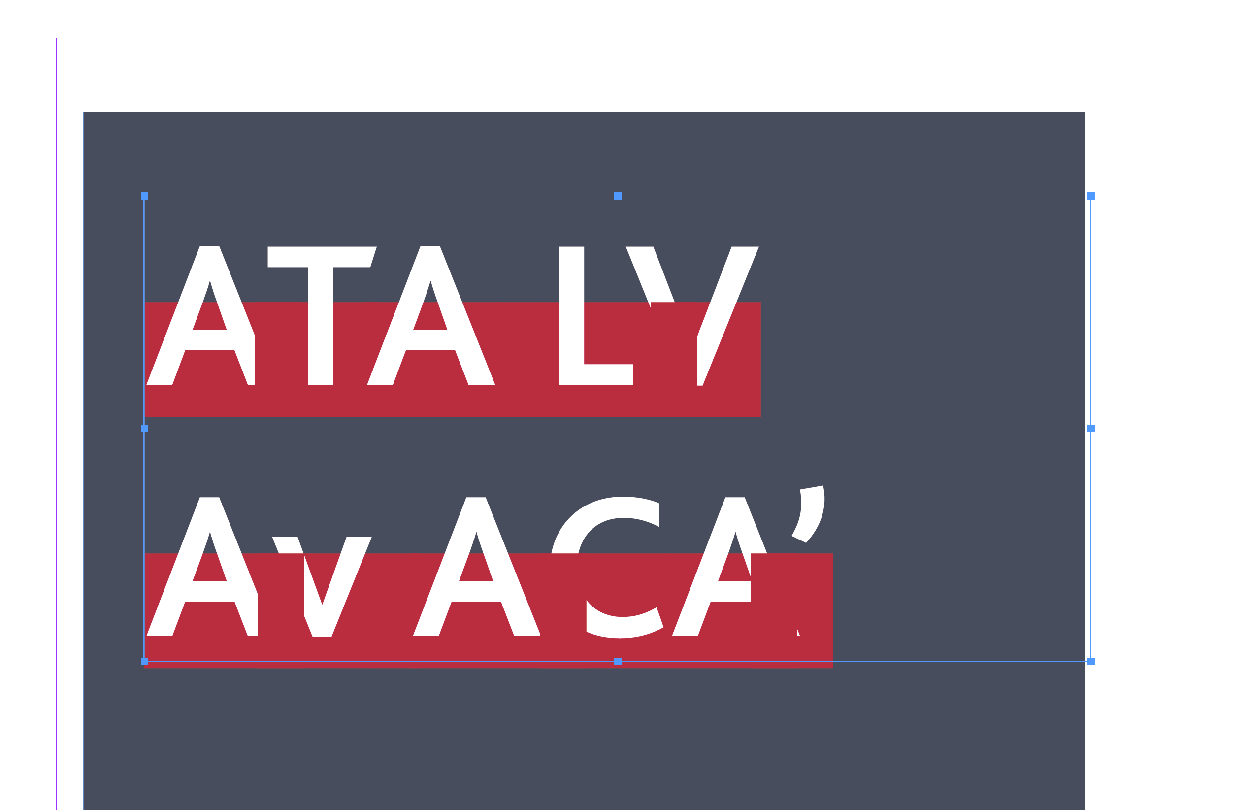
The rogue glyph is the space (which is a red block). InDesign adds it for some reason when a ligature substitution is made.
So this is a bug with the non-World Ready Composer? That sounds like something definitely worth reporting to Adobe.
Are you able to produce a reliable context for reproduction? Can you select the space character, or is it inserted purely as a ‘shadow’ element? Does it only appear with colour fonts?
From what I can tell the issue is with Color Fonts (SVG) and the general (Latin) Paragraph and Single Composer. World-Ready is OK.
And only ligated substitution. I presume it is to do with the hyphenation routine.
If InDesign is inserting space glyph after ligature, you might try making the space glyph blank and add a substitution in, say, ccmp feature that replaces the blank space with the red box one.
Generally, it is a good practice to always keep the default space glyph blank, since many applications will insert space glyph when they need some invisible placeholder under the assumption that space is a blank glyph.