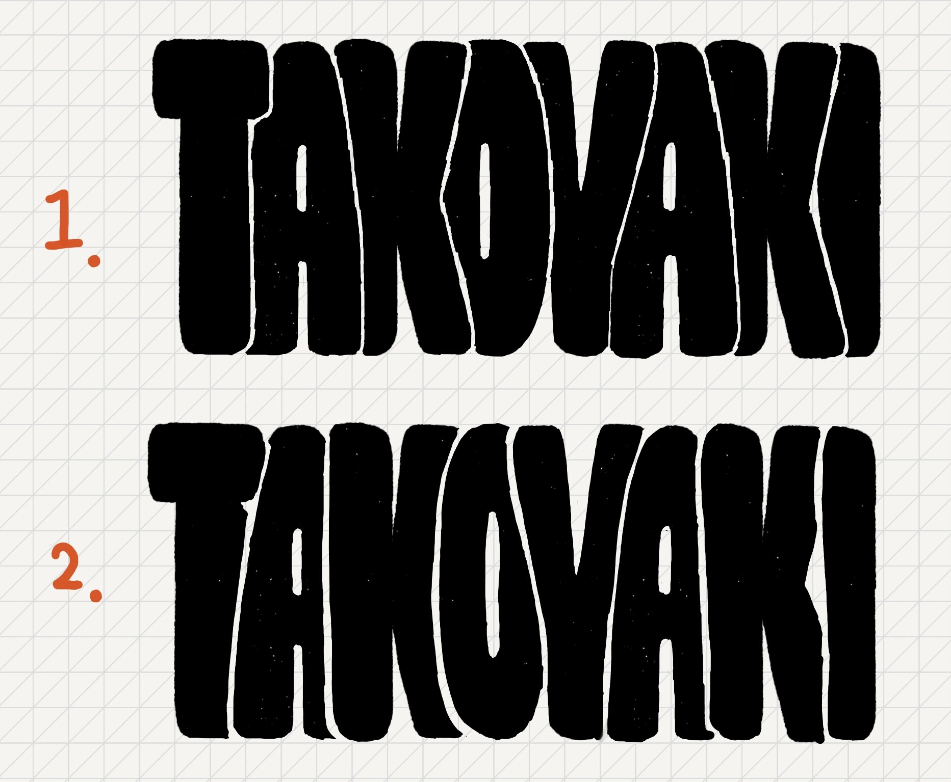
I want to make a display font like the sketch 1 (see below) with color font. The space between the glyphs are drawn separately in white. So it is a colour font but black and white color font.
But then I realised that it is tricky: as it seems text is always rendered in the way that the right hand glyph covers over the left hand glyph.
So the sketch 2 (see below) is possible, but this is not what I want.
Is there any solution to this?
It appears that using several individual fonts could be a solution, but not so user-friendly.
Thank you for the links! It reminds me of Japanese supermarkets and makes me feel nostalgic These design are based on the sketch 2 (the left hand glyph covers over the right hand glyph) though.
The fonts above do not rely on layering or colour font (OT substitution only), and the direction of biting is irrelevant to what they are doing technically.
My suggestion is brute-forcing in essence, but with smart organising and substitution, I think the number of glyphs could be smaller than pure multiplication.