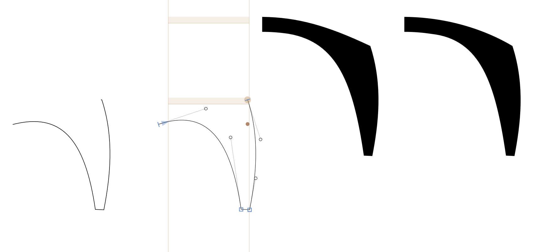
Hello.
I’m working on a serif font that has your typical serifs throughout – serifs with flat “bottoms” where they attach to the flat bottom of a letter. For almost all of my letters, this is what I want.
But for the letters C and S, I would like to have a curved end, and I’m wondering if you guys can help me figure out the best way to accomplish my end goal (while maximizing my ability to interpolate between multiple masters).
I’ve included images to help illustrate what I’m talking about.
default - no curve at end:
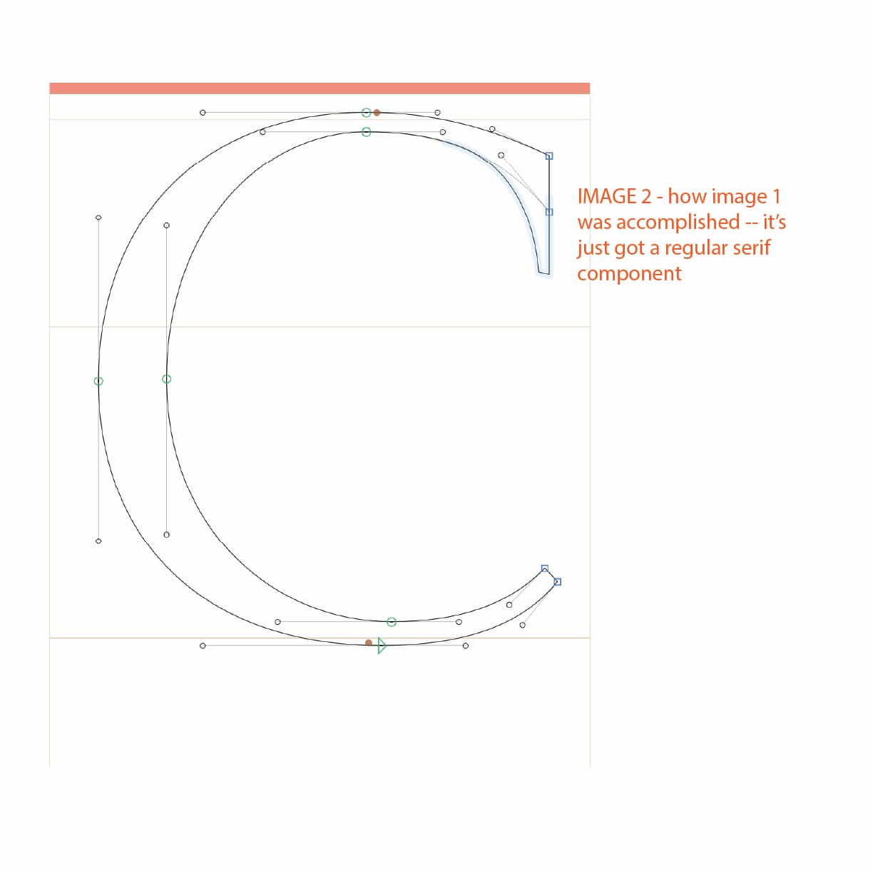
desired - curve at end
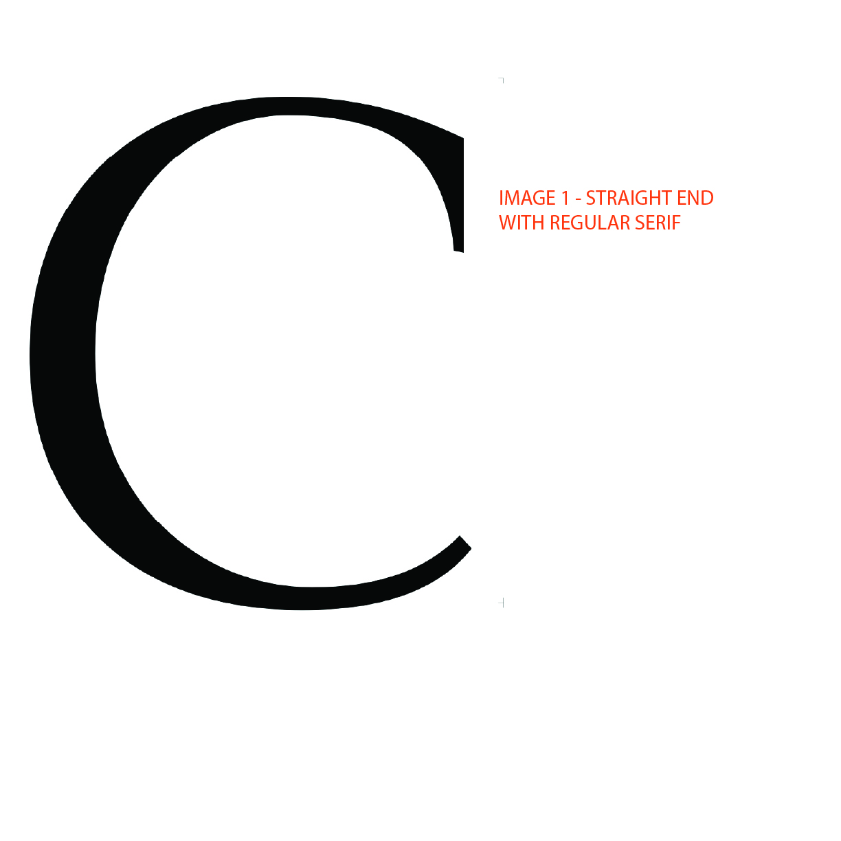
I tried to use both a serif component and a cap component together, but this doesn’t seem to work.
I also tried to curve the end first and then attach a curved serif, but this is unpredictable and was difficult to recreate in a bolder master and wasn’t interpolating well.
It seems my options are these:
1 - decompose the serif component and then either curve that segment manually or else add a curved cap component (this seems like it’s the easiest for interpolating between masters, but it doesn’t give me as much flexibility if I decide to alter my serifs, say)
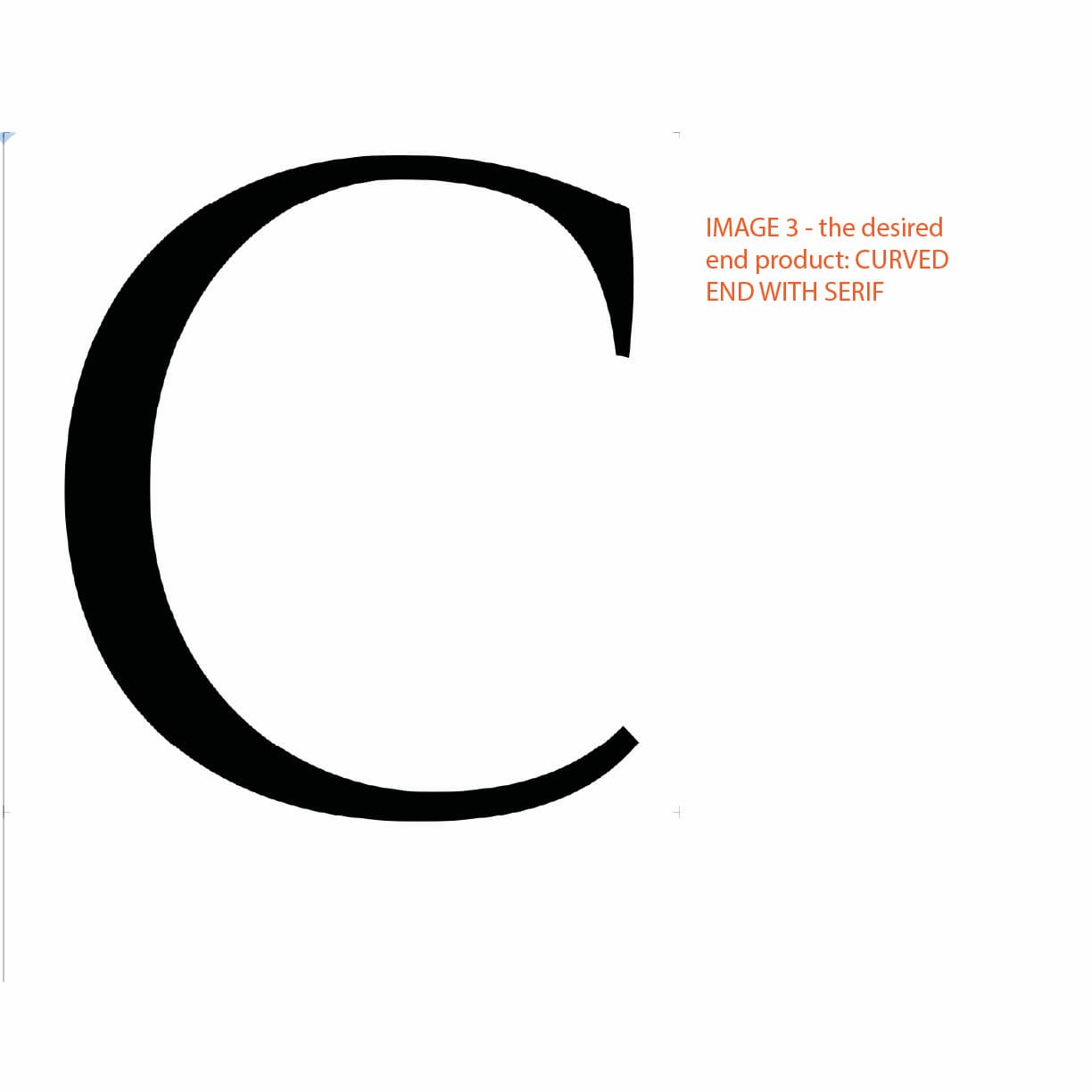
2 - leave the serif component as it is and add a little curved shape at the end (this is what I show in image 4 below - this works, but it isn’t very elegant and it’s not great for working with multiple masters).
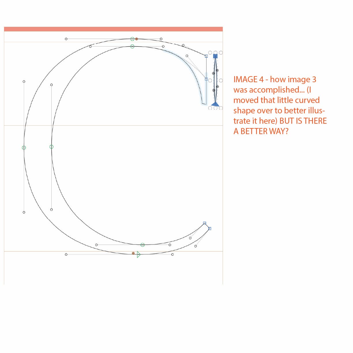
I’m curious, what do you guys think is the best way to achieve what I’m going for?
Thanks,
Julie