Hey!
I’m developing a manuscript font and I am trying to do contextual kerning between some of my letters. I tried to follow the tutorial on Glyphs website but with no success.
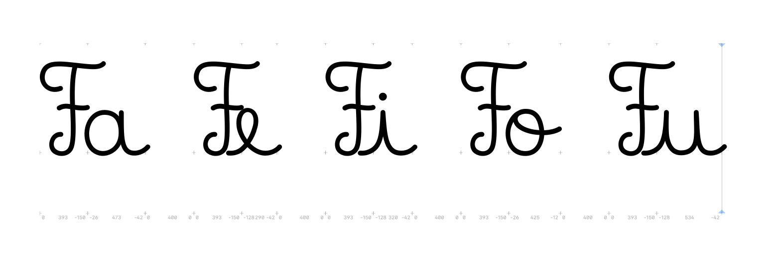
Right now this is what I have on my “kern” features
And make sure you have the spacing correct before you start kerning. The sidebearings of the lowercase look a bit strange. I would expect that the “a” has a positive LSB and a much bigger RSB. Meaning the outline might be better off shifted to the right (as probably all other lower case).