I have added a image so that you can see my query mo clearly.
are the glyphs in yellow are manes correctly to be efficient to the user, or is there a way I have not understood?
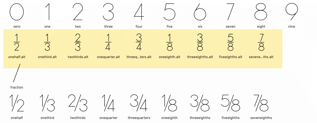
They are also known as overunder fractions or nut fractions and are best named <> as in “oneoverfour” instead of onequarter
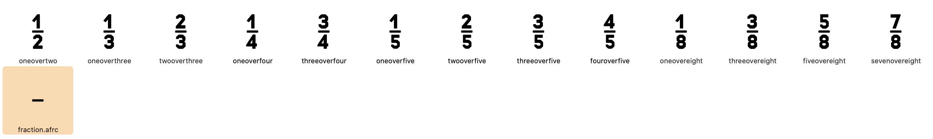
fraction.afrc+onesuperior+fiveinferior=oneoverfive fraction.afrc+twosuperior+fiveinferior=twooverfive fraction.afrc+threesuperior+fiveinferior=threeoverfive fraction.afrc+foursuperior+fiveinferior=fouroverfive fraction.afrc+onesuperior+eightinferior=oneovereight fraction.afrc+threesuperior+eightinferior=threeovereight fraction.afrc+fivesuperior+eightinferior=fiveovereight fraction.afrc+sevensuperior+eightinferior=sevenovereight
Here is what I ended up with
I named the glyphs and kerns them separately so when keyed in there is little to do unless you want to change the kerning to wider or narrower.
I think I’m getting the hang of this. Maybe overthinking it sometime rather than trust my designer instincts.

As long as you are happy with the stacking, go for it.
1 Like
Hi Dezcom. I would like to ask you a really dumb question.
Where it the French template version on TM which is DM located in the template panels.
I told you it was dumb.
A trademark sign for French? You could name it trademark.loclFRA
This works. Thanks very much for your response.
As a response to your question mark. I Work in a number of languages on my packaging projects and my clients in Canada need to use both TM and MD in the descriptive and legal copy. I’'ts a real pain if a font doesn’t have both glyphs.
Canada also uses MC; MR is used in Spanish and Portuguese. I always include all of them.
Hi George. Thanks for the info. How do you go about naming these glyphs.
Glyphs’ name and Unicode:
servicemark is uni2120
trademark is uni2122
raisedMcSign is uni1F16A
raisedMdSign is uni1F16B
raisedMrSign is uni1F16C
1 Like