as I am currently trying to design a Tibetan single line font for laser engraving (has to be VERY small, this is why contour/fill is difficult), I wonder if I am approaching this correctly.
I know all the problems down the line (no standard single line / open paths format for fonts etc.), so let’s assume this were solved and I “just” wanted to draw the font.
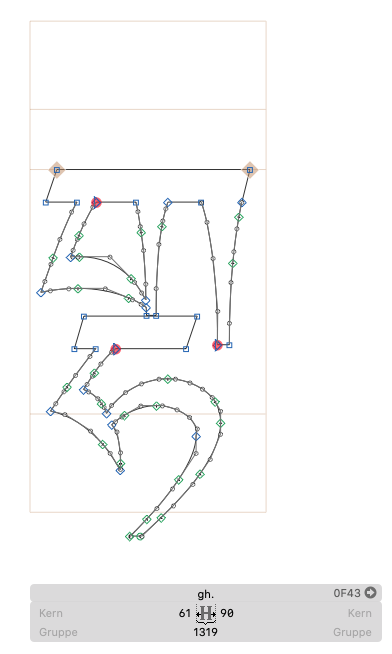
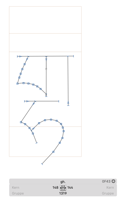
currently I created a second master, where I copy the outline font and draw the center line.
Do I have to add special points (anker points or something else) to make the glyph work, or is what I did ok?
I can show two pics, first the original glyph, secondly the “single line” version.
Please tell me if there is something missing…
Of course my approach is clumsy, as it consists of straight lines and points only, but as it is being lasered VERY small, nobody will see the difference between this and splines I would guess.
Output to the graphics program would then be Drawbot plugin (still needs to be solved)…
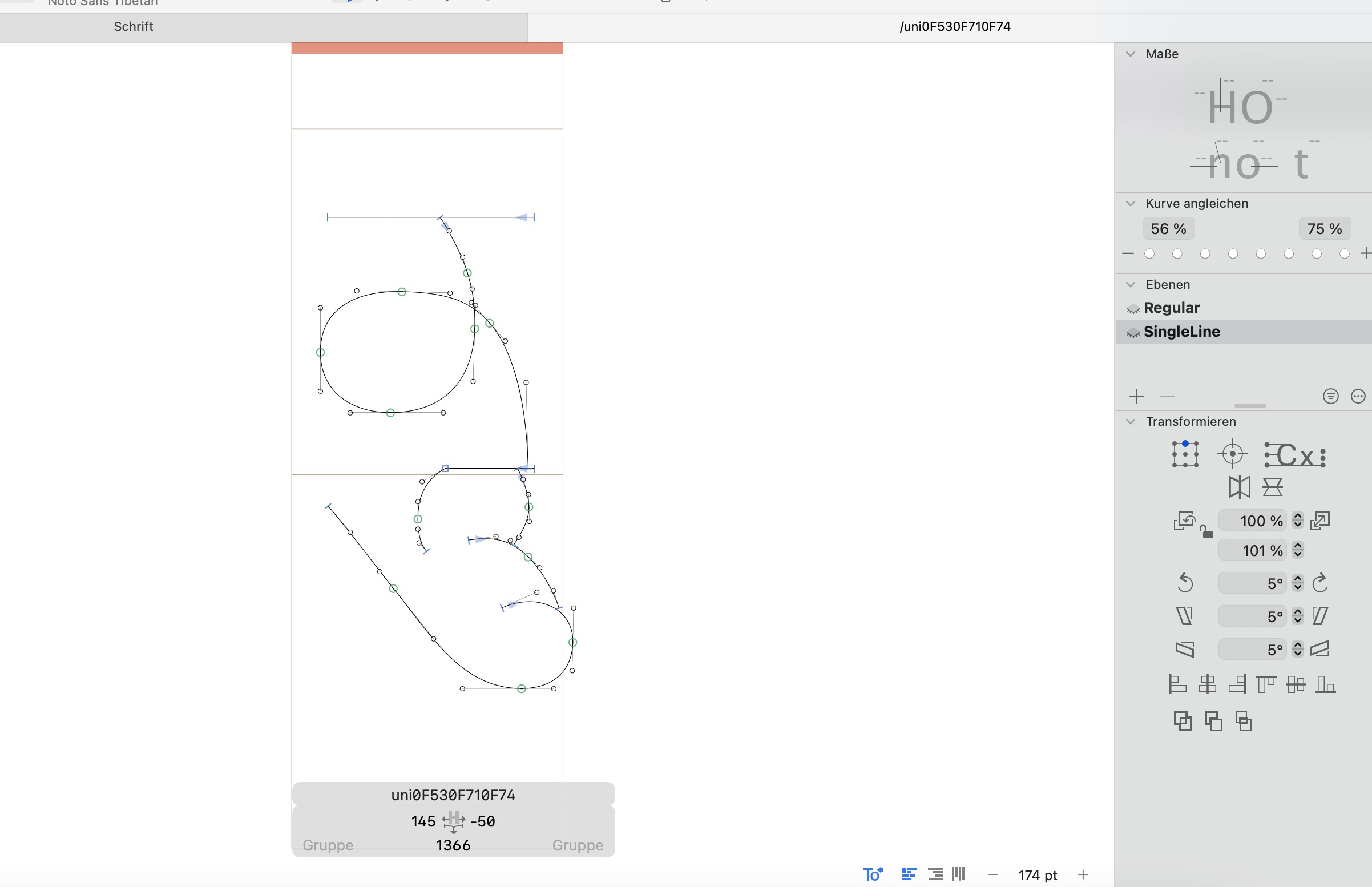
First, it would probably help if you try to use curves.
You could use smart components reduce the number of glyphs you have to draw manually. A lot glyphs can be made by stacking two or three smaller versions of the glyph. But that is not too important as you can just scale the single line drawings.
Well, Tibetan has roughly 1600 letters.
I am at more or less 500 - always adding some that I need.
Then I usually draft them using Glyph and DrawBot.
Those are then used in vector programs to further process.
would you turn that into usable single line fonts? i am interested on developing that into functional single line fonts such as svg or OTF-SVG. how you currently use that?
well, difficult.
I do convert this into OTF or TTF (Cannot remember), but none of them worked.
Ususally the openness is interpreted falsely and you see completely mangled types (automatically “closed”)
I lack understanding how to achieve this.
Of course I would be also highly interested in knowing how to move on and which program could actually use single line fonts properly.
So far my understanding is that there isn’t - maybe @GeorgSeifert has an idea?
Normal design apps don’t support open paths. There are some specialized apps for CNC machines that use some hacks to get it to work. But I don’t know more about this.