Creating a vertical font - tips?

Yes. Ligatures are so-called glyph substitutions. That means that one or more glyphs are substituted for one or more other glyphs. IOW you need something to substitute for something else.

The technical problem below is that you can have two ways of accessing your glyphs: firstly, through the character. I.e., you give the font a Unicode value, and the font returns the glyph for it. That is what happens, e.g., when you type with a font: your key press produces a keycode, which is then transformed by the keyboard layout into a character (Unicode value), and the rasterizer retrieves the glyph from your font that has that Unicode value assigned to it.

Secondly, you can access the glyph through an OpenType feature. An OpenType feature can substitute one or more existing glyphs for one or more other glyph, which does not need (and usually does not have) a Unicode value assigned. Ligature glyphs do not (and should not) have Unicode values assigned, so they need to be accessed through an OpenType feature.

Note again that OT features work on the glyph level, not on a character level. If you do not have b in your font and you still want the ligature to work, what you ask for is to replace a glyph in combination with a mere character, which is not possible, because it is not working on a glyph level. A font, after all, is a collection of glyphs. Unicode is a collection of characters.

Theoretically, you can, thirdly, access glyphs through their glyph ID. Which is what a glyph palette would do. But that is usually not what you aim for as a type designer, so let’s ignore this for now. (Also there is the special case of the fallback glyph .notdef, but I’ll ignore that one here as well.)

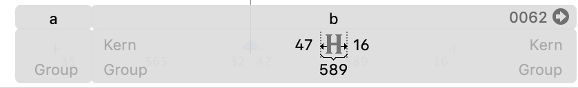
So, if you want a ligature substitution, that is two or more glyphs substituted by a single glyph. If you do not want to have the second glyph in your font, then it is not a ligature but an alternate, and I suggest a different naming for the glyph, e.g. a.ss01 or a.cv01.

More on the subject:

Ah ok fair enough. Thanks. It’s a really handy way of not needing to create a new input system on the computer. Going to be a useful feature! So having to create extra glyphs even for single ones I will not use will be fine. No big deal.

Thanks for all your help. My original problem of making a vertical font remains however. Do you think I should just give up and create it using glyphs rotated on their side and making a horizontal script? Or, is there a way to kern vertically with this app? So far no responses here to make it work.

Sorry, this thread contains so many issues, that it has become hard to keep track of everything.

To kern vertically: switch into vertical mode, put your cursor between two glyphs and change the top and vertical K (=kern) values in the grey preview panel, or use the kerning shortcuts Ctrl-Opt-(Shift-)Left/Right Arrows.

You are aware of the differences between spacing and kerning, right?

No worries. You’ve helped a lot :slight_smile: Thank you!

This was the issue I was stuck on.
I have not got to spacing yet. I watched that nice multiple hour tutorial and it was helpful. A lot to take in, so I’ve been taking it step by step. I was stuck on that kerning thing because as you can see even though I have it set on horizontal, it only gives left and right kerning options in that box.

Thanks for providing an alternative method. I have two questions regarding that:

  1. Does that mean that the option we have for kerning via the box in my pic above is only for horizontal scripts, and we simply don’t have that functionality for vertical scripts, and so have to do it this way you just instructed only?
  2. I tried doing what you said. I will show you the result for a horizontal script:

Looks like I would expect from your description, with ‘kern group’ written, and presumably it’s about the numbers either side of the icon of a glyph with arrows on the sides - seems very intuitive.

However, here’s what it looks like on the vertical script - I did the same thing, click the cursor between the glyphs, which only works in Text mode (which did also work fine in horizontal script by the way), but it doesn’t give that grey box, just the one for kana above that line (and yes there are glyphs below it, and I tried several):

Any ideas?

Hi Galifer, it seems you’re after similar stuff to me. I understood what you were asking straight away, but I have visual-cognitive problems, and can’t focus or read all the issues that followed.

With the Coronavirus keeping us under house arrest, I’m just trying to do something I was keen on years ago, but couldn’t easily download what I needed. I’ve had some graphic design, using Adobe Creative Suite - but now only have Photoshop - which does to some extent even place text on a wavy line - as well as does vertical text.

My wish though is to create a typeface/font from ‘scratch’. I love the Japanese way of combining of scripts - Kanji, kana, and Romaji and have done calligraphy with a brush years ago. My meeting of Japanese here in Australia, inspired me to slope my English handwriting to the left, and more to look like the cursive ‘grass writing’ etc.

My first wish was to make a font of my hand writing. Now, my thing is for vertical Japanese inspired script. I also wish to perhaps add ‘furigana’ to the right, or vowel diacritics, as well as ‘okurigana’ as verb endings and particles etc.

To create a new ‘Earth language’ broader than Esperanto, but limited to mostly Indo-european vocabulary - would be a ‘hobby’ for many years into retirement! But, starting would be great and sharing would be even better.

I found with my visual-cognitive problems that this terrible ‘sans serif’ font everywhere is a great problem, and that pictographic or ideographic material takes my attention, and years later, I still am able to remember how to pronounce the kanji I learnt over thirty years ago. More importantly, it was the meaning that comes immediately to mind. [Sans serif fonts can appear more like '1’s and '0’s - a computer binary code.]

Now, that we can print characters quicker than type Latin letters, or with handwriting, do a quick ‘shorthand’ version of kanji etc. perhaps a ‘fantasy’ font, as done in science-fiction, could be a world language and written language.

Esperanto doesn’t appeal to many. As with serif fonts, there has to be a balance of regularity and ease in language, as well as interesting points. Sanskrit and Devanagari script is more interesting.

I have started with a glyph for ‘five’ and ‘hand’. In Samoan, they use the same word for both, lima, but the kanji for either does not look like a ‘five’ or a ‘hand’, so I’ve redesigned one glyph for both - using three strokes. As with Japanese, each glyph can be pronounced in various ways relating to its use singly or in combination.

The only thing I need, is just a program to ‘type-set’ the various components well, and ‘kerning’ and spacing are necessary, although the kanji part is supposed to be contained in a fixed box size. Smaller ‘kana’ and vowel script/diacritics need to be spaced well for proper aesthetic appeal.

Like a type setter, is there just a method of retrieving my created glyphs and arranging them freehand on a page?

Are these the questions that you are interested in also?