I’m new to Glyphs and can’t wait to start creating new fonts with this amazing app. One of the hardest characters to create is the letter ‘S’. I was just wondering if anybody has any design techniques or tips to create this curvaceous body? I know lots of factors go in, like contrast and x-height to name a couple, but would love to see if there are certain methods people use to help bring the character to life.
I can’t read German fluently but I know a word or two, would you mind forwarding me a copy of your handouts? It’d be a good excuse for me to start learning German again
Thanks @oneweioranother ! I couldn’t find any image links in the old Archive.org links, so it was a bit hard to understand what John Hudson was talking about. However, I did find another link in one of those articles, you can view it in my latest comment below
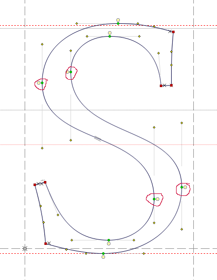
@Joe A lot of it depends on the style and case you intend to draw for the letter /S/ but I learnt this method from Karen Cheng’s “Designing Type” (a great book if you don’t have it already).
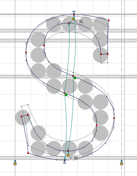
Start with two circles stacked on top of each other (so it looks like a number 8) and then remove portions of the curve to form the letter S. Then weld the two points in the centre of the shape. That’s the basic shape.
You will then need to correct the shape for optical balance. Extend the bottom tail of the S out a little, and bring the top tail in a fraction. Reduce the height of the top curve slightly, and make the bottom part bulge out a bit. The “top story” ideally contrast a little to the bottom story, in size and shape.
Now you have the basic spline you can play with the shape a bit more, thicken it, etc.
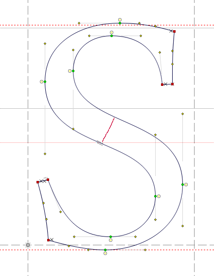
If the design allows it, I try to do without the inflection points in the middle. They are necessary for offsetting (Noodler adds them automatically), but are a risk in interpolation. So what I would do after the fourth picture, is add the S to the background (select all, Cmd-J), delete the middle nodes, and try to reconstruct the bend with the vertical handles only.
I know this thread is oder, and I’m a bloody beginner, too, but i thought I would throw in that especially for the letter S, I found the harmonizer tool to be a life-saver. I think the “practice” advise is still the most important, but the harmonizer is a great teacher.
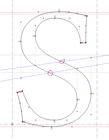
Harmoniser only improves the curve around the node, not the middle of the segment. Also it has no awareness of the stroke (i.e. opposite curve of the stroke), so you might get inconsistent result in the inside and the outside of the curve.
sometimes is is easier to draw with nodes at the inflections and sometimes without. It it should be technically important, they can be added automatically.
Some path operations are only possible in a satisfying manner if a path segment bends only one way (offsetting for instance). And in days long gone, some renderers produced unexpected results, treating inflecting segments as cups. But technically, leaving out inflection nodes is not a problem anymore, at least AFAIK.