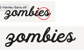
I created a script font and very, very carefully made sure that each letter connects perfectly with the next. But, when i zoom out some of the letters do not look like they are joined properly. This happens in Illustrator, which I know has some strange display things. But it is also happening on the site where i am selling the font…
Here is the link to the site: http://crtv.mk/h0hsL @mekkablue this is the script font you looked at for me. I took all of your suggestions and did delete all the kerning and created the joins primarily with spacing. The “es” pair however, is sightly kerned.
Otherwise there is not much you can do about it. Adobe apps have multiple rendering modes at different display sizes. And in some sizes, letters are snapped to the pixel grid, and then these little offsets can occur.
Hinting is a technology to make letters legible at small size, not faithful. It means your outline will be modified under small pixel size when you embed hints to a font. It’s better not to use hints to a typeface with connecting strokes.
Tosche is right. Please read about hinting in the tutorials and in the handbook first. You have to prepare your outlines for it, and it only makes sense for certain designs.
Does your advice applicable also for glyphs that bear Exit/entry anchors?
If AutoHinting is OFF should all glyphs be manually hinted ?
Eventually I tried hinting some of those with the EE anchors but it did not resolve the shifting in zoom-out display !
Hinting distorts shapes so they better fit on the pixel grid. It makes no sense to use hinting with a connecting script, and doesn’t matter whether it is automatic or manual.